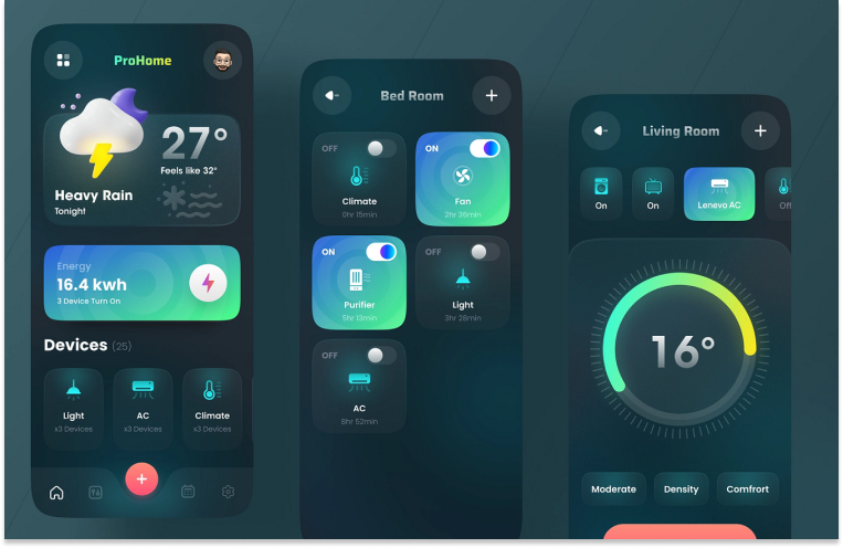
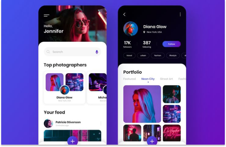
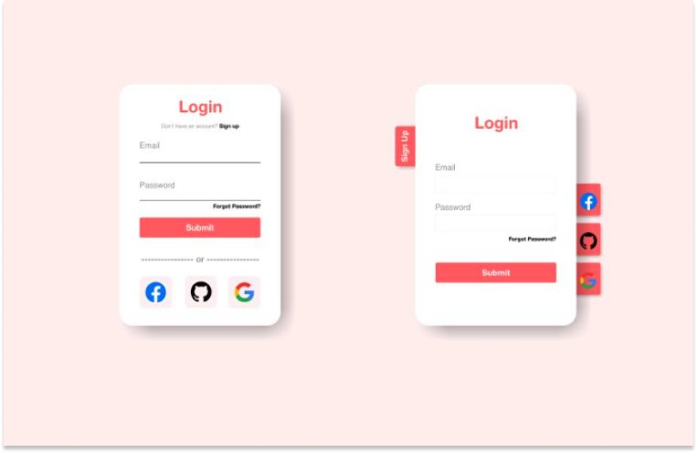
User Interface (UI) design is pivotal in shaping our daily digital interactions, which is why it's no surprise that UI design roles are in high demand and among the most sought-after in the job market. But what exactly is UI design, and how can you master its process?
In this article, we'll explore the fundamentals of UI design and demystify the six essential steps every designer should follow. Whether you're just starting out or looking to refine your skills, understanding these basics will set you on the path to creating captivating and user-friendly interfaces. Let's dive in and uncover the secrets of effective UI design!
What is User Interface Design?
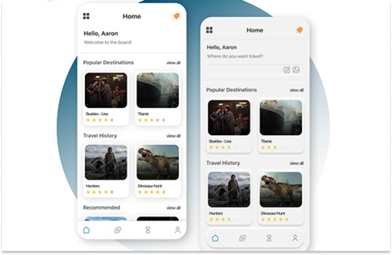
Before getting to know what "User Interface Design" is, we should understand the concept of "user Interface" first . It refers to the graphical layout of software, apps, websites, or any digital platforms that enables human interaction. By providing a visual and interactive environment, it acts as a bridge between the user and the system, allowing users to navigate through the features and functionalities of digital products with ease and efficiency.
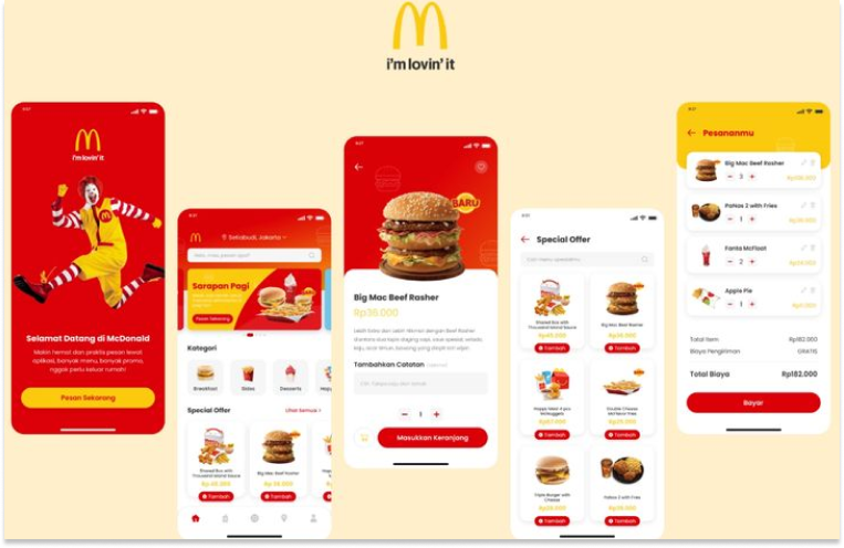
User interface design(also known as UI design) , as a result, is the process designers use to build and refine these digital interfaces. It concentrates on the visual and interactive elements displayed on screens, the colors presented to users, the animations facilitating interaction, the functionality of buttons, the readability of text and more.

What makes UI design important?
UI design focuses on optimizing the user experience by ensuring that interfaces are visually appealing, intuitive to navigate, and conducive to efficient interaction. As the market expands and digital products become increasingly prevalent in our daily routines, the role of UI design in app development becomes paramount. Its importance lies in several key factors:
It has a great impact on users' first Impressions
The user interface serves as the initial point of interaction between users and products. It is crucial to consider user expectations and emotions about the website from the outset and design a product that meets those expectations. A visually appealing and well-organized UI establishes a positive first impression, captivating users' attention and prompting further exploration.

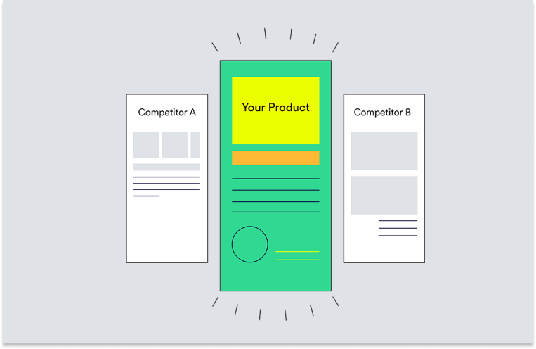
It distinguishes your product from competitors.
Furthermore, an appealing and well-crafted UI can serve as a distinguishing factor. Products with great UI can be more memorable for users. If users perceive a product's interface as more user-friendly and visually appealing compared to competitors, it can confer a competitive advantage.

It provides an enhanced user experience
UI design plays a important role in shaping the user experience. The ultimate goal of UI design is to desing a appealing and easy-to-user interface to assist users in completing their tasks, whether it's finding information or purchasing products. A well-organized user interface that is easier to navigate can provide customers with a more enjoyable and convenient user experience.

It bolsters user retention
Good UI can also bolsters user retention. When users can effortlessly comprehend and engage with an interface, they are more likely to achieve their objectives efficiently, thereby reducing frustration and minimizing errors. Consequently, satisfied users are more likely to revisit a product, bolstering user retention rate and ensuring long-term success.

It reinforces the brand identity
The design elements incorporated into a UI, such as color palettes, typography, and iconography, contribute to the overall brand identity. A consistent and cohesive design reinforces brand recognition and helps establish a brand's character.

It's Good for Updates and Maintenance
A well-designed UI makes it easy to update and maintain your app or websites over time. Updates are crucial for fixing bugs, adding new features, and improving performance. If there's a need to rearrange the layout of certain elements or introduce a new button for a feature, a well-designed UI has the lexibility to enables developers to make these adjustments seamlessly. As a result, users can enjoy an improved app experience without encountering significant disruptions or inconveniences during updates.

UI design vs UX design
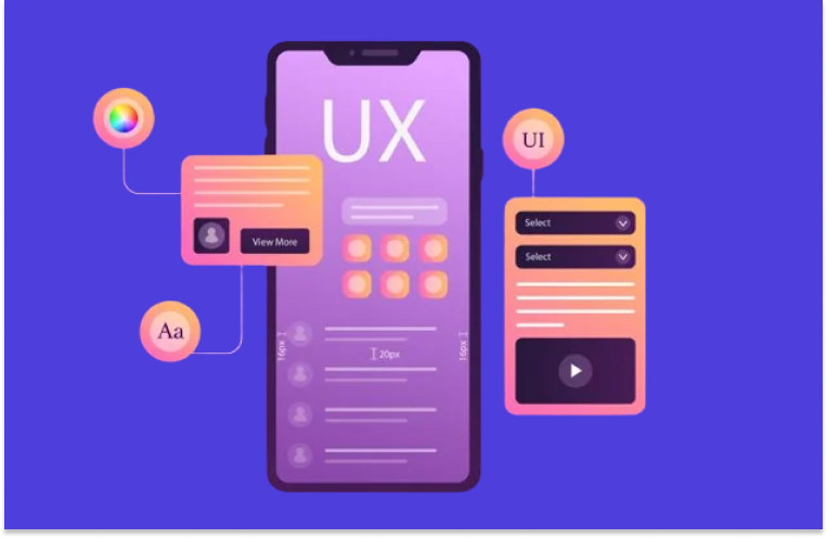
UI design and UX design are two distinct yet closely related fields that together form a successful product design process. While they share some common ground and often work hand in hand, they are fundamentally different at their core.
UI design primarily deals with the visual elements of a product, focusing on creating an aesthetically pleasing and user-friendly interface. This includes aspects like layout, typography, color schemes, and graphical elements. UI designers aim to make the interface visually appealing and easy to navigate for users.
On the other hand, UX design is concerned with the overall experience a user has while interacting with the product. It involves thoroughly understanding user needs, behaviors, motivations, and pain points, and then designing the product to address those aspects effectively. UX designers focus on creating intuitive and seamless interactions, ensuring that the product is easy to use, engaging, and provides value to the user.

For a digital product, both the interface and the experience it provides are equally important. If its UI design doesn't incorporate with good UX design, the overall user experience flow can become very cumbersome and difficult to navigate, potentially leading to a decline in usage rates.
6 easy steps of UI design process
Now you can see UI design literally plays an crucial role in shaping user experience. You must be wondering if there any effective ways or steps to create intuitive and visually appealing interfaces. Here, let's explore the 6 easy and effective steps of the UI design process. Please note that these steps are not always sequential. They do not necessarily need to follow any specific order and can repeat iteratively to refine the solutions to best fits users' needs through the process.
Step1. Understanding users' needs
At the initiation stage of the UI design process, it's paramount for UI designers to define the target audience and gain a comprehensive understanding of their preferences, needs, pain points, usage patterns and scenarios, and more. Designers should literally empathize with users. How to effectively analyze users' needs ? Following the 5W1H principle, let's frame the questions in a manner similar to how a journalist would write a news report:
Who are the target users, their preferences, age groups, occupations, and levels of cultural and educational background?
What tasks do users perform within the website, application, or product? What are their user objectives?
When do users typically engage with specific products or technologies? Are there any daily patterns or behavioral habits to explore?
Where do users perform specific tasks or utilize key technologies within the product? This includes categorizing usage scenarios into common, extreme, and potential contexts.
Why do users engage in particular behaviors? Understanding the emotional and rational drivers behind user actions and their fundamental motivations.
How do users execute tasks or achieve goals within the product? Exploring the detailed steps users take in task execution.
This process can shape the functions, flow, and layout of the interface, guaranteeing it meets users' needs and desires.
Step 2. Creating Wireframes
When designers clearly understand users' needs, they will need a quick and effective way to identify usability issues early on in the design process. Wireframing, it is!
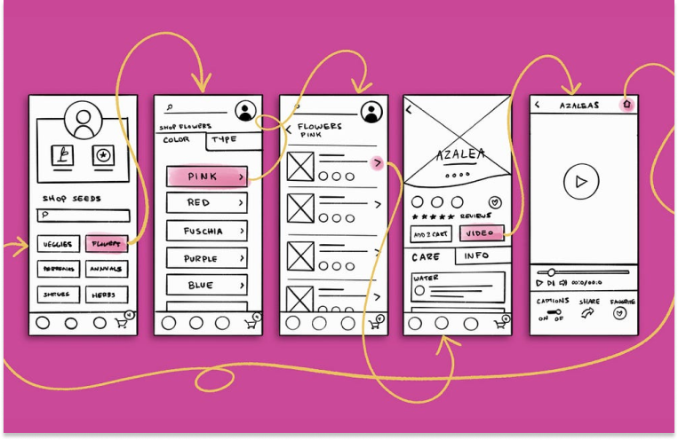
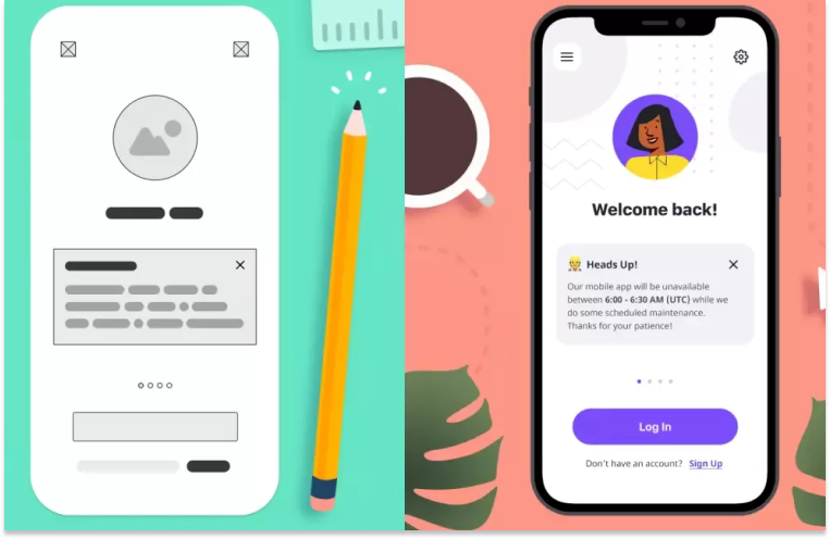
Wireframes are simple, low-detailed visuals that outline the structure and layout of a digital product. They focus on organizing information, guiding user flow, and placing key elements without getting into visual design specifics. Often in grayscale or monochrome, they use basic shapes and placeholders to represent elements like buttons, images, and text blocks. Functionality and user experience are prioritized over aesthetics.
Wireframes help you plan page functionality, identify issues early, and streamline revisions, saving time in the long run. Making changes to a wireframe is easier than altering a detailed mockup with many design elements.

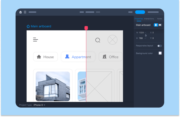
To effectively create wireframes, you can use tools like Mockplus RP. It's really a powerful yet easy-to-use wireframing & prototyping tool. Designers can quickly outline the basics of your interface in no time with a robust set of Android, iOS and Web templates, icons and UI elements. There is no need to start from scratch.

Once it's done, all wireframes should also go through thorough testing and iterations to ensure they accurately represent the desired user experience.
Step3. Create Prototypes
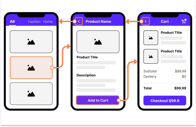
Once you have finalized the basic layout and functionality of your digital product, you can turn wireframes into prototypes. Prototypes mimic how the final product will work and feel for users. They can be used to ensure the product concept is right and are also handy for showing stakeholders how the product will work.
Prototypes can be low-fidelity, with simple designs and interactions, or high-fidelity, closely resembling the final product. At this stage, it's a better choice for designers to create low-fidelity prototypes. It allows more opportunities to edit the prototype, as it will be easier and won’t take a lot of time for change at this stage.

Step4. Designing the Visual Interface
Once the prototype has been thoroughly tested and validated, and the functionality and user experience have been confirmed to meet the project requirements, designers can begin to design the visual interface. At this stage, visual elements such as color schemes, typography and imagery will be added to enhance the aesthetic appeal of the interface.
Color Schemes: Colors can evoke specific emotions in users, like excitement with vibrant tones. You should choose colors that suit the purpose of your website or app and your target users, such as bright and playful hues for a children's toy store. Besides, designers can also create visual hierarchy through colors. For example, designers usually use contrasting colors to highlight important elements.
Typography: Typography plays a crucial role in user experience design as it influences text readability and impact. When using typography, consider font choice for readability and tone alignment, ensuring it's easy to read and fits the content's mood. Font size should be large enough to read comfortably without overwhelming the space, while line height should provide adequate spacing between lines for readability. Moreover, typography can be used for impact by adjusting font size, weight, or style to emphasize key text or create visual hierarchy for a more appealing design.
Iconography: Iconography involves creating symbols to represent features, functionality, or content on interfaces, aiding users in understanding context. Icons serve as a universal language in digital interaction, facilitating immediate recognition of actions. When designing and using icons in this stage, designers should ensure consistent optical size and visual weight, maintain uniform detail level, and keep icons simple by eliminating unnecessary details.
Imagery: It's essential to use relatable images that resonate with your target audience when promoting your brand through digital interfaces. Using familiar imagery in designs can tap into people's psychological tendencies to relate and connect with situations, people, and emotions. For instance, on a travel website, images of happy tourists exploring exotic destinations, enjoying local cuisine, and interacting with locals can evoke a sense of adventure and excitement, prompting potential travelers to envision a memorable vacation experience. Relevant imagery not only enhances credibility but also plays a significant role in influencing favorable decisions.

When designing the visual interface, a powerful design tool sets the foundation for efficiency.
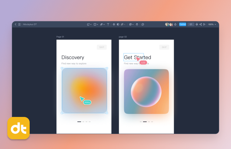
You can use powerful UI design tools like Figma and Mockplus DT. I recommend Mockplus DT.
Mockplus is a web-based design tool that covers almost all the key features of Figma. But it's much cheaper than Figma. It offers a free plan for everyone with limited features. And for its paid plans, it costs only $8 per user per month, while Figma charges $12-$45 per user per month. Moreover, it also provides one central place for whole team to design, animate, collaborate and handoff.

Step 5. Review and Refine
Once the visual design is all done. It should go through a design review process to gather feedback from other designers, developers, stakeholders and potential users. This process can assess its alignment with project goals, brand guidelines, and user needs.
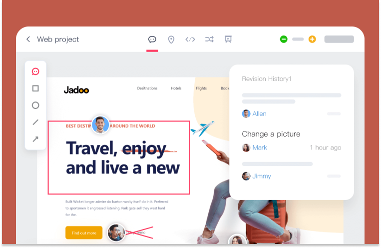
There are a bunch of powerful tools that can be used for an effective design review process, such as Mockplus Cloud. Mockplus Cloud is a collaborative platform where product design teams can collaborate effectively and hand off prototypes or designs more efficiently. Designers can upload their design to Mockplus Cloud and invite teammates to review their designs and finalize all details by commenting directly on the designs and starting a contextual discussion.

If necessary, revisions are made to the designs based on feedbacks. This ensures that any identified issues or areas for improvement are addressed before finalizing the design.
Step 6. Developer Hand-off
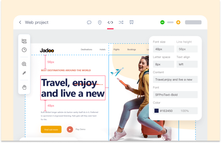
Once the visual design and user flow is finalized. Usually designers should also work closely with developers to translate the final design into code, and provide developers with design specifications, assets, and style guides to ensure accurate implementation. Mockplus Cloud can make this process way more efficient and faster. It offers a Developer Mode where developers can get all the assets you need in image formats and scales with just one click, and view and export auto-generated style codes for all Web, iOS, and Android platforms in over 6 coding languages.

Once the development phase is complete, the product must undergo a rigorous testing and refinement process to ensure that it accurately reflects the intended design and functions correctly before its release. Even after a product is released and users begin using it to achieve their goals, the responsibility of UI/UX designers persists. They continue working to update the product in line with emerging UI and UX design trends.
Conclusion
Overall, UI design plays a crucial role in creating successful digital products that meet users' needs and expectations. A well-designed UI design not only improves the overall user experience but also contributes to the brand's identity and differentiation in the market.
Today, we show you 6 easy steps of the UI design process. As you can tell now, UI design is a blend of art and science. To create a great user interface, it is not merely reliant on designers' design skills. Instead, it also requires a deep understanding of user psychology. Designers have to empathize with users' needs and optimize information architecture to create intuitive interfaces that can really enhance user satisfaction and ultimately drive business success in today's competitive market.


