In order to create a product that users love, designers or product teams involve users early on in the design process, adapting decisions to the different needs and wants of users. That's why user-centered design has become extremely popular in recent years.
However, as a designer, do you really know what user-centered design is? What benefits user-centered design will bring to you? How can you or your team create a user-centric product step by step?
This ultimate guide to user-centric design will walk you through the basics, benefits, principles and examples of user-centered design, and let you know exactly what to do when creating a user-centric product.
Table of Contents
What is user-centered design
User-centered design vs human-centered design
User-centered design benefits
How to create user-centric products step by step
User-centered design principles
Best user-centered design examples
What is user-centered design?
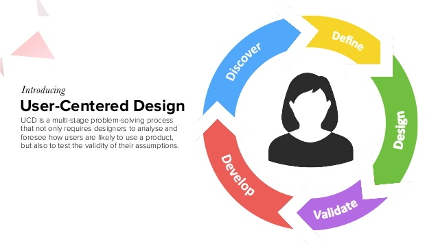
User-centered design (UCD) talks about the design process that designers conduct to create an effective website or mobile app by taking users' needs as the center of focus in each phase of the product design workflow.

Here are three points that can help you better understand the definition:
UCD design is an interactive design process
When trying to design a product that users like, designers use different methods and tools to research the target audience, trying to figure out what they need. However, users' needs are complicated and sometimes change quickly. That requires designers to make or change the decisions correspondingly at every design and iteration stage of the UCD design process.
UCD design is user-centered, but, not only user-centered
As we've said, UCD design requires users to take the real needs and wants of users as the center focus, however, it is not the only focus. To achieve the final goal of increasing users and sales, when designing a product, you should try to balance the users' needs and your business needs perfectly, especially when they conflict with each other in some cases.
UCD design needs long-term monitoring and testing
Even after your website or mobile app has been published, you should not stop the design process. The market is changing. The needs of the audience are also changing. To create a more user-friendly product, you should ensure long-term monitoring and testing to keep it up to date.
User-centered design vs human-centered design
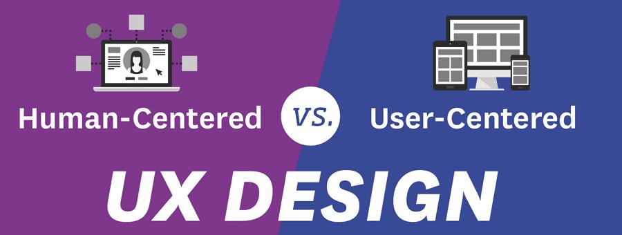
User-centered design is an interactive process that designers take to create products based on users and their needs. The entire process is user-oriented.

However, human-centered design considers the needs of ordinary people of all ages and fields, not only the needs of the target users. The needs of the ordinary people can be unimaginably complicated and can, sometimes, even conflict with the needs of the target users, bringing users a bad experience.
User-centered design benefits
Standing in the shoes of users when designing a product can bring many benefits to your business:
Prioritizing user research and testing at every design state allows designers to better know their audience and work more user-friendly solutions into the end product. This will help bring a much more positive user experience.

Earn and build customer loyalty
Apps that easily resolve users' problems help companies attract more users, making it easy to win over other competitors. An easy-to-follow experience also leaves a positive reputation and improves customer loyalty.
A better user experience often means a better product. A better product strengthens user confidence, finally making it more likely to buy a product on your website or mobile app.
Since you've brought users on board early during the product design process, all possible problems can be found and fixed before being moved to the app development process. Saving time and money.
So, most designers and product teams will reap rewards if they create user-centric products or services.
How to create user-centric products step by step?
Let's see how you can create a user-centric web or mobile app in 5 steps:
Step 1. Conduct user and market research
To achieve your business goals, before starting to design a website or mobile app tailored to the needs and specialities of users, you should first take time to research users and see what they will want to get from your app.
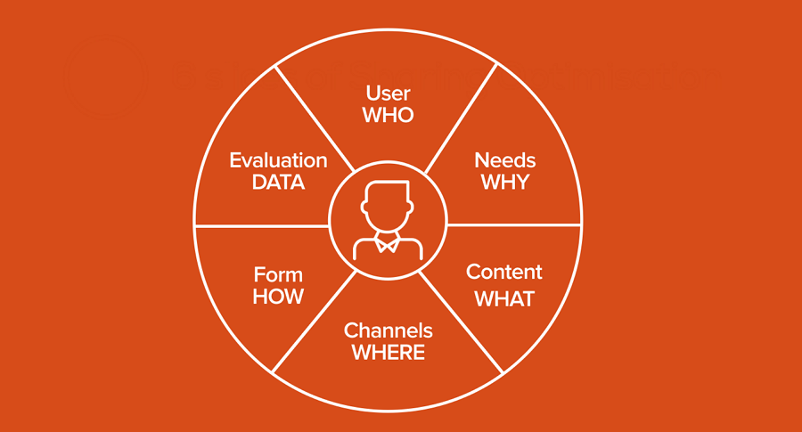
Here are some questions that you should find the answers to to better know the audience better when doing the research:
Who is the target audience of your product or service?
What are their purposes when using your product or service?
What problems do they often face when using similar products or services?
How will they interact with your product or service to achieve their goals?
What is the common journey they have gone through to achieve their goals?

In UCD design, without knowing the users and their needs clearly and correctly, the later design will definitely be a disaster. Never underestimate the user and market research before starting to design your website or mobile app from scratch.
Tools you can use in this step:
Survey Monkey - a free online survey tool that offers crafts templates to help you create custom user research surveys, gather and analyze feedback from the target audience.
Condens - a centralised platform for storing, structuring and analyzing your user research data and sharing findings across your teams.
Step2. Identify target users, user scenarios and requirements
After knowing the audience, the next step is to define your target users, their requirements and usage scenarios.
After analyzing the research data, you may find a wide range of people may use your product. However, not all of them will be taken as the target audience. In fact, to create a product that really helps users, you should always select the main two or three groups of people as the target users and take their requirements as the design standard.
Additionally, you should also try to figure out what scenarios they would choose to use your product. There are several things you should pay attention to:
summarize the main medium that users take to access your products, like desktops or mobile phones.
analyze the main situations that users may prefer to interact with your product.
record the main emotional state that users have when using your product.
The result can not only help you better understand their problems, requirements and pain points, but also give you a base to create a product that these users are really interested in.
The tools you may need in this step:
Tableau - a data visualization and analytics platform that helps you analyze data, create intuitive data visualizations, export reports and share across teams and devices.
Modern requirements - a requirement management tool that helps design teams manage their requirement documents and increase team productivity.
Step3. Create user personas and user journey map
Now let's take it a little further and try to create user personas, user stories and even user journey maps, so everyone in your team can quickly have a good understanding of the target audience and start to complete their tasks in user-centered design.
Generally, a user persona is a typical representation of your target users, giving a clear picture of the people that you are designing for. You should offer as many details as possible, including their goals, job titles and major responsibilities, ages, education and family status, goals, pain points and problems, and so on. However, provide only relevant information as a product user.
A user journey map describes how users will move through your website or mobile app to achieve their goals. It also plays an important role to help your team members better understand the audience. You can read a complete guide to the user journey map to learn more about it.
The resources to simplify this step:
Free download 20 user persona templates and examples
Step4. Ideate your solutions
After knowing clearly the needs and problems of your users, the next step is to design your solution. In other words, discuss with your team and see what features and designs should be included to meet user needs and resolve problems they may face.
For example, when designing a food delivery app, users may want to save their favorite dishes so that they can quickly find and reorder it whenever they want.
A series of questions might be related to this feature, such as how to add a dish to your favorites, whether it is necessary to add a star button, how to design the star button, how to remove a dish away from the favorites, and so on, and should be fully discussed and resolved with your team.
In case you forget something important, try to make a feature list.
Step5. Prototype, test and iterate your solutions
The last but certainly not the least is to prototype your solutions and fully test them to see whether they all are workable and user centered. There is a need to include every detail of your website or mobile app, but, the main functions and interactions, specially the ones that can change your decision, should be visualized at the aid of a handy design tool. Find out how your app feels with just a few clicks, allowing you to make early changes and saving you time later on in the development process.

Never forget to share the prototypes with your team, collect feedback and iterate the details together with them again and again. Then you can make sure the needs of the user are perfectly balanced with your business needs.
The tools you should try in this step:
Mockplus RP - a rapid online prototyping tool that helps you translate ideas into functional website or mobile app prototypes, share and collaborate with your entire team. An ever-growing component, icon and template library help you get started quickly.
Mockplus Cloud - a web-based design collaboration and handoff tool that allows your entire team to sync designs from Axure, Figma, Adobe XD, Photoshop and Sketch, collaborate and discuss details together, and hand off to developers with accurate specs, assets and code snippets. Your entire product design process is covered in one platform.
User Testing - a user testing and research tool that helps you improve customer experience.
User-centered design principles
Here are 5 basic principles that you can follow to create a better user-centric product:
Include users in the design process from very beginning
UCD design putsin users' needs and interests at the top of the priority list. This not only requires designers to fully research users before starting designing, and also forces them to take users into the design process from the very beginning, such as the designing process, the testing process and iterating process. The users' experience and feedback sometimes directly determines the design direction of a website or mobile app.
Not all users are included
The deep research towards the target groups help designers understand their needs better and provides more chances to create a stunning website or mobile app. However, that does not mean that you and your team should take all users into consideration.
The target audience consists of different groups of people. Their needs, goals, problems and behaviors also vary. If you try to meet the needs of them all, your functions and interfaces can become very complicated, giving users a very bad experience.
So, no matter how complicated your target audience is, try to select two or three main groups of people who will really affect your app and boost your business.
Mobile users are growing in numbers every year. To increase sales, one of the most effective ways is to try to create a mobile-friendly website. So, when designing a user-centric product, you should also never forget this. Responsive design would be your best solution for this.
Introduce end users into the testing loop
Designing everything focused on the user not only requires designers to keep the user needs in mind all the time, but also requires them to take end users, stakeholders and even clients into the testing loop.
Only when these real users have been introduced into the testing process, designers or product teams can truly know which features meet the needs of users and which features do not. This also offers a good chance to find the possible issues that users may encounter in the future and fix them as soon as possible in advance.
Keep testing and iterating
User-centric design should be conducted during the entire product design lifecycle. Even after you've published a website or mobile app, you and your team should keep an eye on users, analyze their needs, update functions, and then test and iterate on the app regularly.
Always put yourself in the shoes of the users and keep your designs up-to-date all the time.
Best user-centered design examples
Let's look at some examples to see how you can design a user-centric website:
1.YouTube

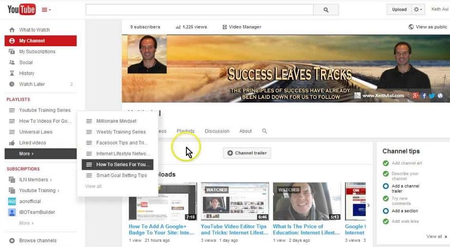
YouTube is the largest video sharing website in the world across all categories. To help users find the videos that suit their tastes, YouTube offers a powerful filter system below the search bar that puts videos the user might like in front of them. The left sidebar is also powerful and gives a personalized view at the users subscriptions and other options that help engage the user.
2.Microsoft

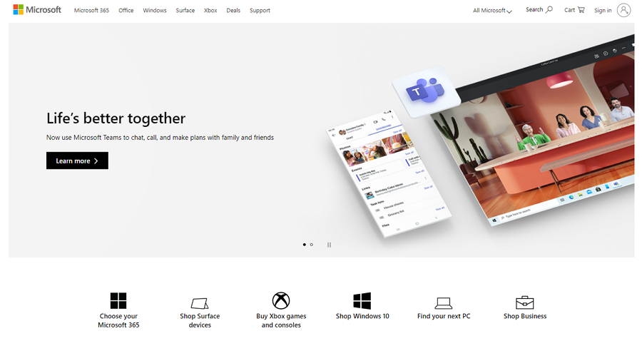
Microsoft provides users with a wide range of products, including laptops, operating systems and other soft services. As a result, Microsoft needed to design their website with a powerful navigation system.
The smart drop-down menus, big product image slides, product and service bar and clean layout, all these features make it easy for users to navigate through the website and for users to find what they want, fast.
3.MSN

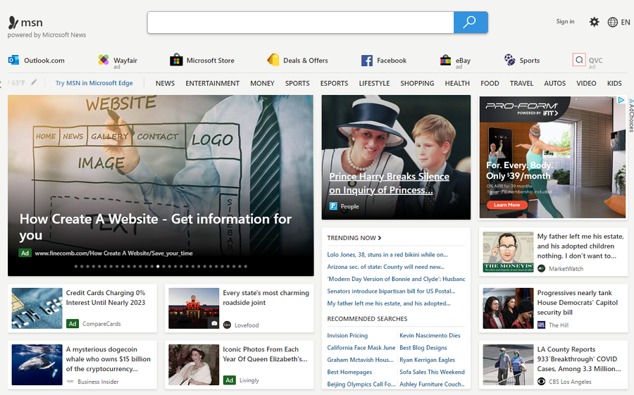
The Microsoft-owned news website, MSN, keeps people informed across the web, phones and PCs. It uses rich card designs to clearly present different news and videos on its home page. Users can also easily change language and content on the top according to their own needs. It provides easy navigation for the user to find news they’re looking for.
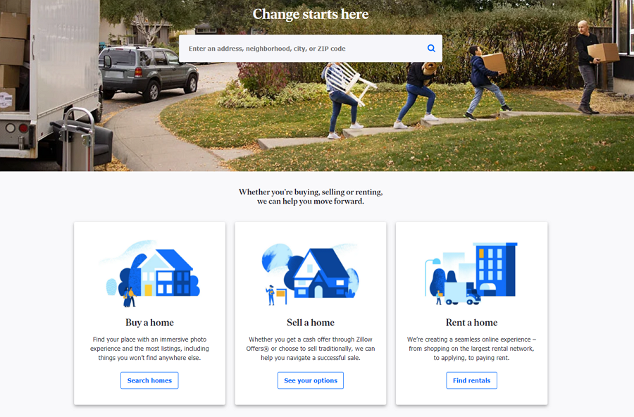
4.Zillow

For a real estate website, the needs of users sometimes directly decides how they will navigate around the website. So, Zillow provides two ways to help users find houses they want as soon as possible.
They can easily enter an address, neighborhood, city or zip code on the top search bar to narrow down the options. Or they can click the card designs that offer options like "Buy a home", "Sell a home" or "Rent a home" to find their favorite home. Buying a house can be difficult but with Zillow putting users at the center of their website design, users can find what they’re looking for far quicker than normal.
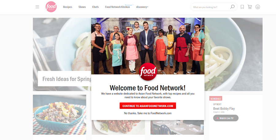
5.Food network

Food network is a unique lifestyle network website or magazine that shares stories and news of food. Apart from images of tasty food and clean layout, this website offers a special Asian version for Asian users.
While navigating around, you will also see a rating window that helps to collect your feedback. All these designs help users have an enjoyable experience there. For a food website, the Food Network focuses on the user rather than distracting the user with too many images of food, they let the user find the recipes they want.
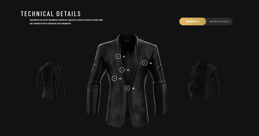
6.Davenport Blazers

Davenport Blazers is a fashion website that provides clothes for modern men.
As we all know, one of the people's pain points of people buying clothes online is that they cannot check the details and try out whether the clothes fit them. With this in mind, this website uses 3D effects to present the clothes. Users can then click the points over the cloth or videos to view more details.
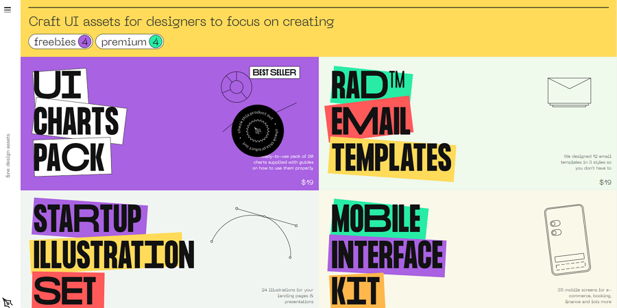
7. The Pen Tool

The Pen Tool is a website that shares free and premium templates, email designs, UI kits, illustrations and more . Its homepage has a fresh design style, along with personalized colors, fonts and rich microinteractions.
When you hover over a design resource plan, the background color will change to visually highlight it from other plans, making it easy for users to know which plan they are seeing.
8.Wayfaire

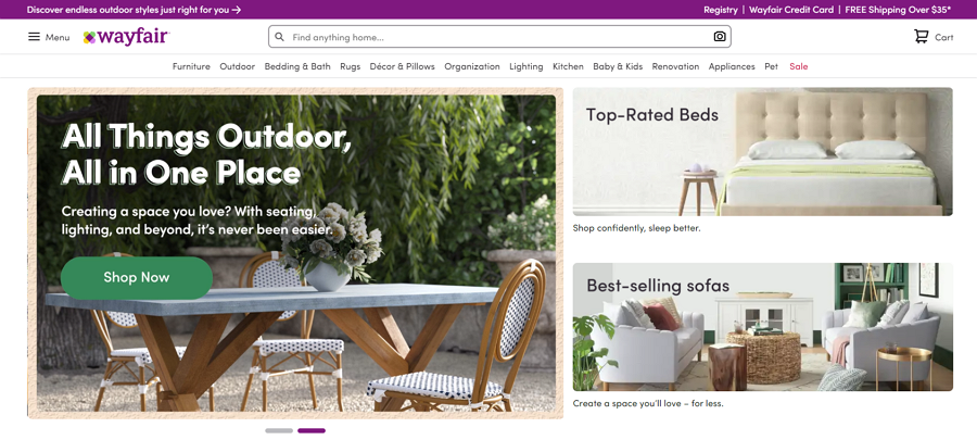
Wayfaire is an online home store for selling furniture, lighting , cookware and more. Its home page uses powerful drop-down menus and a hidden sidebar to help users find their desired objects. The clean and neat grid layout is easy for the eyes of people to scan around and helps users remain keen to stay on the website and not feel overwhelmed by too many choices.
Wrap Up
User-centered design requires designers and developers to think in the shoes of users, offering more changes for them to create a website or mobile app that users love to use.
We hope this guide can help you have a good understanding of user-centered design.
Free prototyping tool for web and mobile app design
Get Started for Free
Free prototyping tool for web and mobile app design
Get Started for Free
Free prototyping tool for web and mobile app design
Get Started for Free


