User experience design is one of the most important aspects of product development, and as designers, we need to focus on the UX design process from the very beginning. We list fifteen UX design principles that are fundamental to UX design, and how they can be applied to your work.
As you become a more experienced designer, your approach to some of these design principles may change over time. Evolving your design approach is a great tactic to implement as part of your design process, and as you may have already experienced, no two companies, projects or teams will work in the same way.
The last five principles are focussed on more advanced design elements that become more apparent with experience and the evolution of your design processes, although you can certainly implement them at any stage in your career. Let’s get started…
1. First, seek to understand
Before launching into solution mode for any project, stand back and focus on fully understanding everything you can about the product or service you will be designing a solution for. You not only need to understand who the users are, and their needs, goals, and frustrations, but firstly, what problem you are trying to solve? What is the business trying to achieve by solving this problem? Is there existing data or research available to enrich your thinking?
So before you start generating ideas for your design solution, ensure you deeply understand exactly what it is you are solving for. Having a strong foundation of research can mean the difference between an average and an amazing design outcome for your users. This initial research phase could include existing information from the business, data analytics, user interview outcomes, competitor analysis, and general desktop research.

Image source: Pexels
2. Place users at the center of your design
As a UX designer, it is crucial to always keep in mind that your focus is on empathizing with the users of the product or service you are designing for. Your role is to fully understand who the users are, empathize with their needs, and design a solution that can solve their challenges that fit easily into specific life situations.
The best way to do this is to start by interviewing your users. Understanding their needs, goals, frustrations, habits, and motivations will allow you to clearly focus on exactly what they might need from your product.
As you move through the design process, always come back to this key principle to ensure that your focus and design solution approach has not drifted off course.
3. Remember that you are not the user
It is so easy to fall into the trap of designing a solution that you believe will be optimal for the user. I have done this myself over the years, only to be surprised by the outcomes of usability testing that identifies major issues with my design. As designers, we become too close to the design, and we lose the ability to review our design with fresh eyes.
The way to work around this is to always test your design flow with real users. Don’t make assumptions. Even if you are unable to test with real users, ensure that you collaborate with other designers, developers and teammates to test your user journey design components from start to finish. Try to be aware of your own biases and how they may impact your design approach.

4. Use a design framework
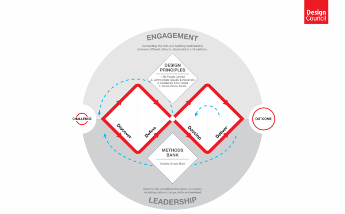
Design frameworks are a way for designers to create consistency in their design outcomes. A design framework is a set of standards and guidelines that help designers build products faster, more consistently, and more successfully. They provide you with a flow from beginning to end, but with the flexibility to choose the processes you engage with, and to move in a non-linear way to revisit the previous framework elements as required. Design frameworks can provide a proven path and if followed effectively will almost guarantee a successful outcome for your project.
I highly recommend using design frameworks for every design project you embark upon. My favorite is the Double Diamond framework. Other popular frameworks are the Design Thinking Framework and the 5 Elements of UX Design.
Below is an example of the Double Diamond framework from the Design Council.

5. Collaborate throughout the design process
UX design is definitely not a solo activity, and the more you collaborate with team members and users (where possible), the more successful your outcomes will be. While not everyone has the skills of a UX Designer, in my experience, sometimes the most creative ideas can come from developers and sales team members. The more ideas that can be collected, the more rounded your design solution will be.
The following are some of the best practices that UX designers should follow when collaborating with team members:
· Be open-minded and also aware of your biases
· Be willing to share and explore incoming ideas
· Keep an open line of communication
· Be open to constructive criticism or feedback from others

Image source: Pexels
6. Gather feedback from real users
I know this has already been mentioned briefly, but this is important enough to be highlighted as a standalone principle.
There are two main types of user feedback. The first is via user interviews, surveys and other methods, and the outcomes here provide insights into the users habits, goals, motivations, and issues.
The second type is conducting usability testing using a design prototype or finished product. Generally, the participants are given a task to complete, and the insights gathered from observing this journey help to identify key issues with the product.
This type of testing can be a game changer in assisting you to iterate and refine the user flow that can more successfully solve the key user challenges. In my experience, never underestimate the value that is delivered via the usability testing process. It is a time-intensive procedure, but the investment is definitely worth the effort.
7. Consistency
Consistency is a crucial component for good user experience. The purpose of providing design consistency within a design framework, helps users to quickly learn how to interact with and understand how a product functions. Consistency gives the user a quick way to anticipate when to expect similar outcomes from a similar function. It creates a sense of familiarity and trust and a more predictable experience.
Apply the consistency principle in your design process to navigation, language, design elements, iconography, imagery and typography.
A word of caution, sometimes it is easy to apply consistency for consistency’s sake. If you need to design a new function to resolve a user need that looks visually different, sometimes you may need to break your current consistency rule to solve this issue.
8. Keep it lean
There are multiple ways we can apply the word “lean” to the UX Design process. Firstly, keep your process as fast and efficient as possible. For example, avoid working on your final high-fidelity designs until your wireframe designs have been validated by stakeholders and user testing, where possible.
Secondly, only include the necessary design components that are essential to the product design to keep it simple and intuitive. If you can’t describe why you have added a particular element to the page, it probably doesn’t need to be there.
9. Iterate, iterate & iterate
Design iteration is a natural part of the design process. We are continually looking for ways to improve the user experience, and often our design ideas will come iteratively. Iterations allow us to take on feedback from other team members and explore and validate various components of our design. A UX design tool can help you iterate the wireframes or prototypes in the early stages of UX design and get the feedback you need to iterate.
Iterations allow constant and never-ending improvement and instill the idea that the design process is ongoing but delivered in stages. The only struggle we seem to share as designers is drawing a line in the sand to declare the end solution for our current design. It’s hard to stop iterating!
10. Include error prevention elements
By taking proactive steps to prevent users from making unnecessary mistakes, designers can create a much smoother user experience.
For example, form field validation can be used to prompt the user to enter the correct information before submitting a form. Another example is to provide visual prompts when a user is about to perform an action, such as a confirmation box before they commit to an action.
For a much-improved user experience, take the time to consider all the interactions where an error can be prevented simply by providing the user with the right messaging at the right time.
11. Context is king - ADVANCED
Context within UX design provides the user with the setting, background, or perspective needed to understand the functions based on their specific needs. For example, a user's age, gender, or occupation can be used to tailor the design to their specific needs. Understanding the context of a user's experience is a key factor in creating a successful design.
Using familiar language is another way to provide context for a user. Consider that the type of language spoken by 18 year old teenagers would be very alien to 60-year-old retirees. In my experience, I have found that by making simple text changes to labels and headings can create a massive change to the user experience.
12. Data driven design - ADVANCED
Data driven design is the process of designing products or services by using data and analytics to help inform our design decisions. Data outputs can provide insights into user patterns and behaviour when using an online product or service which will identify how successfully, or not, the users are achieving specific outcomes. Tools such as Google analytics and Hot Jar are commonly used to capture user data for this purpose.
A/B testing is another process used to capture user insights. This type of data experiment is used to test two versions of a web page against each other. The goal is to determine which version is the most effective. These types of A/B tests can continue as the page components are modified each time to maintain incremental improvements with each test.
The data outputs described above are referred to as quantitative data, as they can be quantified or measured. Qualitative data is the data gathered through open-ended questions, interviews, focus groups, observations, and other techniques. Qualitative data can be used to provide context for quantitative data.
It is also important to note that qualitative data can be used in conjunction with quantitative data to gain a more comprehensive understanding of the current state of the user experience and inform future design decisions. Both types of data are invaluable in delivering successful outcomes.

Image source: Pexels
13. Focus on storytelling - ADVANCED
I have found that as a UX designer, we are not only creating narratives for our users, but we also focus on telling stories to present to stakeholders and team members to convey our design approach as we move through the design process. If we can’t do this successfully, our great design outcomes may suffer from strongly opinionated product owners with other ideas!
Let’s look at storytelling in UX design, where we use narrative techniques to create a unique and engaging experience for our users. This involves creating a story around a product or service that resonates with our users, while focusing on the journey through the product.
If storytelling is done well, the UX experience creates an emotional connection with the user, which can lead to meaningful interactions and more successful products. This can help create a more engaging and positive user experience, as well as increase user loyalty.

Image source: Pexels
14. Design hierarchy - ADVANCED
A design hierarchy is a way of organizing visual elements to create a clear and logical structure. This structure is used to lead the user through the interface as intuitively as possible, and it supports the prioritization of elements depending on their importance. It presents a visual flow that guides the user’s eye toward the most significant components. A good design hierarchy is achieved by the use of navigation, size, colour, whitespace, typography, and other visual elements.
A clear design hierarchy is an essential component of a great user experience. I highly recommend testing your proposed design hierarchy at least with your teammates to validate your approach.
15. Incorporate standard UI patterns - ADVANCED
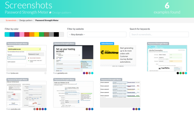
You don’t need to reinvent the wheel to be a great designer. In fact, using existing and common UI patterns can provide immediate benefits to the usability of your product design. Standard UI patterns assist with usability by providing a familiar interface for users which allows them to quickly recognize features and functions. This makes it easier to use an application without having to learn unfamiliar interactions.
The easiest way to identify common patterns is by referring to your own experience, reviewing the websites of well know competitors, or accessing websites such as UI Patterns that contain libraries of patterns that you can search for.
Below shows an example of Password Strength Meter UI Pattern

Conclusion
A great user experience is made up of many smaller incremental components that on their own are not a significant improvement, but the sum of them can make a massive difference.
All the UX design principles listed in this article may not be significant individually but applying multiple principles to your designs will surely see ongoing improvements, ranging from enhanced user satisfaction to increased ROI. This in turn leads to higher conversion rates, and increased customer loyalty.
Ultimately, implementing some or all of these listed UX design principles can ensure that businesses gain a competitive edge, as customer demands and expectations continue to rise.


