With countless websites and apps vying for our attention, providing a seamless and intuitive user experience has never been more critical. Good design is a good business. But how to know if the product you're working on has a good design? One option is to learn from the best. That's why we've compiled a list of the 15 best UX design examples you can learn from to improve your designs.
What makes the UX design good and bad UX design?
Good design focuses on creating a positive and satisfying user experience and helps to increase the chances of having long-term relationships with users. It prioritizes the needs and goals of the user.
The critical characteristics of good UX design
User-centered Design: As the name suggests, this design is centered around the user, offering users value and making it easier for them to interact with a product. Product designers aim to craft an intuitive and easy-to-use interface that enables users to accomplish their goals efficiently and effectively.
Clear and concise communication: Users don't read; they scan. Good UI communicates information at a glance—it offers clear and concise messages and pairs it with visual cues that help users understand and interpret information.
Consistency: Good design is visually and functionally consistent. Consistency helps ensure that users are not confused or disoriented as they navigate through different pages or use different product features.
Personalization: Good design is tailored to the needs of a particular user. The system aligns the content it provides according to the user's preferences and needs.
Feedback and measurement: Good design incorporates feedback mechanisms to evaluate the design's effectiveness and identify improvement areas.
On the other hand, bad UX design is characterized by poor usability and useless features. As Adam Judge said: "The alternative to good design is always bad design. There is no such thing as no design." Poorly designed products can cause frustration and drive users away.
The key characteristics of bad UX design
Half-baked UI design: Unfinished design can be difficult to use. It might have confusing navigation, unintuitive features, and a lack of clear calls to action.
Inconsistency: Incosisny conveys an impression that a product was designed by a lot of different people who work independently. Inconsistent design impacts usability (makes it difficult for users to understand how to use a product) and pleasurability (inconsistent UI doesn’t have a shared visual language that is used to communicate with users).
Confusing communication: The language we use in our product has a direct impact on how users perceive it. Confusing or unclear messaging, such as jargon or complex language, makes it difficult for users to comprehend the information.
Lack of personalization: poorly designed products look very generic; they look like "one-fits-all" solutions. Many times people want to have a tailored experience—an experience that will match their needs.
Lack of feedback and measurement: Bad design does not collect feedback from people who interact with it. Without collecting feedback, it can be hard to assess the design's effectiveness and identify areas that require improvement.
15 best examples of UX design websites and apps
From industry giants like Airbnb and Instagram to lesser-known but equally impressive platforms like Duolingo and Calm, we've handpicked the top brands that have nailed the art of UX design.
1. Airbnb
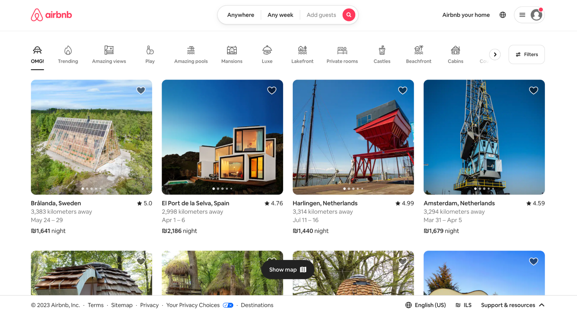
Airbnb, as in “Air Bed and Breakfast,” is a service that lets property owners rent out their spaces to guests. Through the Airbnb platform, hosts can list their properties and provide details such as the type of accommodation, location, availability, and pricing. Guests can then browse through the available listings, view photos and reviews, and make reservations directly through the website or mobile app.

Why it's great: The platform's design is centered around helping users find an accommodation that fits their specific needs. From the search & filter functions that enable users to provide detailed requirements to an interactive map that shows available accommodations in a particular area, the tool allows the customer to go faster from idea to booking.
2. Dropbox
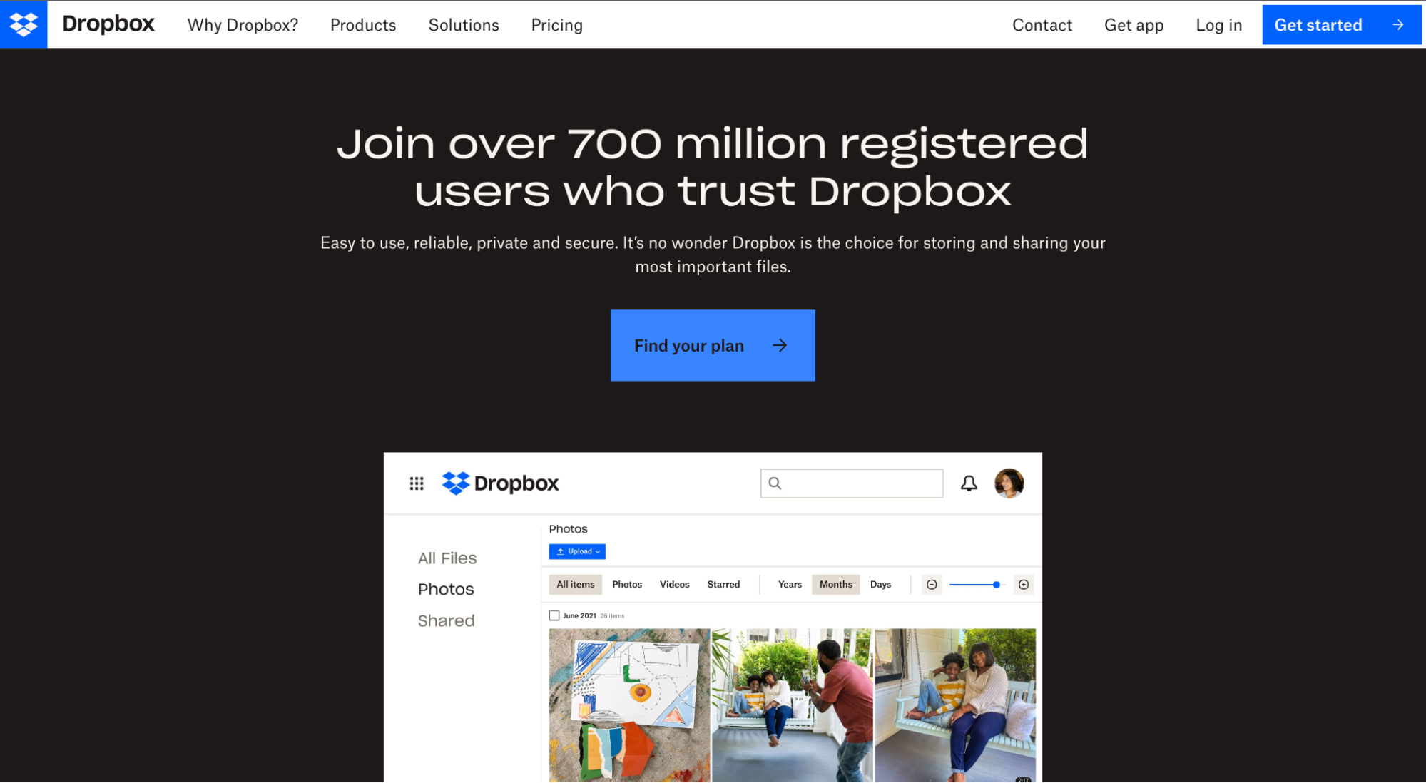
Dropbox is a cloud-based file storage and sharing platform that allows users to store and access files from anywhere, on any device, as long as they have an internet connection. The company offers a variety of services and tools, including cloud storage, file synchronization, file sharing, and collaboration tools.

Why it's great: Ease of use and reliability are two significant advantages of Dropbox. The service offers a simple interface that makes it easy for users to navigate and find what they are looking for. Dropbox follows a minimalist design approach—a clear visual hierarchy of content and functional elements enables users to access their files from any device.
3. Slack
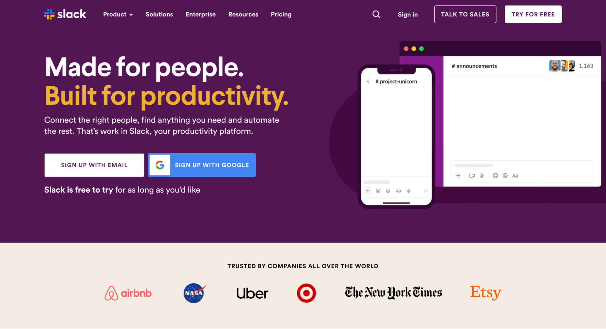
Slack is a cloud-based communication and collaboration platform that enables teams to work together more efficiently and effectively. The platform offers various features and tools designed to streamline communication and improve teamwork, such as messaging, file sharing, video conferencing, and project management tools.

Why it's great: Slack is an excellent example of a user-centered design. The app also offers a range of customization options to suit different user preferences. For example, users can set up notification preferences that align with how they prefer to work. Apart from that, Slack is integrated with many different apps such as Google Workspace, Dropbox, etc., allowing a seamless workflow.
4. Uber
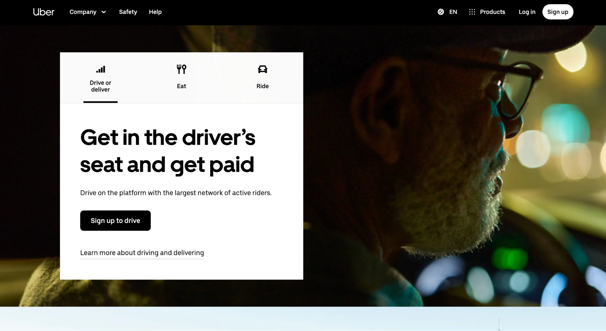
Uber is a ride-sharing and transportation company that provides on-demand transportation services to riders through its mobile app. Essentially, Uber allows people to easily and quickly request a ride from a nearby driver, eliminating the need to hail a taxi or call a car service.

Why it's great: When Uber first arrived on the market, it created a new paradigm—users could book a car without calling a taxi service and track the ride on the screen. The app constantly learns user needs and tries to offer more value. For example, the latest version of the app provides options called Services. Users who access this option see all the services available near them, from e-scooters to cocktails and flowers.
5. Spotify
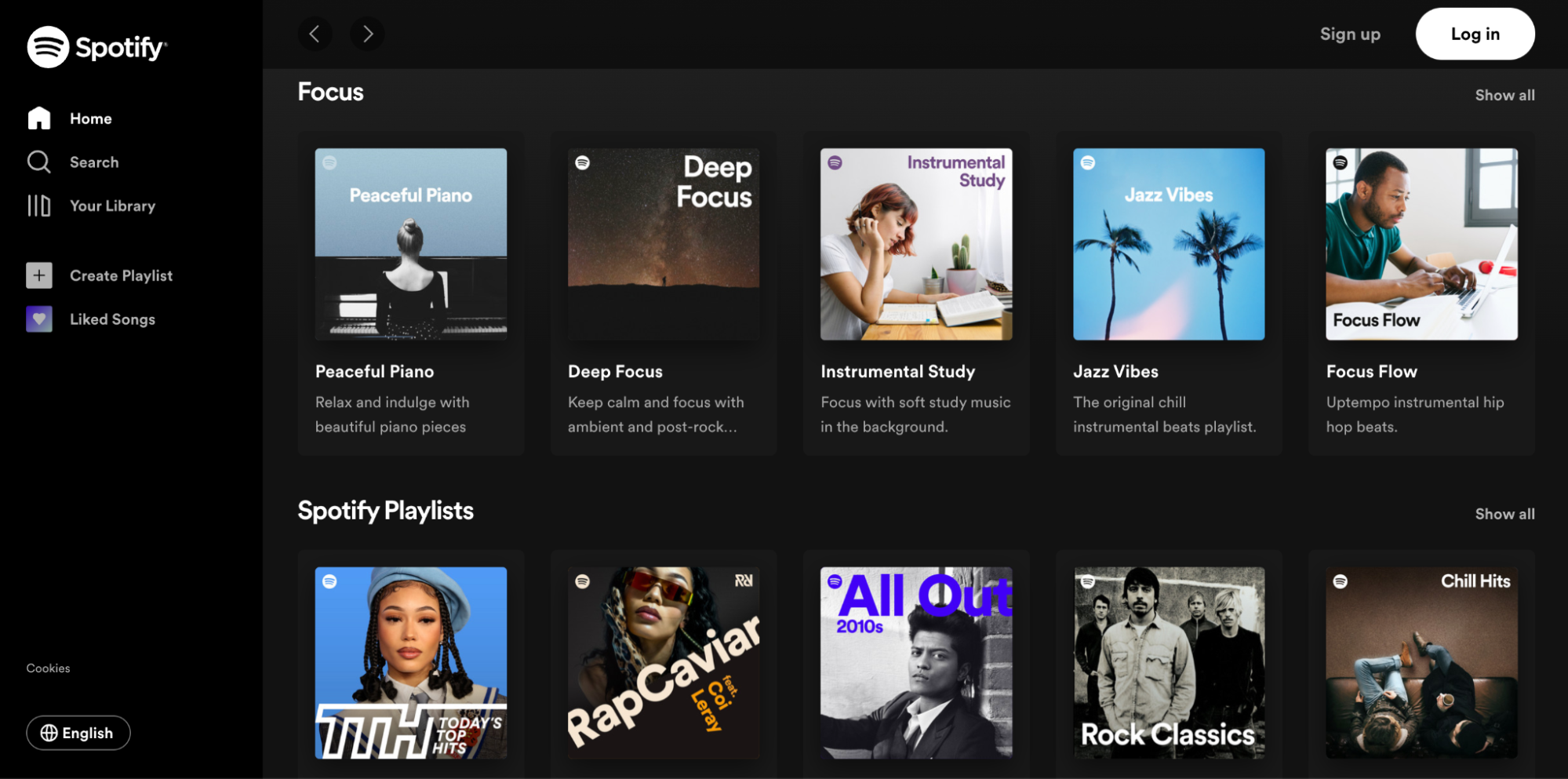
Spotify is a music streaming service that provides users with on-demand access to a vast library of music from various genres and artists around the world. The platform allows users to stream music directly to their devices, including computers, smartphones, and tablets.

Why it's great: Spotify wasn't the first music streaming app on the market, but it was one that embraced the importance of personalized recommendations. The app offers personalized advice and curated playlists, making it easier for users to discover new artists and songs.
6. Instagram
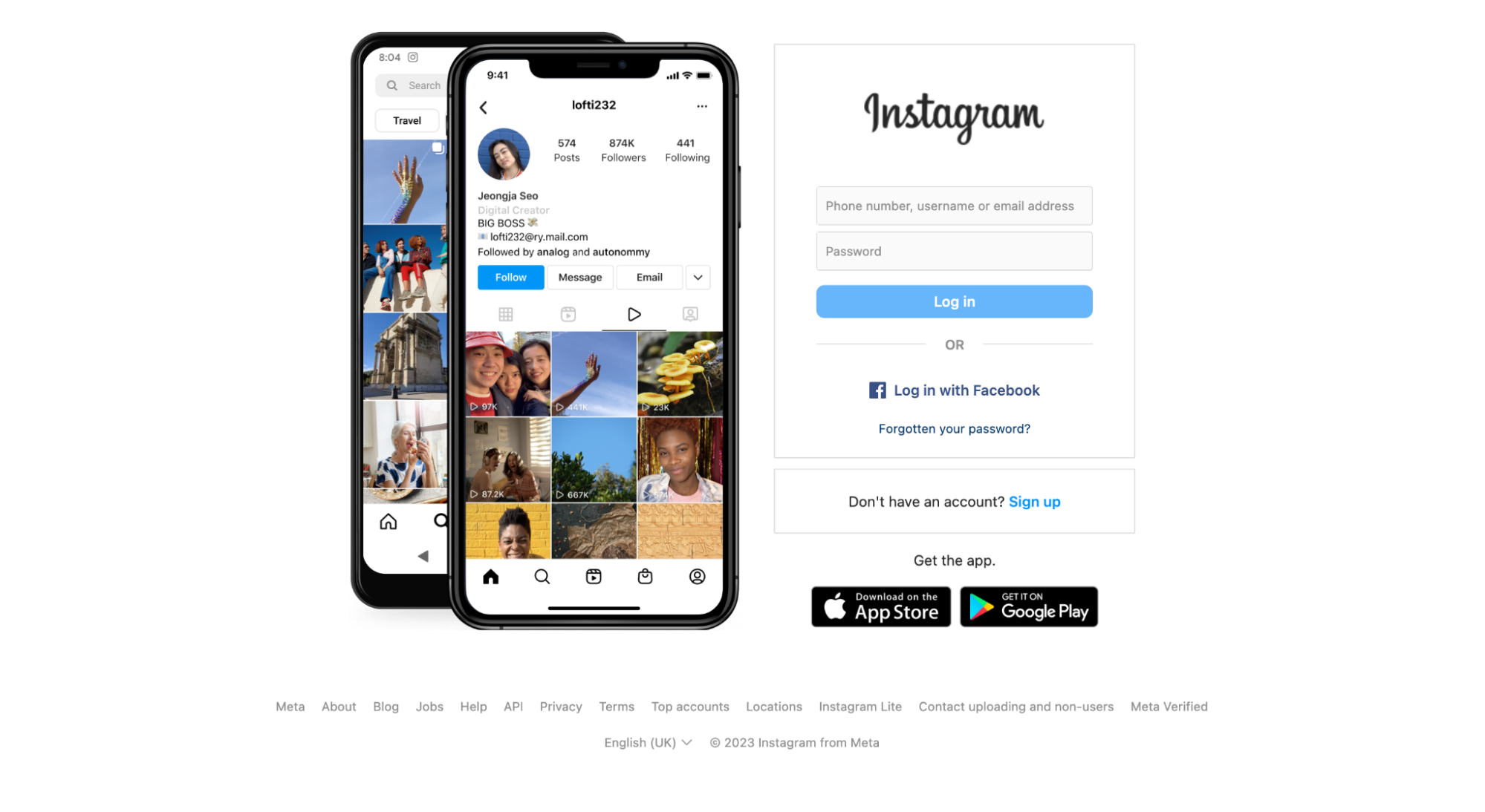
Instagram is a social media platform that allows users to share photos, videos, and stories with their followers. The platform is primarily focused on visual content and is widely used for sharing images and short videos with friends and family.

Why it's great: Instagram has an attractive visual design that makes browsing a pleasant experience. Also, Instagram makes the most of its ranking algorithm—it provides personalized recommendations based on the user's past search history, location, and preferences.
7. Duolingo
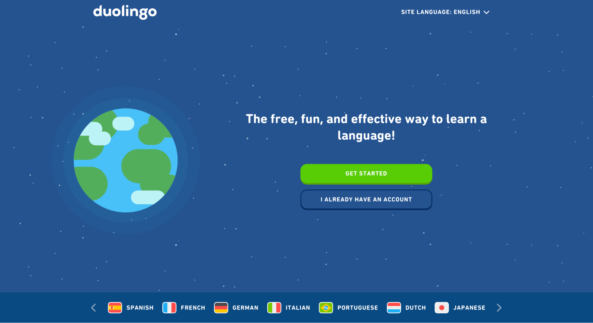
Duolingo is a language-learning platform that offers free online courses to help users learn new languages. It provides bite-sized lessons that take only a few minutes daily and allow everyone to learn a new language.

Why it's great: The app uses gamification techniques (adding game mechanics into nongame environments) to motivate users to learn a new language. Gamification, along with personalized recommendations and real-time feedback, makes the process of learning a new language a fun and exciting exercise.
8. Pinterest
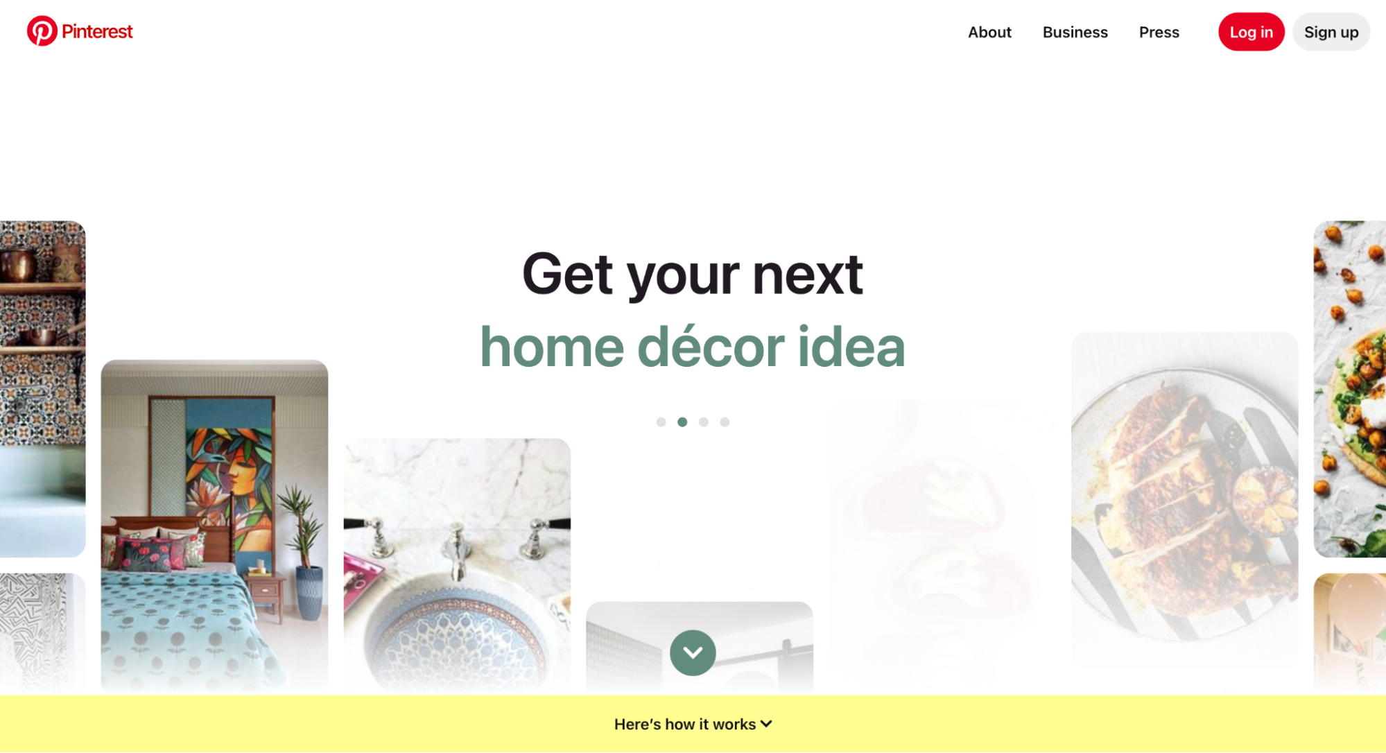
The word "Pinterest" is a combination of two words, "pin" and "interest." Pinterest is a visual discovery and bookmarking platform. The platform allows you to discover recipes, home ideas, style inspiration, and other ideas. In addition to saving and organizing pins, users can also follow other users or boards that align with their interests and hobbies.

Why it's great: The platform is designed to inspire creativity and help users find ideas and inspiration for various projects and interests. Pinterest offers an easy-to-use interface and personalized recommendations that help users discover and save ideas and inspiration
9. Waze
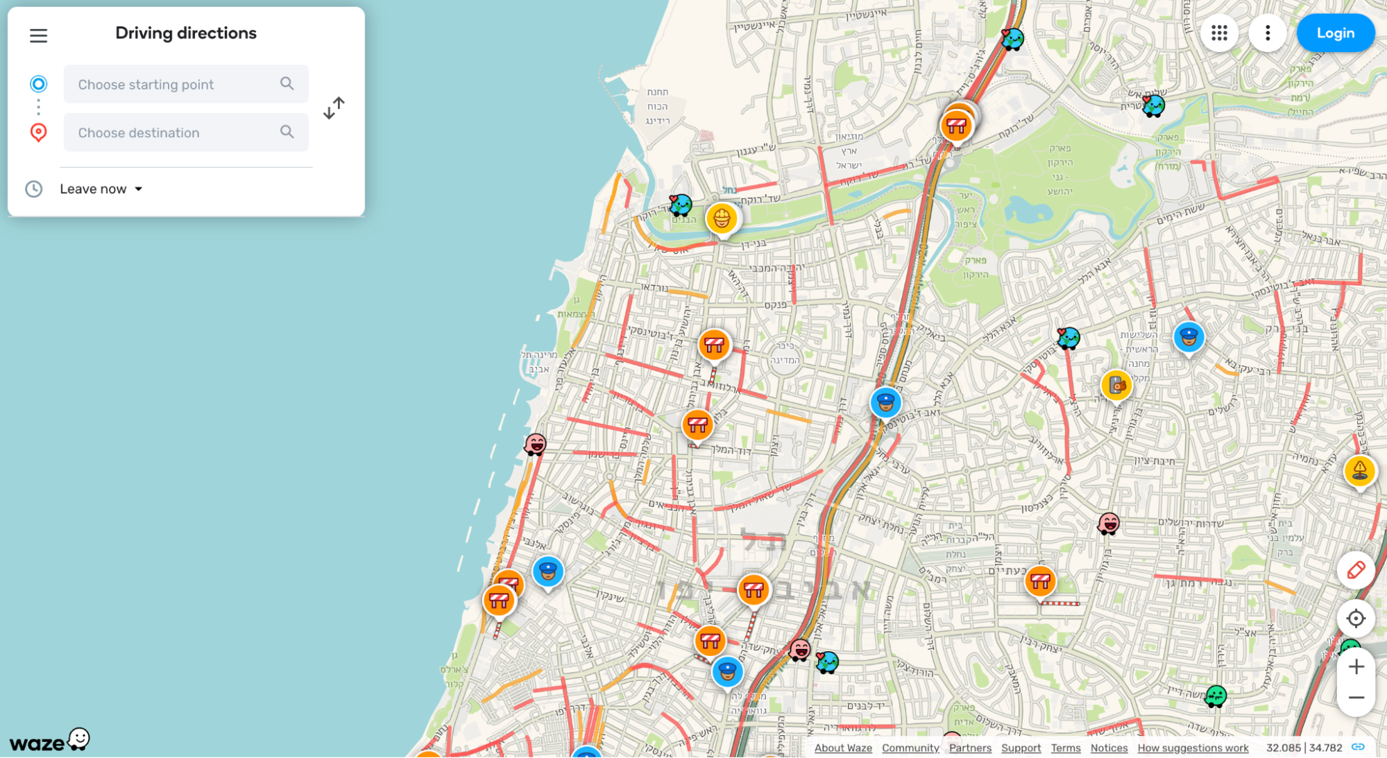
Waze is a navigation app that tracks city traffic and offers real-time updates so drivers can find the fastest and most efficient routes. Because of the social features, Waze offers better routes to avoid traffic jams and potholes.

Why it's great: Waze pairs intuitive design with humorous illustrations, creating the right mood for users. Unlike other navigation apps available on the market, Waze makes the experience more joyful.
10. Asana
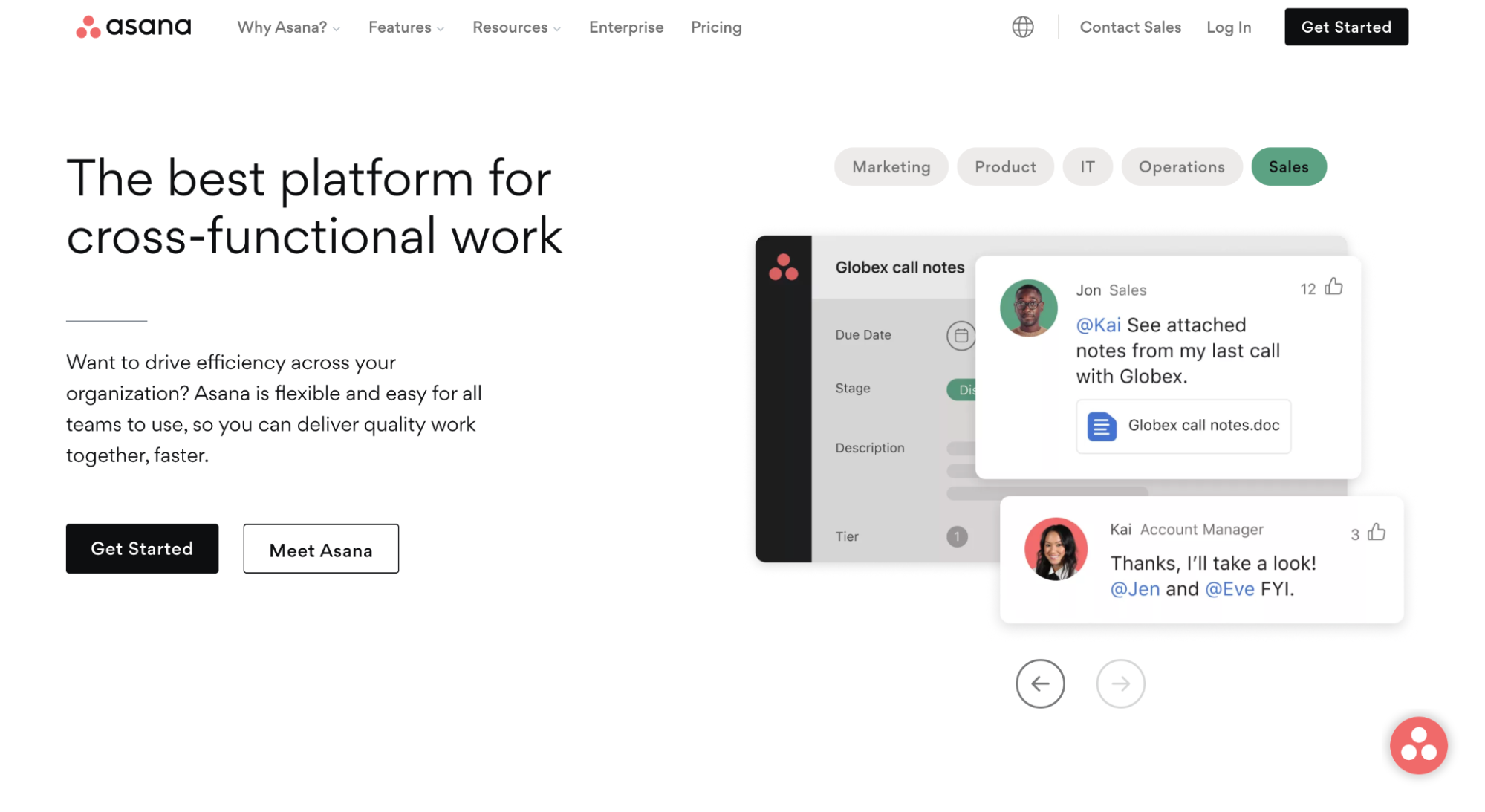
Asana is a web and mobile application that offers a platform for teams to manage projects and collaborate on tasks. The platform is designed to help teams organize their work, track progress, and communicate more effectively.

Why it's great: Asana has a clean and minimalist visual design. Using color coding, familiar icons, and crisp typography helps improve the user experience. Apart from that, Asana supports the user along in the user journey by offering timely updates and congratulating them when they complete essential tasks.
11. Medium
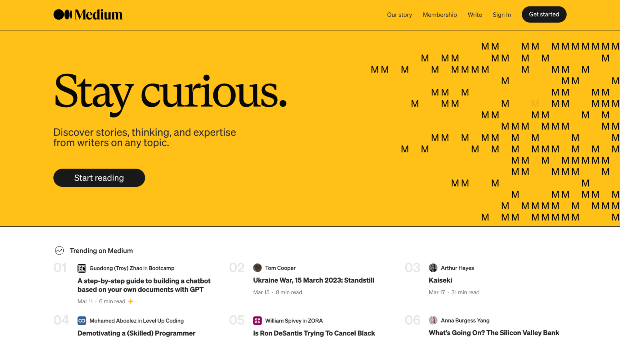
Medium is an online publishing platform that allows individuals and organizations to publish and share articles, essays, and stories with a broader audience. The platform is designed to make it easy for people to share their ideas and insights and to connect with others who share their interests.

Why it's great: Medium offers a minimalistic and distraction-free interface, creating an immersive reading and writing experience for users. Medium trims all secondary elements, such as unnecessary decorative effects, and enables writers and readers to engage with content effectively.
12. Mockplus
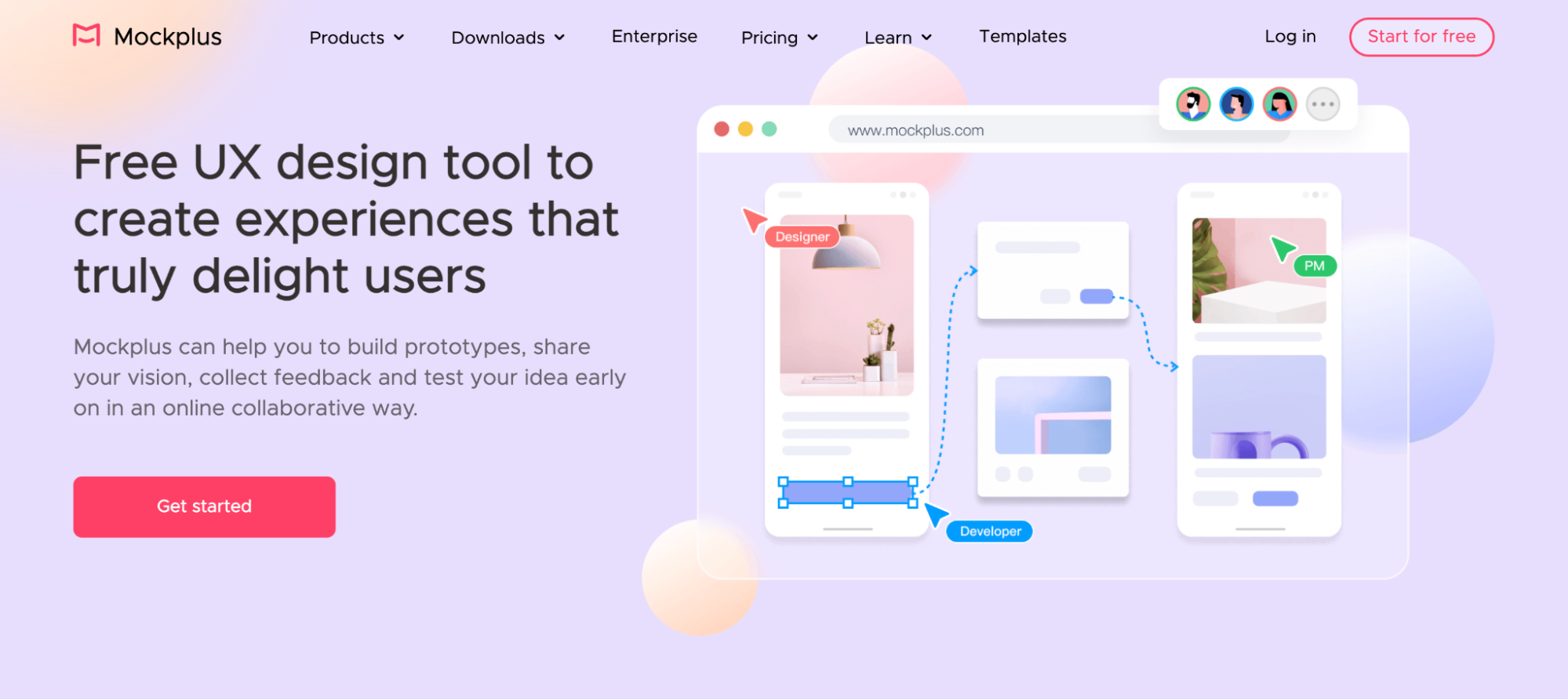
Mockplus is a UX collaborative design tool with an intuitive and user-friendly interface. It allows designers to rely on simple drag-and-drop options to make interactive prototypes and wireframes for mobile apps and websites.

Why it's great: Mockplus offers real-time collaboration features and an extensive library of design assets, making it a popular choice for designers and design teams that want to build a nicely-looking and well-functioning design.
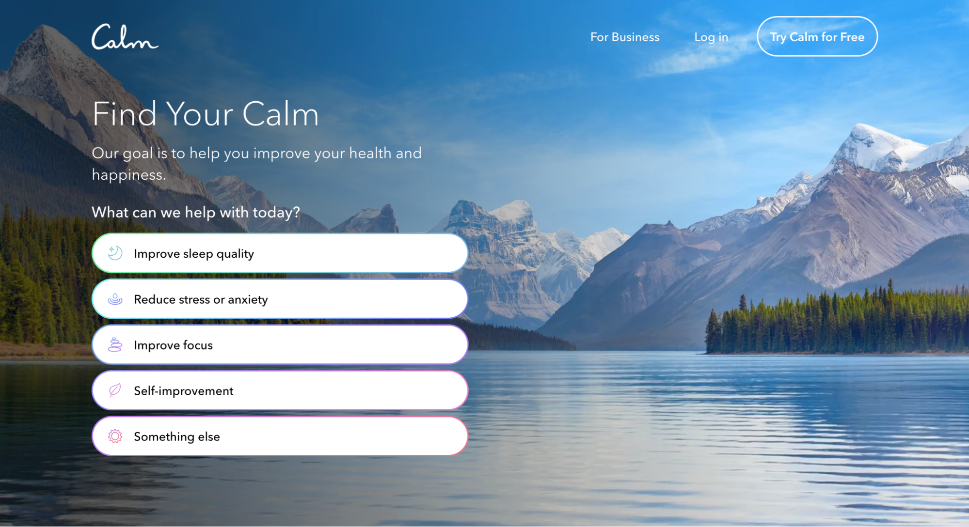
13. Calm
Calm is a mobile application and web platform that provides guided meditation, relaxation, and sleep support. The platform offers a variety of audio and visual resources designed to help users manage stress, anxiety, and insomnia, and to promote mental and emotional wellness.

Why it's great: Calm relies on visual design decisions that help users relax and reduce stress. Blue is used as the primary color for the app. Blue calls to mind feelings of calmness and relaxation. The app relies on fine typography and relaxing audio tracks to calm the user.
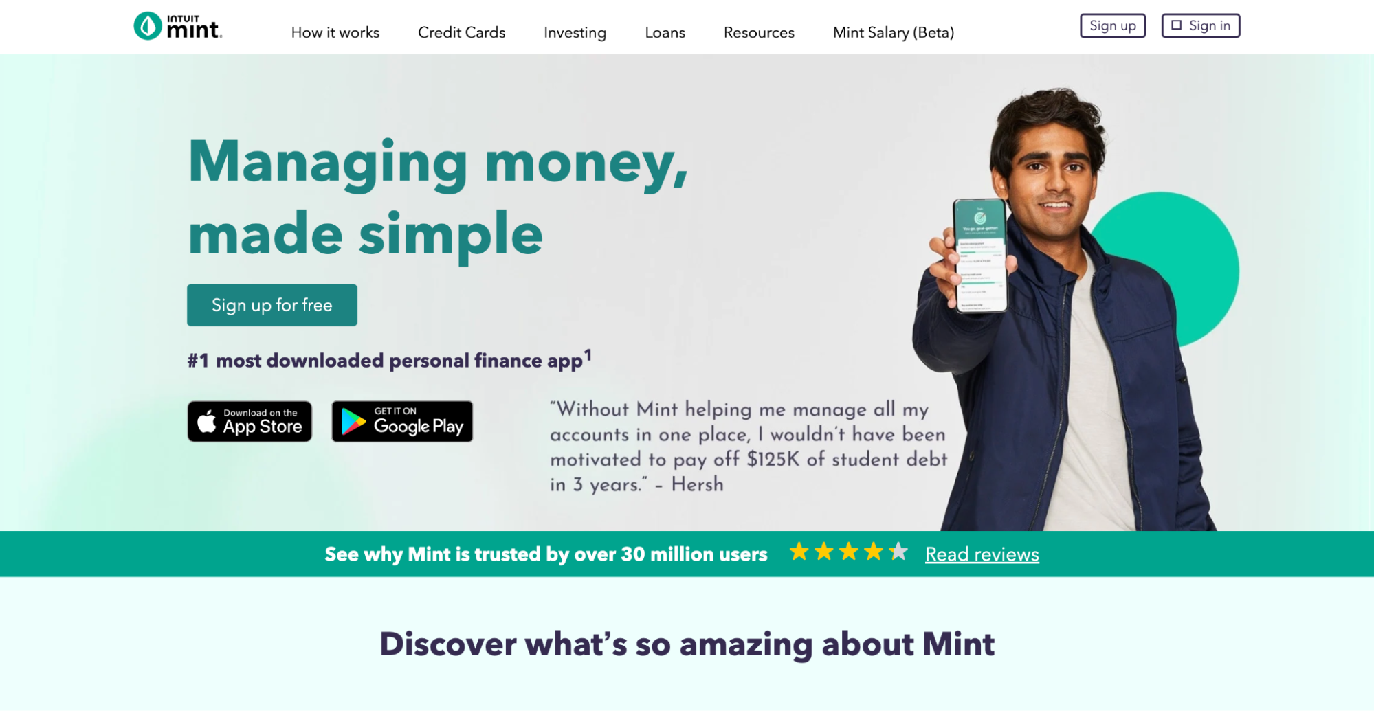
14. Mint.com
Mint.com is a finance service that helps people manage their finances effectively. The platform provides automation features such as automatic expense categorization and bill reminders, allowing users to save time and reduce the likelihood of missed payments.

Why it's great: Mint.com makes the most of both visual and functional design. It uses green as a primary color. Green symbolizes growth, and it creates a positive impact on viewers since they subconsciously feel safe about their money. Regarding functionality, effective data visualization (charts and graphs) that the service uses make financial data more digestible.
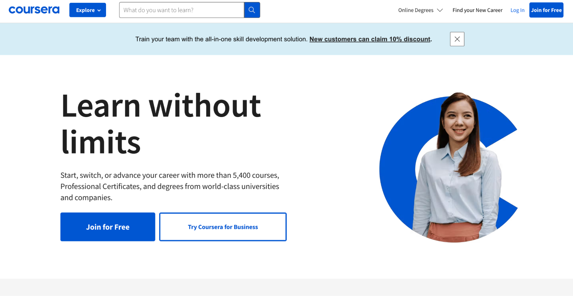
15. Coursera
Coursera is an online learning platform that offers courses, certificates, and degree programs from leading universities and institutions around the world. The platform provides users with access to high-quality educational content in a wide range of fields, including business, technology, data science, and the humanities.

Why it's great: Coursera provides personalized features such as recommended courses and progress tracking, allowing learners to customize their experience according to their learning goals.
Conclusion
A great user experience maximizes the chances that users stay engaged, satisfied, and happy. The 15 best UX design examples discussed in this article demonstrate how businesses can provide their users with an excellent experience. By following these examples, you can take your design to the next level and create more intuitive, user-friendly, and successful digital products. And this will also have a positive impact on your design organization. As Robert L. Peters said, "Design creates culture. Culture shapes values. Values determine the future."


