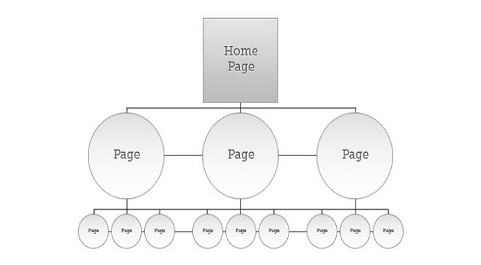
Design navigation menu is the primary hint for the user to know about your site. After all, once the user gets lost, the cool dynamic effect and interesting content will be meaningless. Even if our site has a search function, the search box can not be the only tool for the user to navigate. The navigation menu is one of the main factors to determine the usability of a site, and if visitors can easily find the content they are looking for without effort, they will be more likely to stay on your site instead of closing the page to leave. Effective website navigation menu design can help your site to increase page views, improve user experience, and even increase sales and profits.
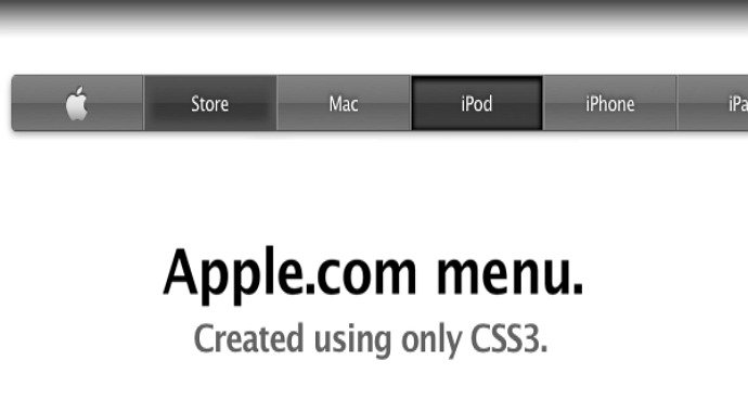
Definition: The navigation menu is a list of the main content or features of the site, usually composed of a set of links or icons, and it looks significantly different in the visual style from other content of the site.
Design an excellent navigation menu is not so difficult, but one should need to grasp the following points:
Tips: here are some wonderful prototyping tools to create an amazing navigation menu and they are worthy to share: Axure, Mockplus, UXPin, Sketch
1. Easy to find
The user can find the navigation menu easily and quickly. The navigation text can’t share the same color, font, and size with your content and should be prominent and conspicuous. What’s more, the navigation area needs to maintain the certain size, and it should be placed at the top of the page or the left side (commonly used area).
2. Easy to operate
Menu options should be large enough to facilitate clicks. If the navigation menu options are too small or too close to each other, it will cause great trouble to mobile users; Users don’t want to consider how to operate it, if they do, then you have lost them! Stop letting the user click on a small inverted triangle to open the secondary menu because they can’t find it easily.
3. Clickable
Make sure all elements of the navigation are clickable. When using multiple categorized directories in navigation, all elements should be clickable links. Even if you use the drop-down menu, do not think this is a ridiculous, I often find some of the site navigation unclickable.
4. Consistency
Consistency is the most important principles in navigation menu design. If your site has different mode of the navigation menu, users might think themselves on another site rather than your site. Be sure to use the same navigation mode so that users can easily access your site without losing it.
5. Clearly
Your menu text must be clear, short, descriptive and focused. Using simple and straightforward terms, do not let the user think about what is the text means or it will cause a bad user experience.

6. Keep it simple
You can add more items to the vertical navigation, but can’t have too many items in the main menu, or it will distract the user's attention. Generally, don’t go beyond the limit of more than 8 items.
7. Style
Minimalism is still the trend of web design, a unique visual style will make your menu look cool, but make sure it matches the overall design style of the entire site.

8. Accessibility
Website accessibility is always an important principle for measuring the quality of a website. Please make sure you are friendly to people with disabilities. If you want to use a lot of cool CSS technology, please consider compatibility with screen reading technology.
9. Solve the navigation problem, provide a good user experience
If the user can not access your website, even good content will be worthless. Well, they may find and visit it eventually, but if they can not find the content easily or overwhelmed by unnecessary choices, users will become frustrated or give up and leave the site.
Understanding how to design a website properly will help solve the site's navigation problem to give users a better experience, so that more users can read and share the contents of your site, happy user, happy you.
Follow the checklist below to provide a good user experience website:
1. Easy to find the navigation menu on the page
2. Only need to use the mouse hover or the mouse click to operate the entire navigation menu
3. Each menu item can be clicked and run normally
4. Navigation text should be short and clear
5. Provide only one navigation menu style
6. When the mouse is moved to the corresponding menu item, it highlights the corresponding item
7. There are no more than 8 navigation menu items
8. Navigation menu items have to been sorted by importance
9. The style of navigation and the overall style of the site should be consistent
10. The navigation menu item can be correctly recognized by the screen reader
We will show you 6 excellent navigation menu websites with a different style for your inspiration.
Tips: You can click on the following navigation menu one by one to see how they are working on the browser.

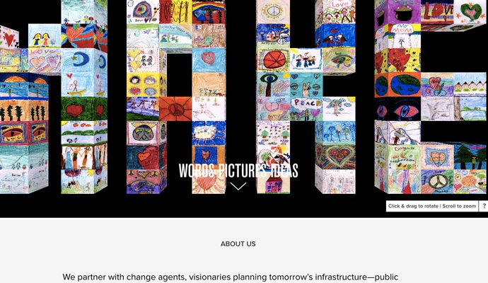
Words Pictures Ideas

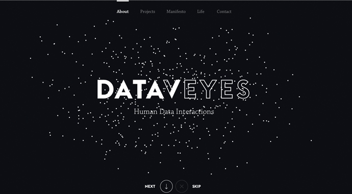
Dataveyes

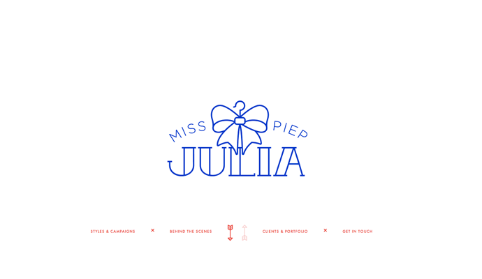
Miss Julia Piep

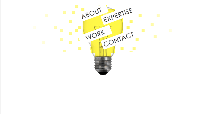
Pervasive Light

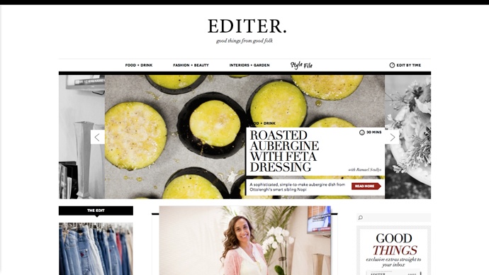
Editer

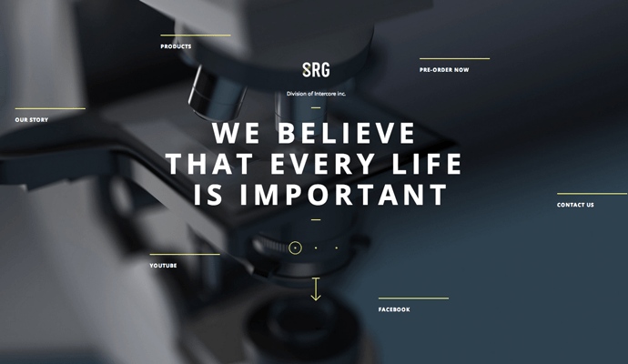
SRG
Conclusion:
Above are the principless on website navigation menu design to improve your webiste user experience. Hope all of you can gain something from this post.
Free prototyping tool for web and mobile app design
Get Started for Free
Free prototyping tool for web and mobile app design
Get Started for Free
Free prototyping tool for web and mobile app design
Get Started for Free


