The rapid development of web technology not only enables designs and products to meet more refined and intricate demands of end users but also allows designers to express themselves in a more nuanced and distinctive manner. Today's web design trends are no longer confined to singular techniques. From the selection of colors, text layout, overall interface design to the presentation of user experience, they serve as reflections and externalizations of the current culture and the trajectory of the era.
Understanding the trends in web design is crucial for designers and developers. Only in this way can they stay close to the latest fashion and ignite inspiration to create products that better align with user expectations and maintain competitiveness in the dynamic market.
Here we choose 15 web design trends that signify emerging directions that are quietly gaining popularity. Also, we picked some frequently asked questions you might encounter with. Hopefully, it will provide you with further insights and rich inspiration in web design practice. Let's dive into it.
15 Web Design Trends in 2024
Apparently, it is difficult to make precise predictions about the top web design trends for 2024, as it is constantly evolving, and also new technologies and design approaches are always emerging. However, here are a few potential trends that are quietly gaining popularity.
1.Minimalism
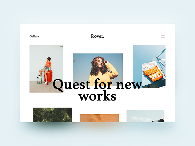
While design trends can evolve and change over time, rooted in the design principle of “less is more”, minimalism has indeed demonstrated a remarkable level of endurance and timelessness. Minimalism puts the primary focus on the content rather than on unnecessary design elements. By avoiding trends and excessive ornamentation, minimalist websites can avoid looking outdated as design trends evolve. But in essence, minimalism is not just an aesthetic choice but also a strategic approach that prioritizes user-centric design. With less nonrotations and intuitive navigation, users can effortlessly find what they are looking for, leading to increased engagement. Additionally, the simplicity of minimalist design can also help reduce the amount of data that needs to be downloaded, making it faster to load on mobile devices.
2.Retro and Nostalgic Design
Retro web design, featuring its nostalgic charm and vintage aesthetics, has seen a resurgence in popularity in recent years and it's very likely be a compelling design trend in 2024.
In an increasingly digital and fast-paced world, users often long for a connection to the past. It's where retro design comes to play. With its ability to evoke emotions, stand out from modern designs, and create a sense of playfulness, retro web design offers a delightful user experience.
-4.png)
3.Interactive Elements
There is a saying goes that getting users' attention is getting them convert. With interactive elements, users are encouraged to engage and interact with the website in order to explore more, which effectively deal with the user's short attention span and get them interested and more engaged with your content.
You can find examples of the best interactive websites having elements like eye-catching animation, videos, audio, or even some gamification features such as quizzes, polls, or challenges. But it's important to strike a balance and ensure that interactive features serve a purpose and contribute to the overall usability of the website.
4.Neon Glows
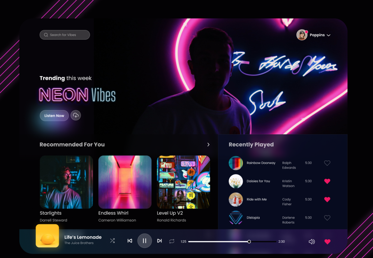
Neon glows in web design uses bright, vibrant, and often fluorescent colors, mimicking the appearance of neon lights. These colors often stand out against dark backgrounds to enhance the glowing effect. This style draws inspiration from science fiction, computer games and technology, creating a futuristic look and a sense of innovation. This is why it’s often employed in websites related to technology, gaming, entertainment, or any industry aiming for a cutting-edge and modern image.
5.Light/Dark Mode Toggle
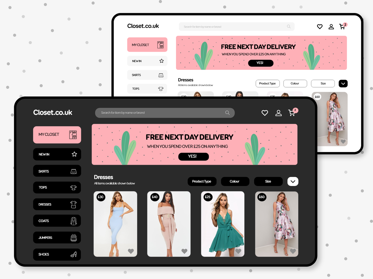
Most users have a distinct preference to use dark or light mode. Today most phones and tablets have the option for users to switch to a dark, rather than the standard light default color scheme. Implementing a light/dark mode toggle in web design also has become a popular trend due to its ability to enhance user experience and accommodate varying user preferences. But light and dark mode toggle is not just switching from black to white or vice versa. The design scheme should contain palettes for both modes.
6.Video-First Web Design
Video is a highly engaging and versatile medium that can effectively convey information, evoke emotions, and leave a lasting impression on website visitors. In video-first web design, video content takes center stage as the primary and predominant element in the overall design and user experience of a website. This design philosophy places a strong emphasis on leveraging video to communicate messages, tell stories, and engage users in a dynamic and visually compelling manner.
7.Vibrant Gradients
Vibrant gradients in web design involve the use of dynamic color transitions, often blending multiple hues to create visually striking and energetic backgrounds, elements, or overall themes on a website. Gradients add depth, dimension, and a sense of vibrancy to the design. Whether used in backgrounds, buttons, or other design elements, vibrant gradients contribute to a modern and dynamic digital aesthetic.
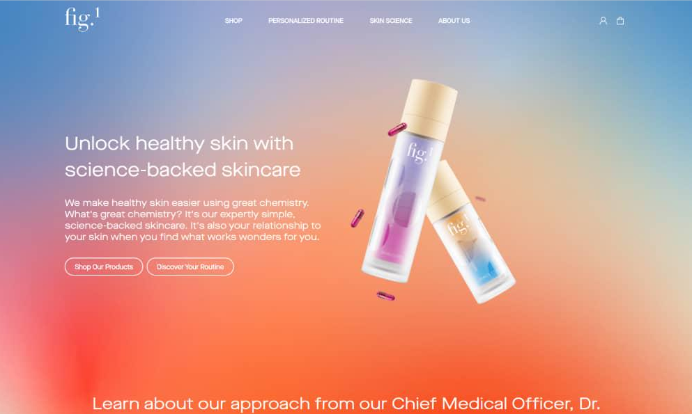
8.Handmade Illustrations
Handmade Illustrations go beyond stock graphics, offering a distinct visual identity that aligns with a brand's personality, values, and messaging. By investing in handmade and custom illustrations, websites can communicate their unique identity, tell compelling stories, and establish a lasting visual impression. The other reason why handmade illustrations are likely to be a design trend in 2024 is that they can be quite versatile. The visuals can work with different themes, layouts, and elements and play a huge role in establish a lasting visual impression.
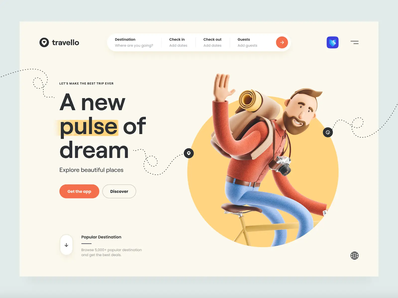
9.Typography-Driven Design
Don’t have the perfect image or video? You can use only beautiful typography. Typography-Driven Design places a strong emphasis on the use of typography as the primary visual element on a website. When executed with creativity and precision, it can result in visually striking and memorable websites that prioritize content and storytelling through the art of typography.
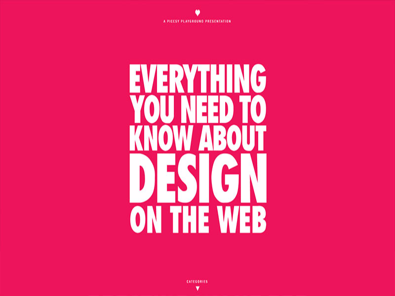
10.Neomorphic Design
Neumorphisim is the name given to a recent design trend where Skeumorphisim is combined with flat and minimalism. It creates a soft, three-dimensional appearance by using subtle shadows and highlights to mimic the look of real-world objects. It represents a departure from the starkness of flat design while maintaining a clean and modern aesthetic.
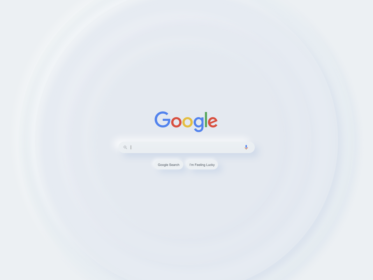 11.Anti-design Web Design
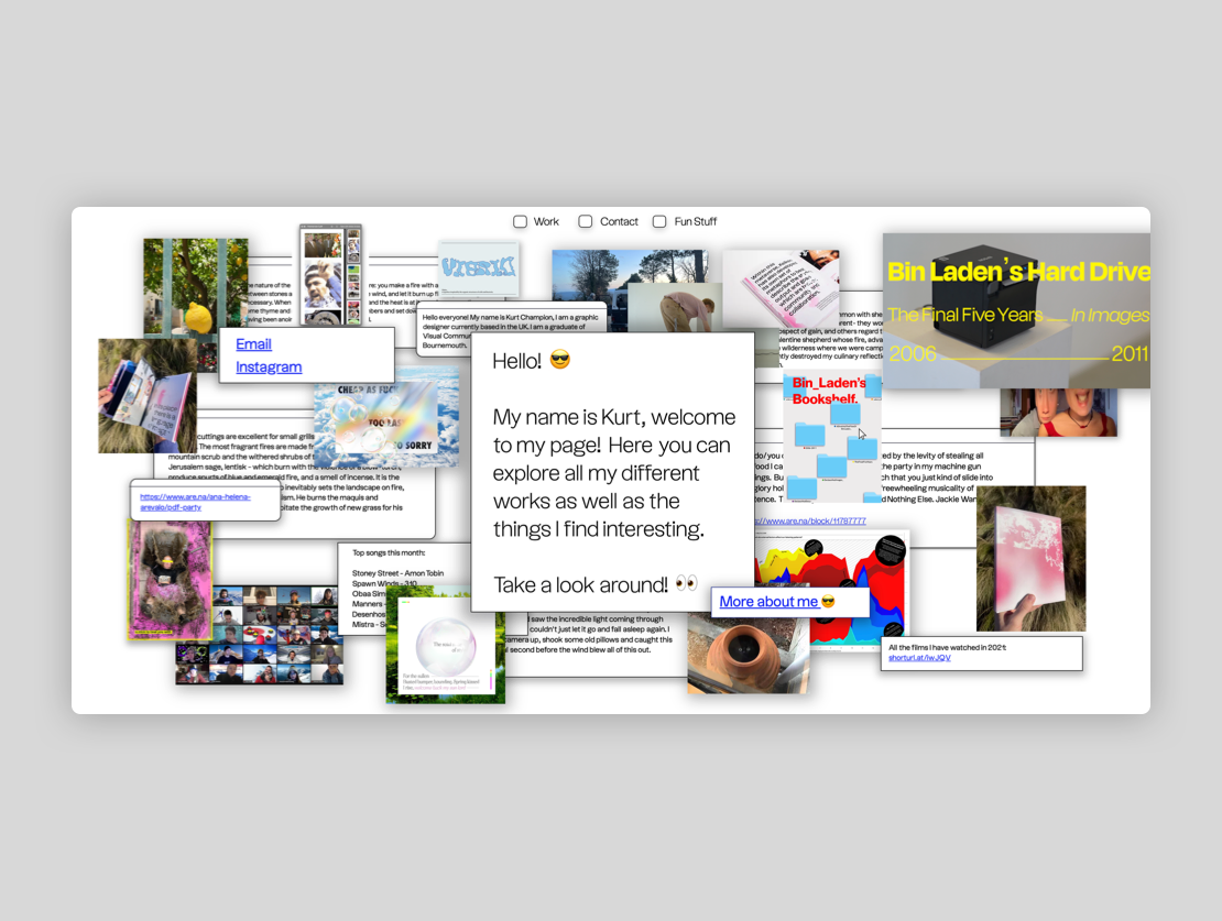
In this era of information explosion, attention is the most valuable commodity. Being special can be crucial for standing out from competitor. Anti-design web design is a deliberate departure from traditional design principles and aesthetics. It's a rebellious and unconventional approach that challenges established norms and intentionally disrupts user expectations. It often embraces irregular and asymmetrical layouts, deviating from the structured and grid-based designs commonly associated with traditional web design.
12.Shapes and Clear Boarders
Using shapes and clear borders in web design can create a structured and visually appealing layout. It allows you to define content areas, highlight important elements, and add a sense of order to the overall interface.
13.Overlapping and Collaged Elements
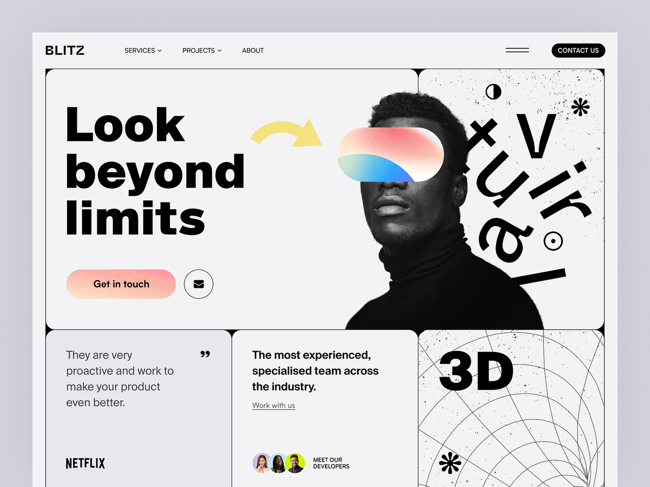
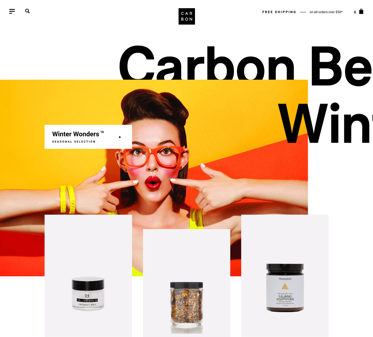
When an element flows outside its expected boundaries, we notice. The design elements don't have to be placed side by side. They can also overlap. The use of overlapping design elements is a contemporary and dynamic trend in web design that involves layering visual elements on top of one another, creating depth, dimension, and a sense of movement. It adds visual interest and complexity to the layout to engage users and makes the design more visually appealing.
14.Modern Split Screens
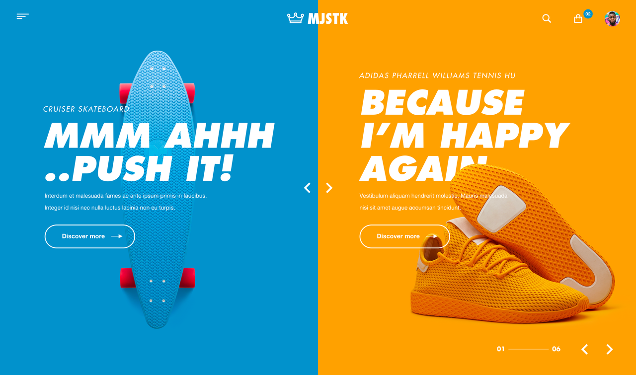
Modern split screens are a web design trend that involves dividing the screen into two or more distinct sections, each showcasing different content or functionality. It enables dual focus, allowing designers to highlight two key elements or messages simultaneously. This can be effective for showcasing contrasting content or creating a visual balance.
15.Micro-Animations
Creating focus is one of the most important reasons to use micro-animations. From tiny images popping up on the screen to moving text elements, micro-animations (rooted from brutalism) bring a sense of dynamism to the interface. By drawing the user's attention to a specific area, it helps clearly convey information.
FAQs:
1.What 5 characteristics should a good website include in 2024?
A good website has many features that collectively contribute to a website's effectiveness. Here are 5 key characteristics a good website should include:
The user's experience is the most important thing for any website. It is a fundamental aspect of web design that directly impacts the overall success of a website. Good navigation contributes to increased engagement, conversion rates, and overall satisfaction.
Moreover, search engine algorithms consider factors such as bounce rates and time spent on a site when determining rankings. When users can effortlessly find the information they are looking for or navigate through your site without frustration, they are more likely to stay longer, engage with your content, and return in the future. Therefore, easy navigation can also positively impact your site's SEO performance.
With the rapid evolving digital world, those days of desktop dominance has long bid its farewell. In today's digital landscape, due to the prevalence of mobile device usage, the majority of users access the internet through mobile devices. That's why a good mobile-first design strategy isn't just a trend but also a strategic necessity.
The key to mobile-first design is implementing responsive design, which dynamically adjusts their layout and content based on the user's screen size, providing a consistent and optimal experience across various devices. By prioritizing mobile users ensures that your website remains relevant, accessible, and competitive in this increasingly mobile-centric world.
Like mobile-first design, faster loading speeds are also crucial for user satisfaction and SEO (search engine optimization), as search engines favor websites with quick load times.
Actually, most users can only tolerate webpage loading for a few seconds. If it exceeds their patience threshold, they will unhesitatingly close your webpage. Moreover, page loading time is another important criterion for ranking web pages in their search results. A fast website can increase search engine rankings.
In a world where time is precious and the online realm moves swiftly, you often have mere seconds to seize the attention of users to your website. Many users swiftly scan a site before reading the content more thoroughly. This is where immersive visuals come to play. As we know, images and video are more engaging than cluttered text and are a must-have website feature. They can help create a more immersive visual experience. By using those immersive visuals, your website can immediately capture the user's attention and create a memorable first impression. This visual appeal encourages visitors to stay on the site, explore further, and engage with the content.
Business is business. You build your website to achieve some goals, whether it's guiding users to make a purchase, signing up for a newsletter, or contacting your business. Well-defined CTAs provide a roadmap for user interaction. Having a strong and clear call to action is how you tell users what to do next. Letting the user know exactly what action you want them to take minimizes confusion and increases conversions. Each content page should have a clear CTA because you want to keep users on your website.
But meanwhile, you should also be cautious of the strategy of using CTAs. Too many CTAs on one page can be overwhelming and might also cause confusion for users.
2.What web design tools should designers use in 2024?
1.Mockplus RP - A Powerful Web Design Tool
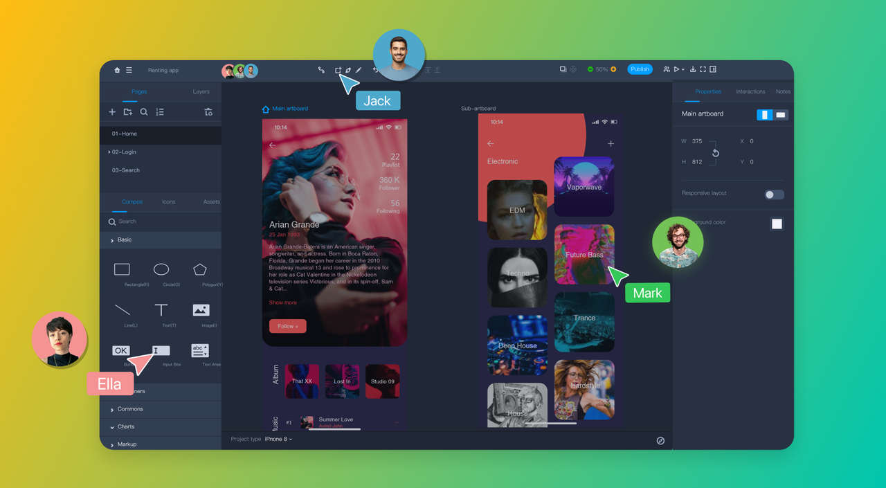
Mocker RP is a free but professional online web design tool with rapid prototyping capabilities, powerful interaction design features, and efficient team collaboration capabilities. You can create all levels of visual designs in Mockplus, from sketches, wireframes to interactive prototypes that work like an end product.
Key Features
Simplicity - No learning curve with intuitive interface.
Professionalism - Build realistic prototypes with advanced interactions and animations.
Compatibility - Import Axure files for further editing.
Efficiency - Get a headstart with ready-made templates, icons and components.
Reusability - Drive consistency and reduce rework with reusable libraries.
Testability - Preview & test out your prototypes on real devices, without code.
Seamless Collaboration - multiple users work together in real-time
2.Axure - A Prototyping Software
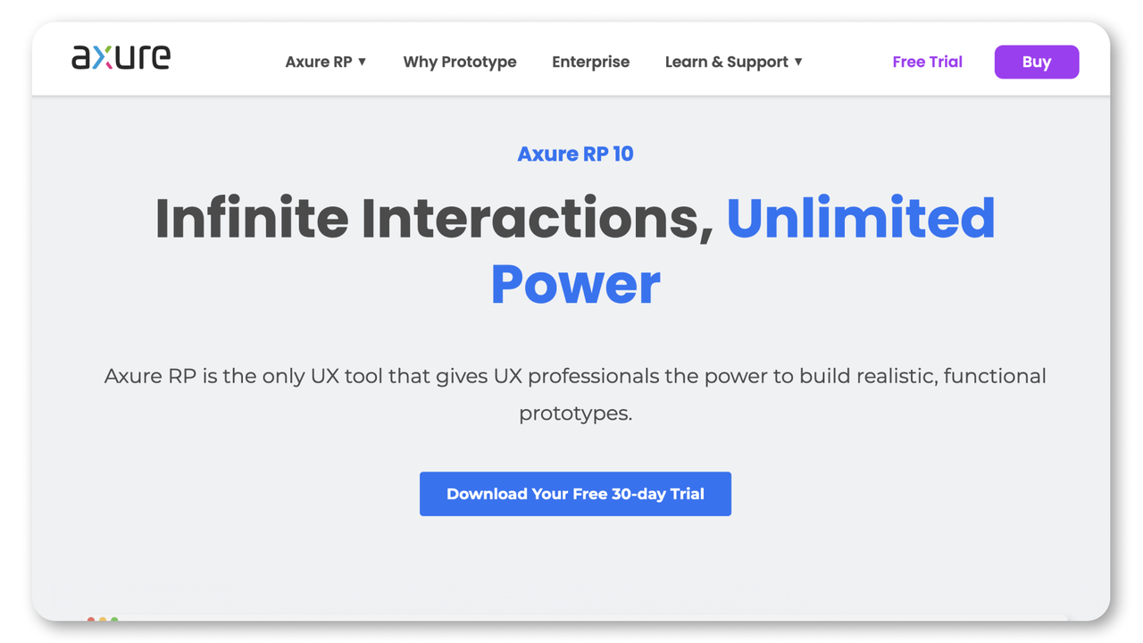
Axure RP is a prototyping software founded in 2002. Having undergone numerous iterations over the years, it boasts comprehensive functionality and a diverse range of interactive styles. It can handle virtually any interaction you can think of. However, due to its professional and extensive software architecture, it comes with a steeper learning curve, requiring a considerable amount of time for mastery.
Key Features
Powerful Interaction Design Capability - It supports various trigger, states and animation effects, enabling the realization of a wide array of complex interactive effects.
Built-in Component Library - It Integrates common UI elements and interaction patterns, allowing for quick drag-and-drop usage.
Extensibility - Supports integration with plugins and scripts, providing flexibility for customization and expansion.
3.Sketch - A Vector Graphics Design Software
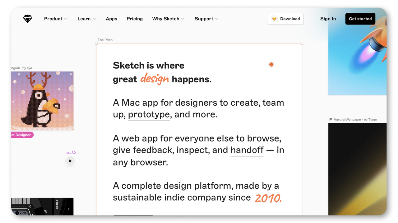
Sketch, a vector graphics editor, is one of the oldest designer platforms, developed by the Dutch company Bohemian Coding. It's commonly employed for interface, web, and vector illustration design. It also serves as an effective prototype design tool, facilitating the creation of wireframes and prototypes. However, its primary drawback lies in its exclusive compatibility with the macOS, which may pose challenges for larger design teams.
Key Features
Vector Editing: Sketch excels at vector editing, making it simple for designers to produce accurate and scalable designs.
Plugins and Libraries: The design community has produced many plugins and UI kits for Sketch, increasing its capabilities and offering enormous resources.
Exporting Assets: Sketch makes it easier for developers to export design assets by creating a variety of formats and resolutions in a matter of clicks.
Available offline: Sketch's offline feature offers designers freedom and convenience who prefer an independently operated design tool without an online connection.
4.Figma - A Online Design Platform
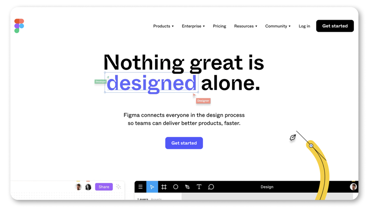
Figma is a popular design platform. Known for its collaborative capabilities, figma allows designers to work together in real time, making it an excellent choice for team projects. But it has a steeper learning curve. Beginners or users switching from other design tools may need more time to understand Figma's advanced functions and capability.
Key Features
Real-time collaboration: Figma allows multiple designers to work on a particular project simultaneously, promoting seamless teamwork.
Compatible Platforms: It is a browser-based application,you can use if whether your system is windows, macOS or other systems. For a more natural experience, it also provides dedicated desktop apps.
Version History: Version history in Figma enables designers to track and manage design changes, making it simple to make adjustments and roll back as necessary.
Developer Handoff: In Figma, handing off the design assets and specifications from designers to developers enables developers to extract crucial information and work productively together on implementing the design.
5.Adobe XD - A Graphics Design Software
Adobe XD is a design tool, offering a smooth user experience and powerful prototyping features. Thanks to its seamless integration with other Adobe Creative Cloud apps, Adobe XD is a go-to tool for many designers. If you're already familiar with Adobe's suite of products, you'll feel right at home with XD. But Adobe XD's pricing can be steep, especially for individual users or small design teams.
Key features:
Effortless Integration with Adobe Products: Designers can streamline their workflows and use the same materials in several applications thanks to Adobe XD's seamless integration with other Adobe products like Photoshop and Illustrator.
Auto-Animate: The auto-animate function in XD makes it simple for designers to make animated and interactive transitions between artboards, improving the user experience. Without using any code or additional tools, designers can create complex animations and interactions with auto-animate.
Plugins: XD provides various plugins such as UnDraw, PhotoSplash 2, Mockplus iDoc, Color Ranger Pro 2, and UI kits that enhance functionality and add more design options.
.png)
6.UXPin - A Online Prototyping Tool
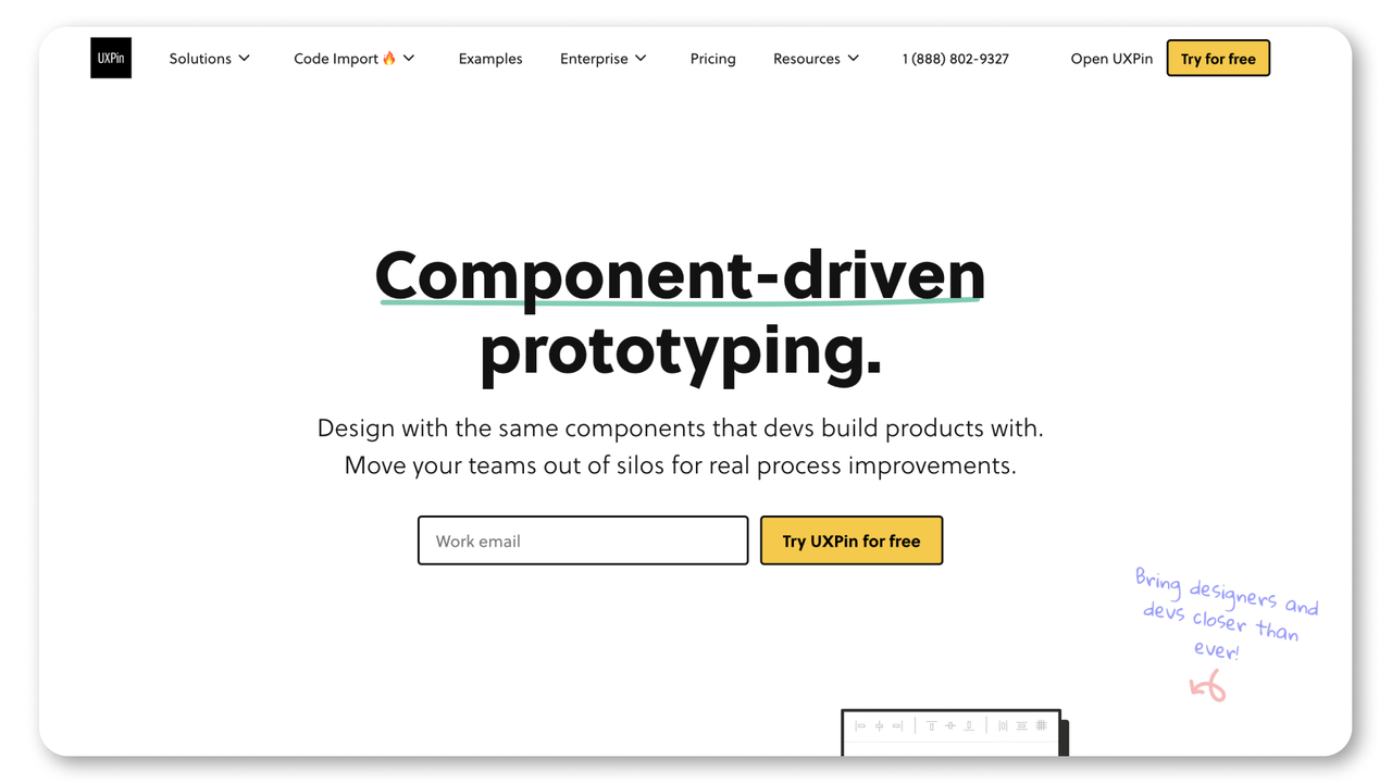
UXPin is a comprehensive online prototyping tool that seamlessly integrates prototyping, UI design, interaction design. However, due to its feature-rich nature, it requires a certain amount of time to get accustomed to it.
Key Features
Complete Design Workflow - UXPin offers a complete design workflow, allowing users to execute the entire process from prototype design to user testing in a single tool.
Diverse Interaction Effects - In addition to common element and state changes, page transitions, and display/hide effects, UXPin supports advanced operations such as API requests, providing a wide range of interactive possibilities.
Import of Sketch and Photoshop Files - Supports the import of Sketch and Photoshop files, facilitating a smooth transition for users who are already accustomed to these design tools.
Abundant Component Library Resources: UXPin provides a wealth of resources in its component library, enhancing the availability of design elements for users.

3.How can I optimize my website for 2024?
It's difficult to set a golden rule for all businesses which might stay at different stages of development. But when thinking about optimizing your website in 2024, here are some key strategies all businesses should take into consideration:
Prioritize user experience - As we mentioned, the user's experience is the most important thing for any website. It is a fundamental aspect of web design that directly impacts the overall success of a website. You can do things like simplifying navigation, mobile optimization, optimizing page loading time and more to improve overall user experience.
Align with current trends - In the dynamic realm of web design, the journey is ongoing. You should embrace emerging technologies and trends such as the design trends we mentioned above or voice search optimization, AI for personalization, and interactive content. And you should also regularly update and secure your website, and apply analytics for data-driven decision-making.
SEO - Traffic is king in the competitive digital world. Attracting a substantial and relevant audience to your website is a fundamental key to online success. You should always stay updated on search engine algorithms and optimize your website for relevant keywords to improve your search engine rankings.
Conclusion
Apparently, an engaging and well-designed website makes an instant positive impression on customers, improves the overall user experience, and increases engagement. As the design landscape continues to evolve, it is crucial to stay informed about emerging design methodologies and technologies. By keeping up with those design trends and tailor them to your unique business identity, you will not only meet the expectations of your audience but also contribute to increased engagement and potential business growth.
Free prototyping tool for web and mobile app design
Get Started for Free
Free prototyping tool for web and mobile app design
Get Started for Free
Free prototyping tool for web and mobile app design
Get Started for Free


-4.png)


 11.Anti-design Web Design


.png)
