In the word of software development, time is the most precious resource. Product creators constantly try to reduce time-to-market without sacrificing the quality of a product. When it comes to saving time, designers strive to use artifacts that can convey the essential information in the most economical way.
Among many different design artifacts, there’s one that is known as a primary communication tool between designers and developers. Designers use this artifact to connect the ideas they have in their head to the specific design decisions that later will be implemented by developers. This artifact is called a wireframe.
From this article, you’ll know what a wireframe exactly is and what are the best ways to create it.
What is a wireframe ?
Before we dive into details on how to sketch wireframes, it’s important to define what wireframe really is. Wireframe is a visual representation of an interface using only simple shapes - boxes, circles, lines, and arrows. Designers use wireframes to communicate information hierarchy and structure of content.
Wireframes and prototypes
Many designers confuse wireframes with prototypes. Wireframes and prototypes are not the same things. While there’s an overlap between two design deliverables, prototypes are more focused on interactivity - they often used to test a concept with real users. Prototypes come after the wireframes have been reviewed and approved.
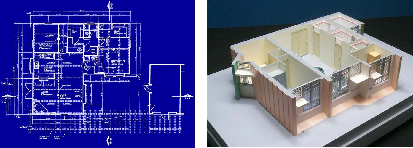
A simplistic way of thinking about the difference between wireframes and prototypes is to use the architecture analogy. Wireframes are like blueprints which give just a basic idea of what will be built, while prototypes are more like a scale model of a building.

When wireframes should be created
Typically, wireframes are produced early in the design process, during the ideation phase when designers need to explore a variety of different options and select the best one. Wireframes are great at that stage because they help designers to demonstrate how the layout should be organized without explicitly specifying the visual design of a product.
10 Practical tips of sketching wireframes
Despite the fact that modern prototyping tools allow you to create a wireframe in minutes when it comes to wireframing it’s really hard to beat pen and paper (especially when you’re in the ideation phase of a design process). The goal of designers during the ideation phase is to generate as many ideas as possible and iterate towards the best possible solution. And it’s much easier to do so using pen and paper rather than using a digital tool. Generally, the more you can flush out your ideas on paper the faster you'll move on your computer.
2. Don’t judge your ideas before putting them on a paper
This doesn’t make any sense’ is a pretty common phrase during brainstorming sessions. People tend to follow ‘the best or nothing’ approach when thinking about a solution. But such an approach can be counter-productive for many reasons. The most obvious reason is that it’s fairly easy to skip a valuable idea because it’s hard to visualize it in your head. That’s why you need a pen and paper. Take an idea you have in your head and make the first stroke of the pen on paper. In no time you’ll have a visual representation of your solution.
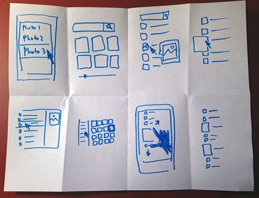
When you explore a variety of ideas, it’s recommended to follow a technique called Crazy Eights. Fold a piece of paper into eight different sections and then do eight different for a wireframe as quickly as possible.

Image: GV
3. Don’t put too much focus on the quality of sketches
Don’t get too focused on details when you sketch wireframes, focus on the speed instead - try to work as quickly as possible. Remember that the most important in sketching is an idea you want to convey. The goal of sketching isn’t to test your arts and crafts skills but to explore a variety of layouts. Thus, put just enough details so you’ll be able to review and refine your sketches later.
The tools you use for sketching have a direct impact on the final result of your work. First, you need to get good pens. I recommend to use three different pens for sketching:
● Black Sharpie pen for wireframing.
● Colored Sharpie pen for shading in elements.
● Highlighter for shading. You can use it as an accent color to grab the user's attention.
Second, try to use the dotted paper. A dotted paper will help you draw shapes and layouts more accurately.
5. Don’t use real UI elements, use placeholders instead
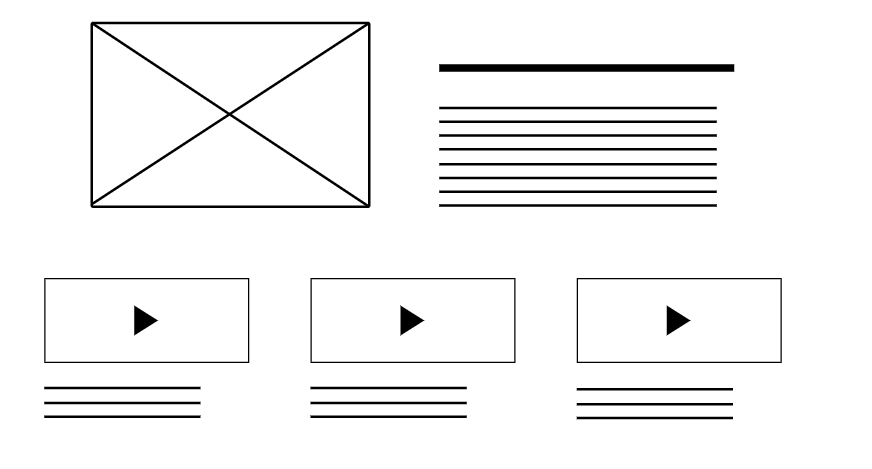
Text and images in your wireframe don't have to be representative of the final product. Moreover, it might be impossible to use real data during the early stage of the product design. Thus, use commonly used placeholders instead of real text and images:
● Images can be represented with a cross.
● Heading can be represented as an extra bold line
● A basic copy can be represented as horizontal lines
● Video can be represented as a horizontal box with a play button in the center.

Landing page wireframe. The page features one primary image, heading, three video widgets.
6. Use color to highlight elements
While it’s true that wireframes shouldn’t have any visual properties of a final design, still, it’s possible to use color to convey the meaning of some parts of your design. For example, using contrasting colors, it’s possible to focus user attention on some particular elements.

Image: Jason Robb
7. Annotate your wireframes
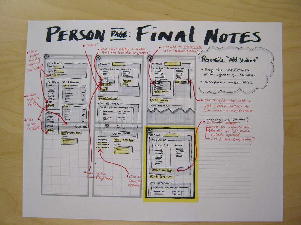
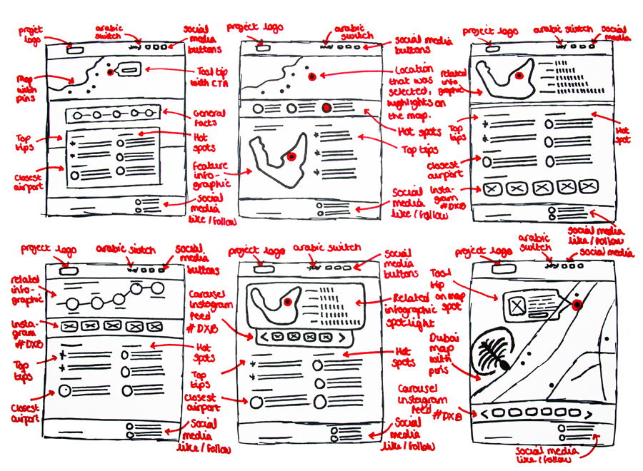
The major problem of wireframes is that they are static design artifacts. Using wireframes, it might be hard to convey the meaning, especially if the screen is really complex. As a result, it might be tough for stakeholders/team members to understand how users suppose to interact with a screen. Designers shouldn’t let wireframes speak for themselves. They should provide annotations and notes in the wireframes to add clarity.

Image: poppydotcom
8. Record your wireframe
To avoid caring for your paper wireframes from meeting to meeting, create a digital copy of the layouts using your smartphone. Simply take a shot of each wireframe and put them into the cloud.
9. Share your wireframes with team
Don’t work in a silo. Remember that the best design decisions come from collective work. Thus, don’t be afraid to share your wireframes early and often to get feedback to get your next design decision.
● Gather feedback and learn from others. Put wireframe in front of your team members to see if your idea has value. Welcome constructive criticism by giving stakeholders and team members an opportunity to have their voices heard.
● When presenting your idea to others, use wireframes as a supplement to your story.
There will be a moment in your design process when you’ll need to switch to the digital tool to continue refining your idea. It’s essential to have a powerful wireframe tool that allows you not only to create a wireframe but also to translate it to a high-fidelity prototype.
In addition, it provides a lot of predefined user interface elements that can be used to create a wireframe or prototype of user interface screens. You can translate your sketches into high-fidelity prototypes that later can be used for user testing.

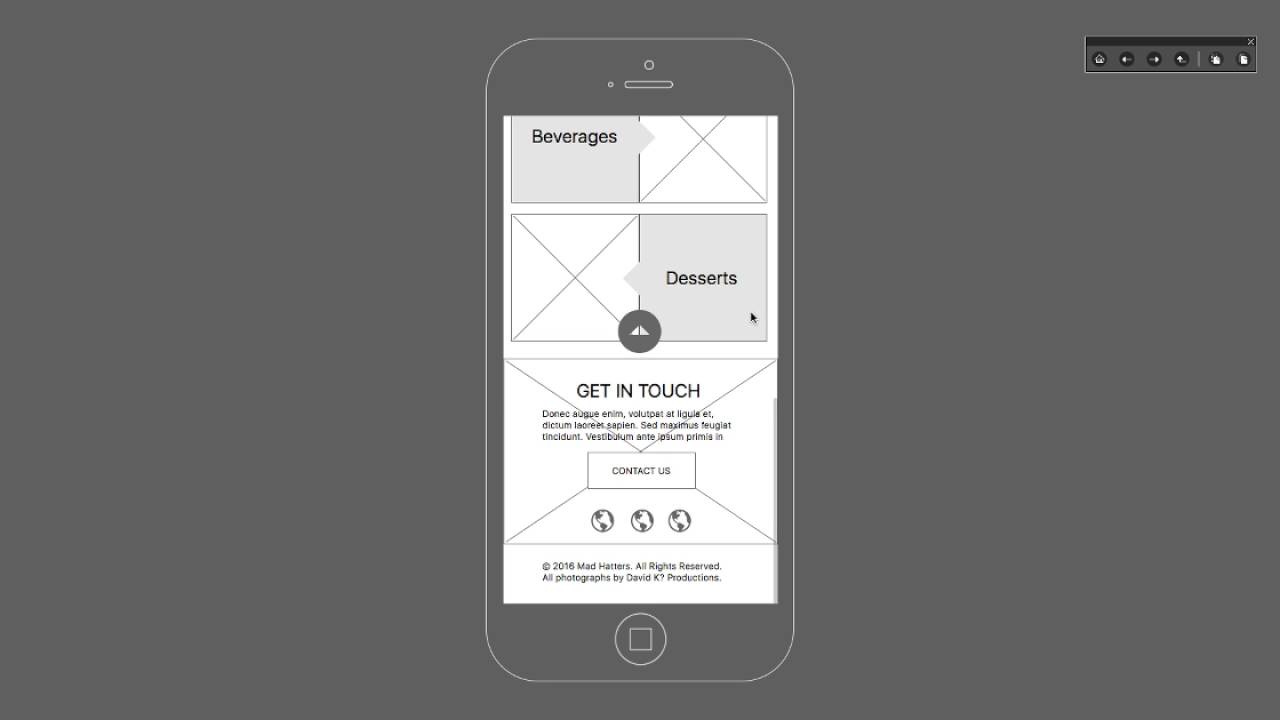
Restaurant wireframe with Mockplus. Image: David Krout
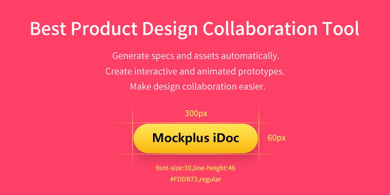
Another tool recommended is Mockplus Cloud, a new handy tool for better communication between designers and developers. It not only helps to streamline your workflow but also helps handoff designs with accurate specs, assets, code snippets, and interactive prototypes. This features Mockplus iDoc and makes sure all design elements be accurate to make a modern hi-fi prototyping.

Conclusion
There’s no right or wrong way to sketch your wireframe. So don’t take all that I’ve said here for granted. Experiment, try different ways of sketching and ultimately you’ll find your own style. Remember, the more you do wireframing, the better you’ll get at it. Have fun!
Sketch your wireframes in 3 steps with Mockplus RP
Get started for free
Sketch your wireframes in 3 steps with Mockplus RP
Get started for free
Sketch your wireframes in 3 steps with Mockplus RP
Get started for free


