Mega menus are one of the most common elements in web interface design and are used to guide users to subordinate pages. Because mega menus are very common, however, it is easy for them to become boring and monotonous.
This article has collected some excellent mega menu examples. Some have beautiful design details, and some have dynamic and smooth interactions. Let's have a look!

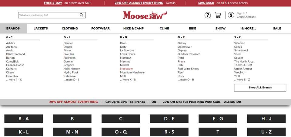
Moosejaw.com is an online brick and mortar retailer specializing in outdoor casual wear, snowboarding, rock climbing, hiking and camping gear. The website's mega menu lists the various available categories as comprehensively as possible. The second-level classification is divided Into the first letter, the gender, the age, and the product. It is very detailed and is a very classic e-commerce menu.

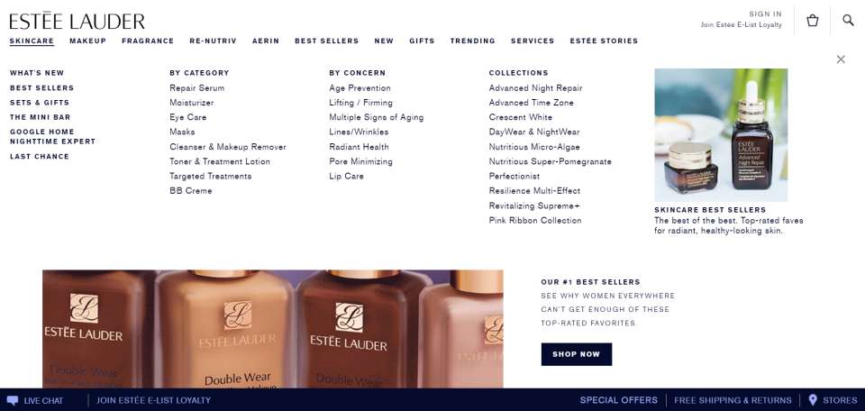
Estee Lauder is a very famous cosmetics brand, and its various cosmetics and skin care products are very popular. The entire website adopts the design style of black text on a white background + large picture. The mega menu design is also very simple and the black font is unified with the hierarchy emphasized only by bolding and capitalizing.

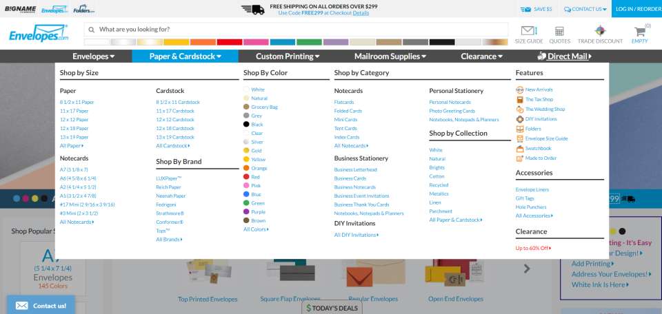
Envelopes is a website that sells a variety of envelopes and mailing materials. In the website’s mega menu, the products are sorted according to color, size, style and paper texture. The details are divided up to improve search efficiency and help users find the best solution quickly.

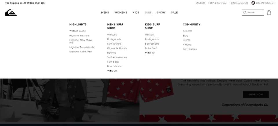
Quiksilver is the Australian retail sports brand and one of the world's largest surfwear and sports-related equipment brands. Its website adopts the design style f black text on white background + large picture.
The large-scale mega menu fits the minimalist style well. The menu is centered, leaving a lot of whitespaces. The black font is unified, and the hierarchy is emphasized only by bolding and capitalizing. The use of gray when interacting with text is very subtle.

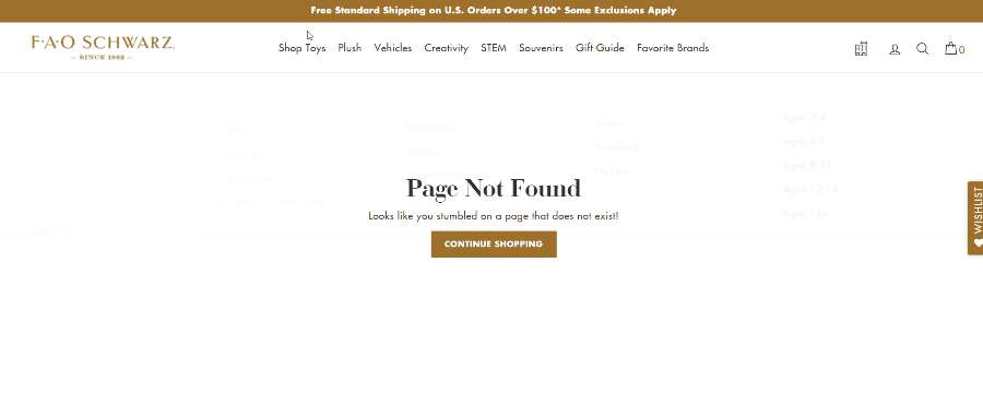
FAO Schwarz is an American toy brand known for its high-end toys, life-size stuffed animals, interactive experiences, brand integration, and games. The website's mega menu uses dynamic effects from top to bottom, left to right, and is very engaging.

Bras N Things is an e-commerce website that sells women's underwear. The website's mega menu is exquisite and smooth, and the second-level menu uses two kinds of design layouts: plain text and text with small images.

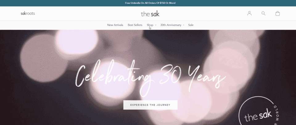
The Sak is an e-commerce website that sells bags. The site’s mega menu generally adopts the dynamic effects. When the mouse hovers over an item, the option is displayed and an underline appears. The interaction effect is executed very smoothly.

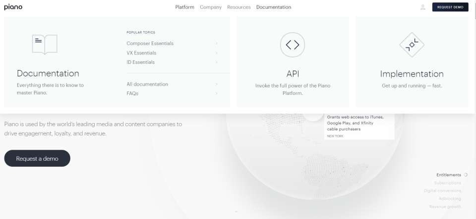
Piano is a team dedicated to helping media companies and content operations companies grow. The first screen of the website has a dynamic and rotating Earth. In addition to the flat design of the website, its mega menu uses the simplest hidden interactive effects and only two levels.

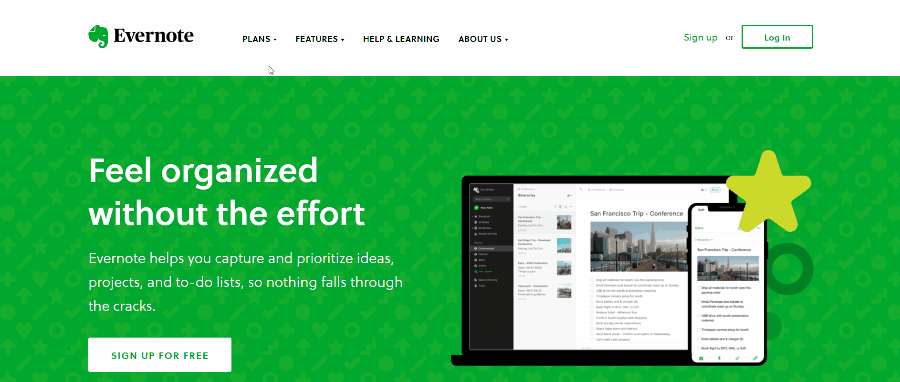
Evernote is a famous electronic note-taking data management software. The whole site is very uniform green. In the mega menu, when the mouse is over to the secondary menu option, the entire option section will turn green.

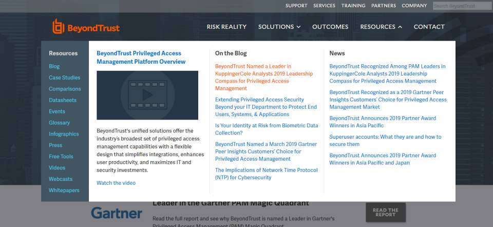
This website's mega menu features two horizontal menus. The options under the second menu are arranged vertically, and the level hierarchy is clear at a glance. When the mouse is over the option, the text becomes system red.
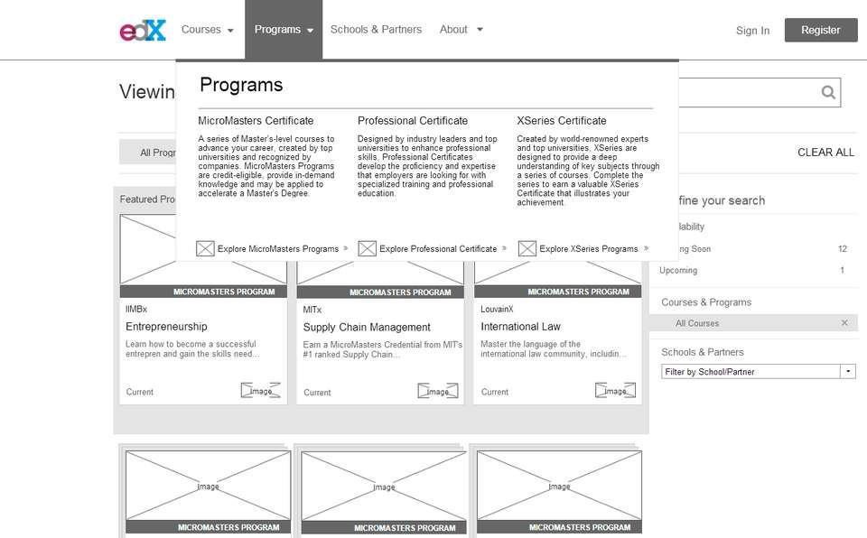
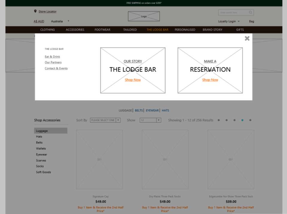
Web page large menu prototype design
Let's take a look at the mega menus in the prototype tool Mockplus.


Free prototyping tool for web and mobile app design
Get Started for Free
Free prototyping tool for web and mobile app design
Get Started for Free
Free prototyping tool for web and mobile app design
Get Started for Free


