Wireframing is one of the first steps in your design process and arguably it’s one of the most important ones. It’s the time when your ideas start to take shape. Despite the fact that wireframing looks simple, it can be done well or poorly, and this can have a significant impact on the outcome of the final product. This article describes the right (and wrong) ways to wireframing. The tips mentioned in this article will help you build better wireframes for your web and mobile experiences.
What is wireframe
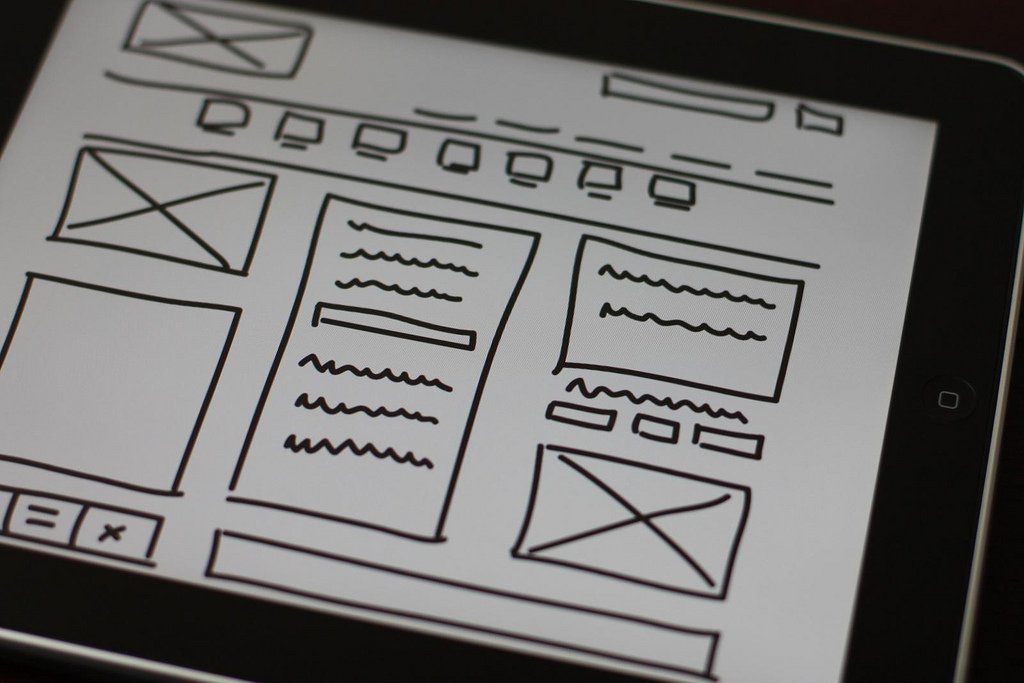
A wireframe is a basic skeleton of your layout. Wireframes don’t use real user interface elements; instead, they use placeholders - UI elements are represented as boxes Usually, wireframes used early on in the design and development process to validate information architecture and general user flows.

Wireframes are created to communicate, educate, and inform. Image: Baldiri (via Flickr)
Why Is Wireframing Important?
Wireframing is a critical step in the process of designing a product because it helps to determine how an app or website is supposed to look and function. Wireframing ensures that everyone involved in the project remains on the same page with regards to a product’s structure and features. Wireframes can also serve as product documentation - a guide for product designers who are building the app or website.
But how can designers make the most of wireframes and what should they avoid? Let’s find out.
First, the do’s
1. Research before creating wireframes
If you want to create good wireframes, you have to research what users need and what they want. It’s important to consider two goals - the business goals and the user goals. Both goals are essential to your product success. Researching before wireframing will help you set clear expectations of what you want to achieve with wireframing.
2. Keep wireframes simple
The main advantages of wireframing over other design artifacts are speed and simplicity. The speed is especially important. Wireframes shouldn't slow you down. You should be able to try a lot of different options before come up with a proper solution for your problem. That’s why it’s essential to keep your wireframes as simple as possible - this will help you avoid distractions and focus on conveying your ideas with clarity.
3. Show a variety of ideas
When wireframing, focus on generating as many ideas as possible. Generally, the more designs you create, the more chances you'll iterate towards the best solution. The ability to produce multiple ideas and variations on a single idea allows you to see the benefits and downsides of each idea.
4. Make sure that wireframes are easy to follow
Wireframes are a tool for communication. They should help other people understand your ideas. If you plan to share your wireframes with your team and stakeholders, make sure that wireframes are easy for anyone to follow. If you’re only one person who can understand your wireframe, then something has gone wrong.
Try following things to improve comprehension:
- Demonstrate your wireframes to a person who has nothing to do with your project and ask them a few questions about your work. This will help you understand what should be done to improve comprehension.
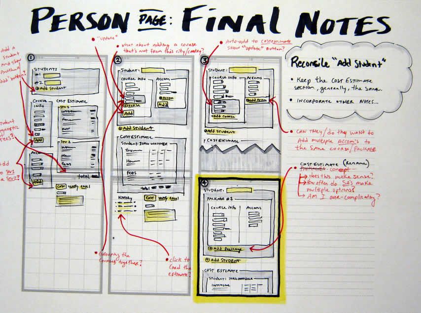
- Annotate your wireframes to make them easier to read and understand. It’s much easier to read a description of some element or interaction rather than trying to figure out how something will work just by looking at a static image.

Supplement some important details with words rather than trying to let the wireframe speak for itself. Image: jasonrobb
5. Collaborate
Never wire alone. When you brainstorm ideas together with other people the potential for good outcome increases significantly. Showing your wireframes to team members earlier in the design process helps validate and improve your thoughts.

The power of feedback will help you to improve your work - listen to what your teammates say about your design and iterate your design to improve it based on the feedback. Image: GA
Now, the don’ts
1. Don’t skip some parts of your app
It’s tempting to skip creating wireframes for some part of your app by saying something like “The checkout page in our e-commerce website is similar to many other websites. It’s obvious how to design it. Let’s skip it and focus on less obvious parts of our app.” Avoid that temptation. Make sure you wireframe every part of your app because this prevents you from missing some vital part of user interactions which might affect user experience. Nothing in your app can be ignored.
When you start wireframing it may seem like a good idea to jump right into your favorite digital design tool. While modern wireframing tools, allows you to create a fully-functioning prototype in minutes, in most cases it’s better to start with pen and paper. Sketch your ideas first, and only after that switch to a digital tool.
3. Don’t use colors
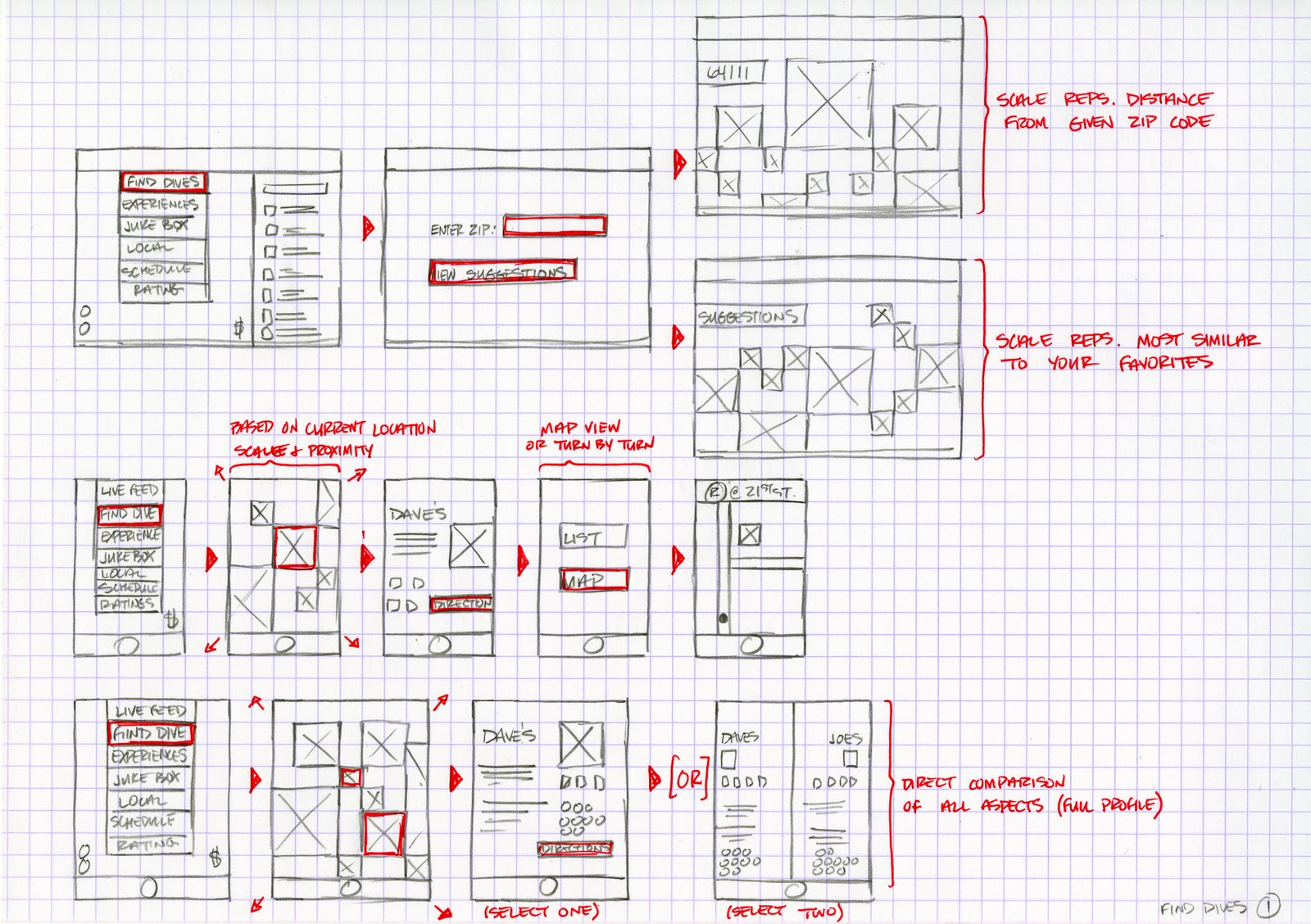
Have you ever wonder why wireframes are often created in grayscale? This is done for the purpose - grayscale prevents distractions by the color. The primary purpose of a wireframe is to layout content and to describe the app's functionality. Adding in multiple colors can cause distractions. Thus, it’s better to avoid using color in your wireframe (unless you want to highlight some specific element).

Don’t use color. If you do, use it intentionally. In this example,tonianni used red color to highlight essential elements and add notes.
4. Don’t try to make wireframes look pretty
Don’t focus too much on how your wireframes look. Wireframes are not design comps/mocks - they don’t need to look and feel like the finished product layouts. Remember that a wireframe is a tool which helps you understand information hierarchy of pages not visual or interaction design. When you focus too much on the later, you might have too polished wireframes but absolutely not solution-oriented. Thus, when it comes to wireframes strive to make them useful first - wireframes should communicate your ideas with ease and invite conversation. Visual and interaction design should be left to later stages of the product design process.
5. Don’t get too attache
Don't get too attached to your wires. Be ready to discard them. Yes, it might be hard to trash something that you’ve spent time on (especially when the result isn’t bad per se, but simply doesn’t fit the concept of the product you design). But it’s important to remember that wireframes are made to be tossed away. You need to try a lot of different options (maybe 10/50/100) and only after that choose the one (or two) which you would like to use a foundation for your prototype.
Conclusion
Wireframing is an essential skill for UX designers. And just any other skills it can be improved over time. The key element in developing your skills of wireframing is practice. The more you do it, the better you’ll get. Thus, next time you start a project set time aside for wireframing. By investing time into wireframing early in the design process, you can save a lot of time later on down the line
Start wireframing free with Mockplus RP
Get started for free
Start wireframing free with Mockplus RP
Get started for free
Start wireframing free with Mockplus RP
Get started for free


