Nowadays, except some chatting/social/messaging apps, many e-commerce and business mobile apps available on the market today also use conversational UI as a way of interaction with users. Chat UI allows users to communicate with each other, request for detailed information, share interesting product experiences or events, etc. The most significant benefit of chat interfaces is that interaction happens in the real-time, this allows to get a response almost immediately.
Despite the fact that the chat-based interface is relatively simple and does not require fancy visual design, it does not mean that UIs should look boring. Chat UIs can be cool, beautiful, creative.
In this article, we will share 12 the best and most creative chat UIs for mobile apps. We hope that those examples will inspire you to design great chat UI with the excellent user experience.
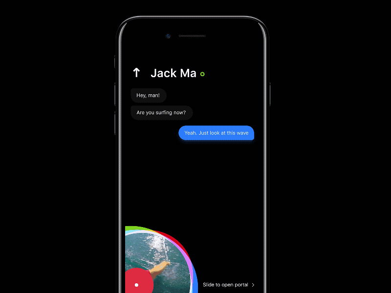
Designer: Dmitry Seryukov
Highlights: A unique way to add and expand a video, and trendy color scheme
The designer of this chat UI uses a very creative and unique way to expand a shared video (by extending the video gradually from the corner of the mobile phone to the full screen). This is very eye-catching. Moreover, its classic black and white color scheme combined with beautiful animated transitions makes this app very fashionable.
Of course, its navigation column with beautiful animation also matches perfectly with its simple bottom design.
What can you learn:
*Create a unique way to add and expand a video/audio in your chat UI designs
*Choose a perfect color scheme for your designs
The combination of black and white colors makes people feel comfortable. The blue and white colors gives a sense of peace and serenity. And the pink and white colors are much more suitable for shopping or chatting apps that want to attract more female users/customers.
Hence, when it comes to selecting a color scheme for your app, it’s better to choose colors based on different scenarios, software/product/company features and more.
It’s also important to make sure that colors were selected according to the color scheme of your brand. And it is also supposed to be in accordance with the color scheme of your entire mobile apps. (Click here to check how to use color in UI design)

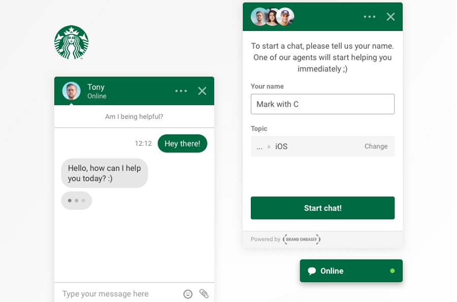
Designer: Albert Zikmund
Highlights: An excellent combination of product/software features
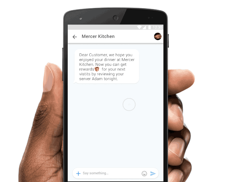
This chat interface is specially designed for Starbucks app, and it reflects the core properties of Starbucks brand. For example, the designer of this interface combines the characteristics of its well-known logo and chooses green as a primary color for this app. This creates a sense of familiarity.
Moreover, considering the features of its online services, a special interface is also added to help collect user feedback and offer a better online service. This is pretty good for better user experiences.
What can you lean:
*Add contents/sections relevant to software/product/company features
In your chat UI/software designs, it is better to add contents in combination with the software, product or company features.
For examples, while designing chat interfaces/sections for a mobile game app, you can offer a feature of choosing an avatar (of some distinctive, popular or typical game characters), or merely add some icons/buttons with game features. These ways are really useful to make your chat interfaces/sections interesting and attractive for users/customers.
And when designing chat UI/sections for e-commerce apps, you can add some dynamic product display panels to showcase popular or hot products. And this will increase product exposure and reduce user frustration while they are not timely serviced online.

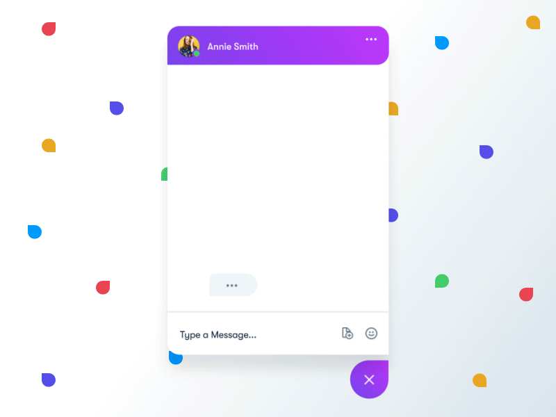
Designer: Balkan Brothers
Highlights: Comfortable color scheme and conversation bubbles
The designers of this chat UI design uses a uniform theme color, both beautiful and comfortable. Moreover, the rounded corners of these conversation bubbles create a fresh look. And such simple layouts are also good for users to have an easier and more pleasant experience.
What can you learn:
*Prepare multiple color schemes/skins for your chat UI
When you design chat UI, you can also provide users an option to select from multiple color schemes/skins. And this will allow users/customers to easily choose the best one based on their own needs, moods, genders and preferences, etc.

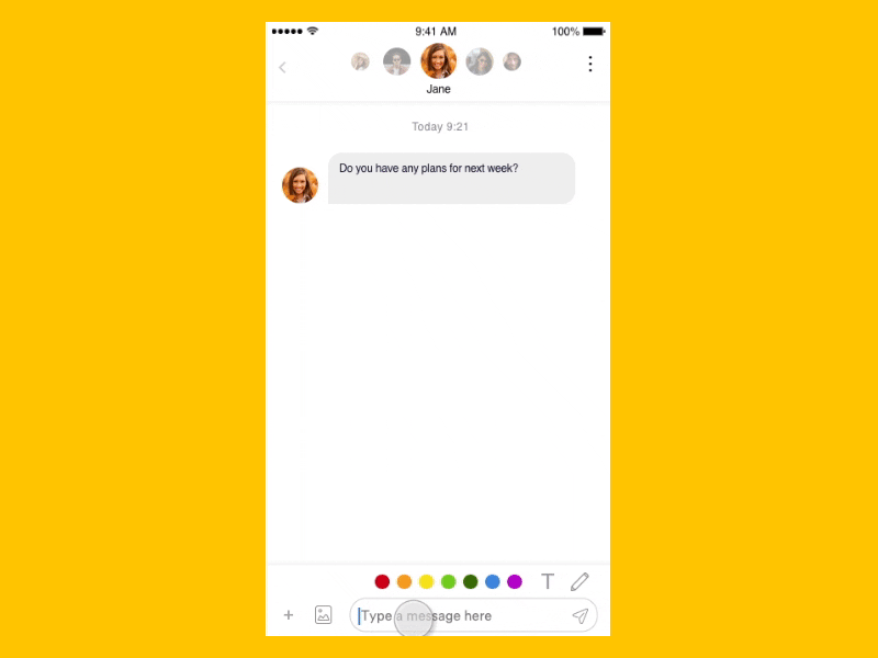
Designer: Hummingbirdsday
Highlights: Very sweet and interesting graffiti board
The most outstanding feature of this chat interface is its sweet graffiti board which allows users to draw chatting messages using different fonts and colors. This is really interesting and impressive.
What can you learn:
*Add an intuitive and interesting graffiti board or the like designs for your chat UI
Such intuitive and interesting graffiti boards or the like unique designs in your chat interface/software can help you attract more users/customers.

Designer: Daniel Boros
Highlights: Use an effective voice chatting
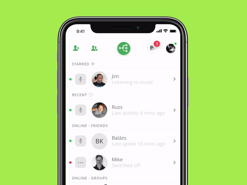
Unlike standard chat-based interfaces which force users to type the message, this interface enables users to communicate using the voice. Users can long press the “Record” button, record the message, and send it.
Moreover, the icons and buttons at the top of the screen allow users to easily switch to other pages or parts of this app. This is a great way to expand the functions of the chat interface.
What can you learn:
*Add icons or buttons for voice communications in your chat UI design
When you provide an option for voice communications, your users/customers could freely choose the way they want to communicate based on their own needs and scenarios.

Designer: K.Mohit
Highlights: Smart and unique design of bottom navigation
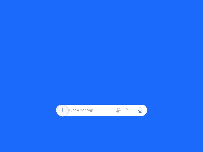
Even though this is not a complete chat UI design, it is worth the attention because it provides a unique feature - a unique design for bottom navigation.
Except some common features such as editing chatting texts and inserting expression icons, the designer of this UI adopts a very unique way to extend its functions. When users can easily click a "+" button located in the bottom left corner, a menu will pop up and users can choose from a few options such as Gallery, Event, Contact and more. This is really effective to make the entire bottom design simple and powerful.
What can you learn:
*Add simple buttons or icons to extend the functions of your chat UI design
*Prepare multiple bottom designs
It worth saying that the way this app presents extra options might not be suitable for all chat UI/section/software designs. In your design, you’d better prepare multiple bottom designs and test them with your users to figure out what works for them.
Of course, if necessary, also translate them all into visualized prototypes by using an excellent prototyping tool (like Mockplus), test and choose the one that offers users the most pleasant and smooth user experience.

Designer: irfanfaiz
Highlights: Simplified chat UI design
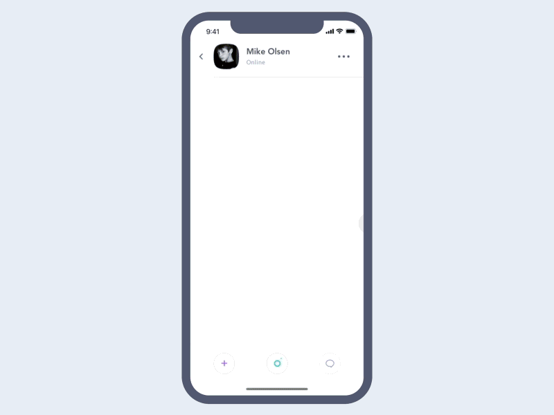
This chat interface uses the power of minimalistic layout to focus users on the core conversational functions. A combination of a limited number of UI elements not only improves comprehension, but they also accelerate page loading.
Moreover, its hidden and simplified menu bar also helps a lot in extending the functions of this chat interface.
What can you learn:
*Simplify user interface
As an overwhelming design trend raised in recent years, such simplified design style does not mean removing interface functions or components to the fullest and limiting users blindly. It means creating a simpler and easier design with using less elements. Therefore, in the design of your chat interface, you can also use this design method, flexibly apply blanks, wireframe, simple and intuitive buttons or icons and interesting pictures to optimize your chat interfaces. (Click to see Top 9 UI design trends for mobile apps in 2018)

Designer: Cuberto
Highlights: Interesting animated background photos
This chat UI uses interesting dynamic effects such as video backgrounds and animated transitions.
What can you learn:
*Add dynamic photos, not just animated background photos, to make your chat UI more attractive

Designer: noterrain
Highlights: Offer commonly-used sentence options
In order to optimize user interactions, the designer of this chat app provides common user’s replies as pre-defined options. This prevents users from typing entire sentence, they can simply choose the option that is relevant to the current context of conversations. It is quite sweet.
Moreover, the designer uses different colors and shapes for conversation bubbles. This is a very effective way to distinguish messages send by users from messages sent by system/respondents.
What can you learn:
*Add context-relevant pre-default sentence/sticker/photo/icon options for better user experiences
*Add conversation bubbles with different shapes, colors and fonts

Designer: Jakub Antalik
Highlights: Advanced fluid effects for text messages
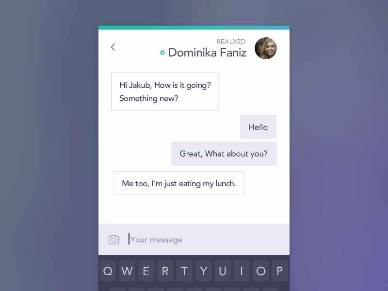
This most distinctive feature of this chat UI design is its special fluid effect for these text messages, which are really interesting and eye-catching.
What can you learn:
*Add special and unique effects for your chatting texts, buttons and bubbles

Designer: Vlad Tyzum
Highlights: Cute and funny animated expressions
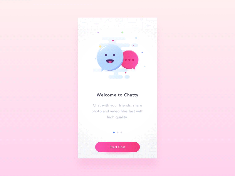
Even though this is only a welcome page of a chat app, its features cute and interesting animated effects. This creates a good emotional connection with users right from the start.
What can you learn:
*Add animated expressions/animations/interactions to improve emotional experiences

Designer: Valentin Salmon
Highlights: Advanced chat robot
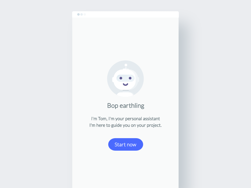
This conversational UI features an advanced chatbot which provides timely and relevant responses.
What can you learn:
* Add a chat robot or such advanced technologies to enrich your chat UI/sections
Chat robots play a more and more important role in such social/chat/messaging apps, which greatly affects and facilitates the lives of users. So, in your chat UI/section/software design, you can also add chat robots and similar advanced technologies to enrich your designs.

These are 12 of Best and most creative chat UI designs for mobile apps in 2018, and hope they are useful for you.
Mockplus Helps Make, Test and Share Chat UI/App Designs Easily and Quickly
Have you been inspired by the examples of chat UIs mentioned above? Would you like to create your own chat UI? You’ll need a proper prototyping tool which will help you make and iterate your chat UI design easily and quickly. The tool should allow not only creating but also sharing designs with other UI/UX designers and stockholders. Without any doubts, Mockplus is the best choice.
As an easier, faster and smarter prototyping tool, Mockplus can not only help translate your Chat UI/section/software designs into interactive prototypes easily and quickly, but also offer powerful features for you to test, present and share these designs freely:
Step1. Mockplus offers powerful features to help make excellent chat UI/sections/Software
1). Use various bubble and expression icons to enrich your chat UI/sections/software
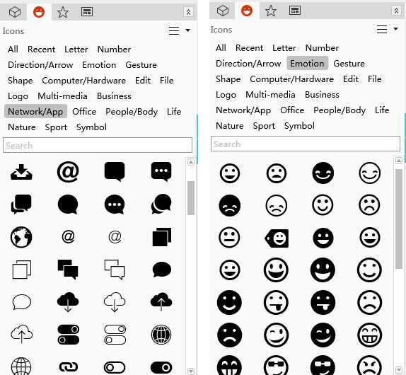
Conversation bubbles and expression icons are essential elements of chat interface. Designers can experiment with different types of bubbles and expression icons to make a much more interesting and attractive design. And Mockplus provides a powerful icon library (including over 3000 icons) which allows you to freely choose different conversation bubbles and expression icons to enrich your chat interfaces with ease and efficiency.

2). Use GIF components to add dynamic expressions/icons/photos in your chat interface
In comparison with static icons or photos, dynamic expressions/icons/photos are definitely much more effective for UI/UX designers to create an interesting and eye-catching chat interface. And, in Mockplus, you can easily drag and drop its “GIF” components to freely add your desired dynamic background photos, expressions and icons based on your needs.
3). Use Label and Text Area components to add diversified chatting messages/texts
Text input field is an important element of a chat UI/section/app. And with Mockplus, you can freely use its“Label” and “Text Area” components to make diversified chatting messages/texts with different colors, fonts, sizes and opacity. If necessary, also add simple interactions for these messages/texts with its Interaction State.
4). Use well-designed samples and templates to create your chat UI designs faster
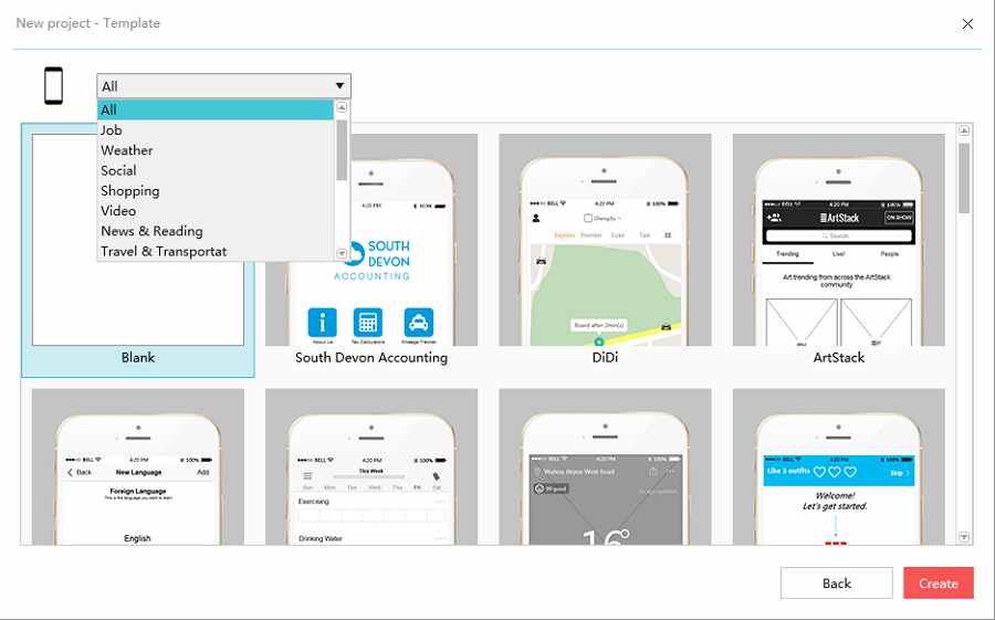
Do you want to design a conversational UI but don't want to start from the scratch? No problem! Mockplus has many well-designed samples and templates of different chat interfaces. Feel free to import them, adjust for your needs.

Step2. Mockplus help test, display and share chat UI/app more intuitively and vividly
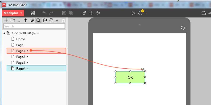
1). Add smart interactions/animations for your interface design with simple drag and drop
Interactive elements in chat UI/section/app designs, such as interactive messages, texts, photos, icons and buttons, are very helpful in simplifying and enhancing user experiences. And Mockplus offers a variety of interactive commands for users to easily add distinctive interactions/animations with simple drag and drop. Of course, if necessary, you can also try its diversified translation effects to smooth and enrich your interaction designs.

2). 8 ways to test, preview and share your chat UI/app prototypes with ease and efficiency
Mockplus offers 8 ways for every designer to test, preview and share different prototypes with ease and efficiency. So, with Mockplus, you can freely choose one of these ways to freely test, preview and share your chat UI/App prototypes for attracting more users, designers and stockholders with ease.
Overall, no matter whether you are looking for a satisfying prototyping tool to translate and iterate your design ideas quickly or test, display and share your designs more intuitively and vividly, Mockplus is absolutely your best choice.
Conclusion
For a UX/UI designer, chat UI/section/software should be not only a platform that enables users to type messages to communicate with each other, but also a sweet carrier that allows users to freely interact with each other, express their emotions and show their distinctive personalities.
And in actual chat UI/section/software design, any element, such as its layouts, video/audio media, color schemes, interactions, animations, message colors/shapes/fonts and even small icons/buttons, can greatly affect the outlooks, user experiences and feasibility of a chat interface. That’s also why designers are often supposed to choose an excellent prototyping tool (like Mockplus) to timely translate, iterate and test their design ideas.
In short, hope this collection of 12 Best Chat UI Designs for Mobile Apps in 2018 will be helpful for you.
Free prototyping tool for web and mobile app design
Get Started for Free
Free prototyping tool for web and mobile app design
Get Started for Free
Free prototyping tool for web and mobile app design
Get Started for Free


