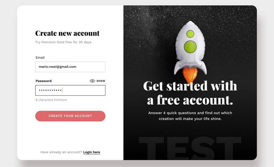
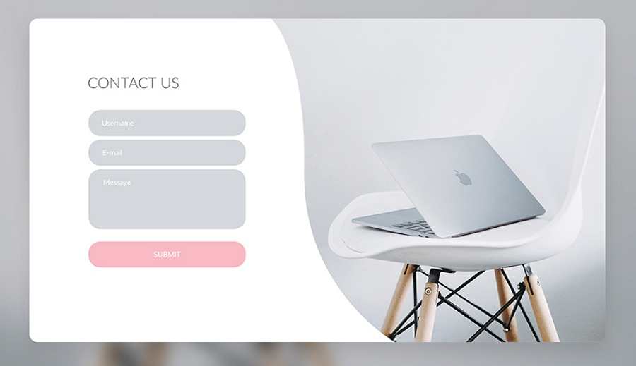
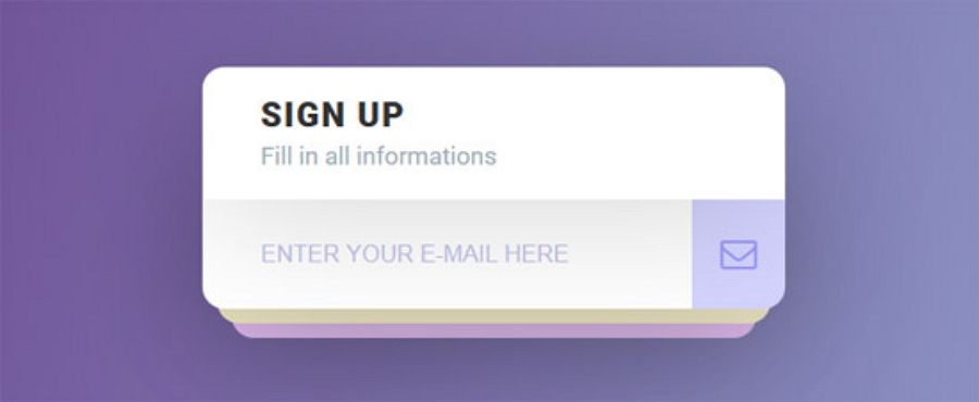
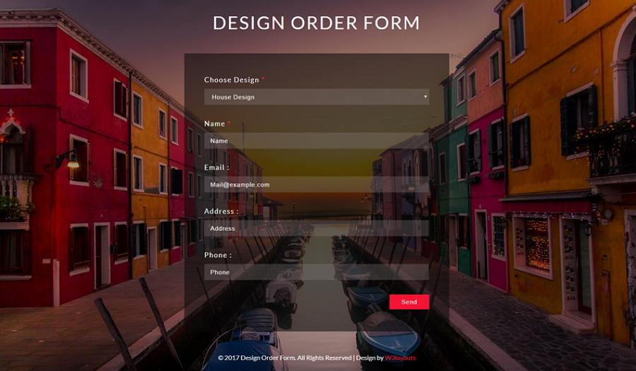
A good web form makes it nice and easy for users to register, feedback, purchase or subscribe, helping achieve business success. However, a bad form can not only lead to low conversion and user loss, but can sometimes even ruin the entire website/app. That’s why a well-designed form is essential for a good website/app.
Today, we’ve rounded up 35 of the best web form design examples, principles, templates and books for you to build an engaging and effective form:
20 Web Form Design Best Practices & Principles for You
First, let’s take a look at 20 of the best web form examples and related design principles for your inspiration:
1. Signup Form

Designer: Michal Maňák
Rating: ★★★★★
Highlights: Interesting registration flow; interactive design
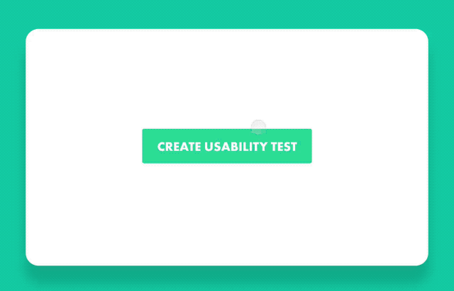
This example displays a very interesting registration flow, which helps pique users’ interests, engage them in the registration flow and enjoy the process.
Web form design tricks:
- Optimize your web form with an engaging registration flow
2. Buying Form Animation

Designer: Rostislav Achilov
Rating: ★★★★
Highlights: Step by step guide
It is preferable to keep a web form as short as possible. However, when you have to build a long form to collect user information, it is best for you to split the long form into multiple steps. More importantly, you should also add a step-by-step guide to enhance the UX.
This buying form design perfectly follows this concept.
Web form design principles:
- Split long forms into multiple steps for better UX
3. Kork App On Boarding

Designer: Jon Rundle
Rating: ★★★★★
Web design form principles:
- Organize all form elements logically
While trying to split a long form into multiple steps, remember to organize all elements logically. Just group the related information into logical blocks, sets or steps.
4. Gym App Login & Register Form Concept

Designer: Rostislav Achilov
Rating: ★★★★★
Highlights: Interactive form design
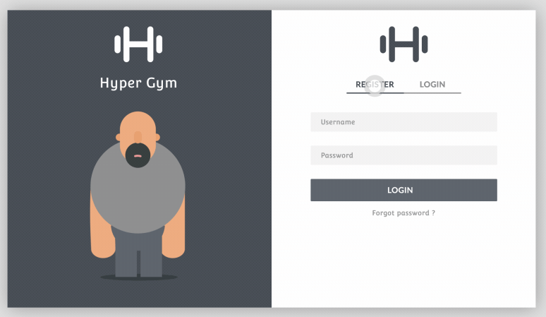
This gym app form design has been divided into two sections. While users switch between the “Register” and “Login” modules on the right, the illustration in the left section changes correspondingly, making this interactive design very engaging.
Web form design principles:
- Create interactive form designs to impress users
5. Contribution Form

Alt: Contribution Form
Designer: Rafaela Ferro
Rating: ★★★
Highlights: Natural language form design
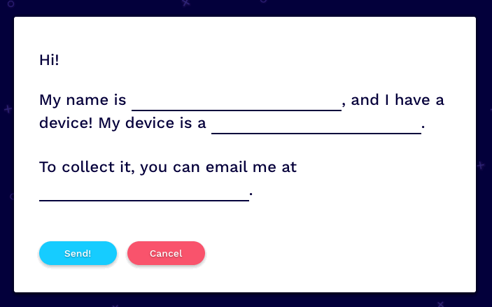
Unlike common web forms with a table-like appearance, this design displays several sentences and leaves blanks for users to fill in based on their own conditions.
6. Schengen Visa Application Form Design

Designer: Jeyhun Bakhtiyarov
Rating: ★★★
Highlights: Auto input design
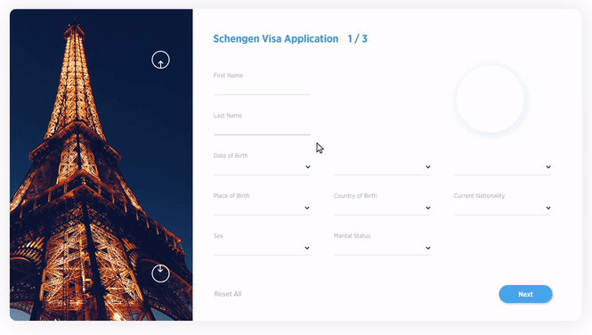
This form design uses automatic input to facilitate the user filling process. It is very user-friendly.
Web form design principles:
- Improve user experience with automatic input design
The best method to reduce or avoid input errors is to reduce input. Auto input design can be a great solution to this problem.
7. Login Form Design

Designer: Nitin Kumar
Rating: ★★★★
Highlights: Sign up through social media accounts
In this day and age, most of the users have social media accounts. To facilitate the signing up process, designers can allow users to register with their social media accounts.
This Sign Up form example allows users to sign up easily with their Facebook, Twitter or Google accounts.
Web form design principles:
- Allow users to register/log in with their social media accounts
8. Contact Form

Designer: Yuliya Kartashova
Rating: ★★★★
Highlights: Persuasive copy design
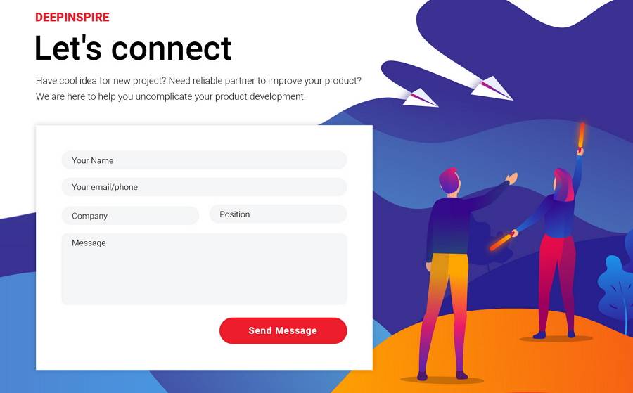
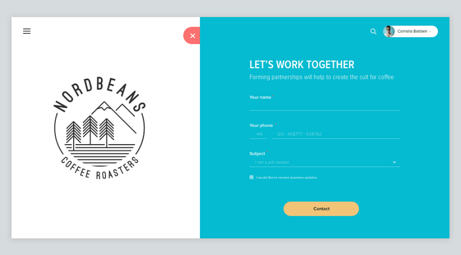
Copy design is another important part of a good web form. This contact form uses persuasive copy design to convince and encourage users to fill in the blanks.
Web form design principles:
- Encourage or guide users to complete a form with a well-designed copy
Follow 7 secrets to write perfect copy for your web forms
9. Airelines Flight Booking

Designer: Nikolay Apanasik
Rating: ★★★★
Highlights: Multiple input methods; animated illustrations
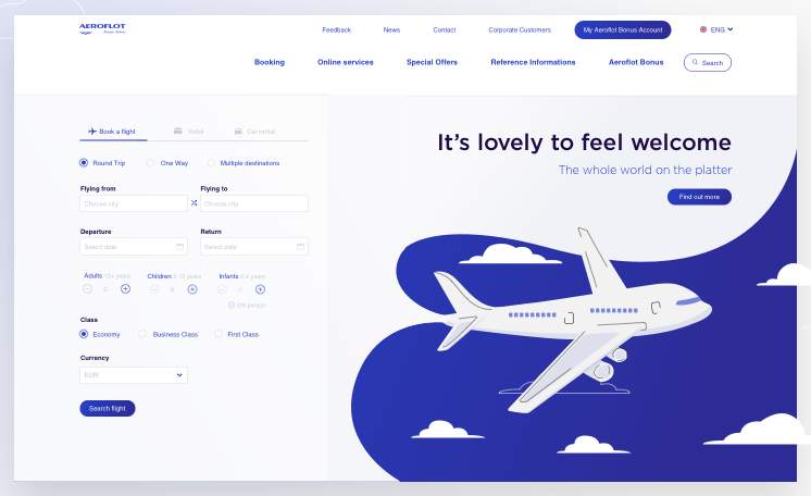
This flight booking form uses multiple input methods to speed up the completion process. The illustration animation on the right side is also eye-catching.
Web form design principles:
- Use multiple input methods for better UX
Multiple input methods help reduce input error and speed up form filling process.
It is best for you to use various types of input methods to simplify your website forms. For example, you can use text/password fields, drop-down options, checkboxes, radio buttons, date-pickers, etc.
10. Hello Dribbble

Designer: Laura de Magalhães
Rating: ★★★
Highlights: Clear input validation
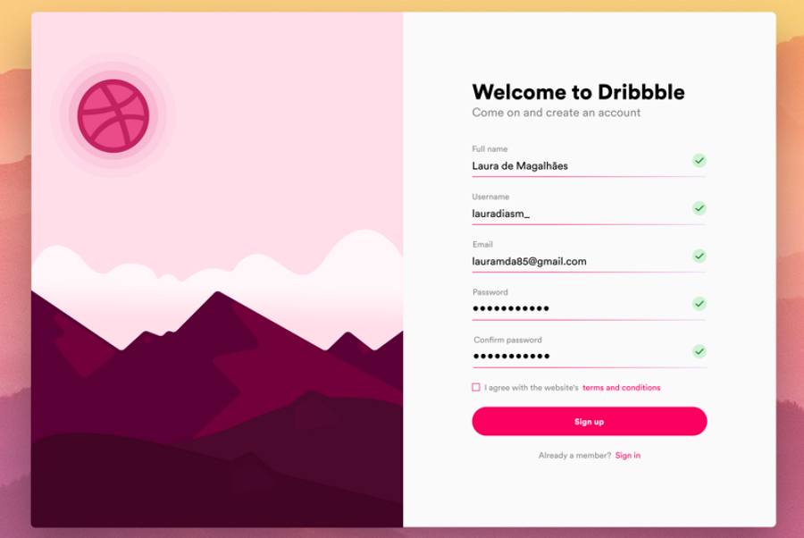
Input validation is important to help assure that a website/app is gathering correct user information. This sign up form includes validation functions for every input field.
Web form design principles:
- Validate input data whenever possible
Do not forget to add input validation. Of course, also remember to design clear error messages when users have entered data incorrectly.
By the way, using red to draw users' attention always helps highlight an error message or warning.
11. Registration Form

Designer: Alok Dubey
Rating: ★★★★
Highlights: One column design
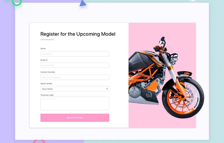
Listing all input fields in one column is often easier and faster for users to scan through and fill in, when compared to one or multiple columns.
Web form design principles:
- Use one column design to simplify your web form designs
12. Improved Invites Flow

Designer: Jon Rundle
Rating: ★★★
Highlights: Label the mandatory input fields
Web design form principles:
- Clearly show mandatory and optional input fields for better UX
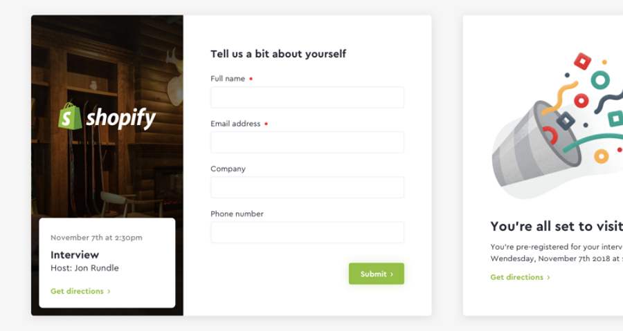
Some website forms provide optional input fields to allow users to fill in based on their own needs. To avoid any misunderstanding, it is best for you to label the mandatory or optional input fields.
For example, in most online forms, designers tend to use a red “*” to clearly point out mandatory input fields.
13. Superarena Private Beta

Designer: Dionne Ong
Rating: ★★★★
Highlights: Intuitive icon designs
Icons help designers create a more intuitive and simpler web form.
Web form design principles:
- Good icon design keeps short forms simple and intuitive
More Inspiring Website Form Designs for You
14. Moose Sign Up

15. Subscribe Pop Up

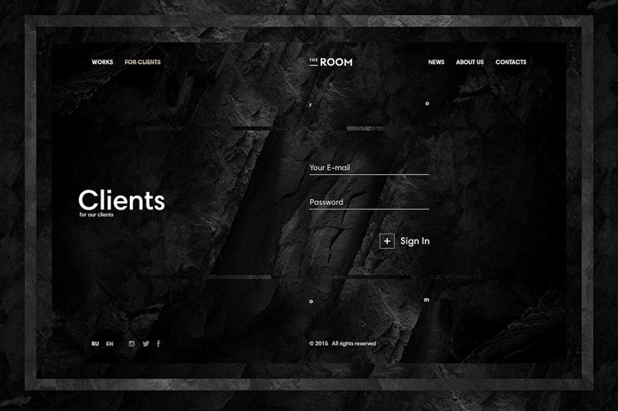
16. The Room for Clients

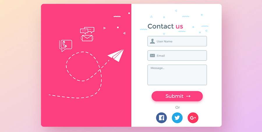
17. Contact Us Form

Article recommendation: 12 best free html5 contact form & contact us page template
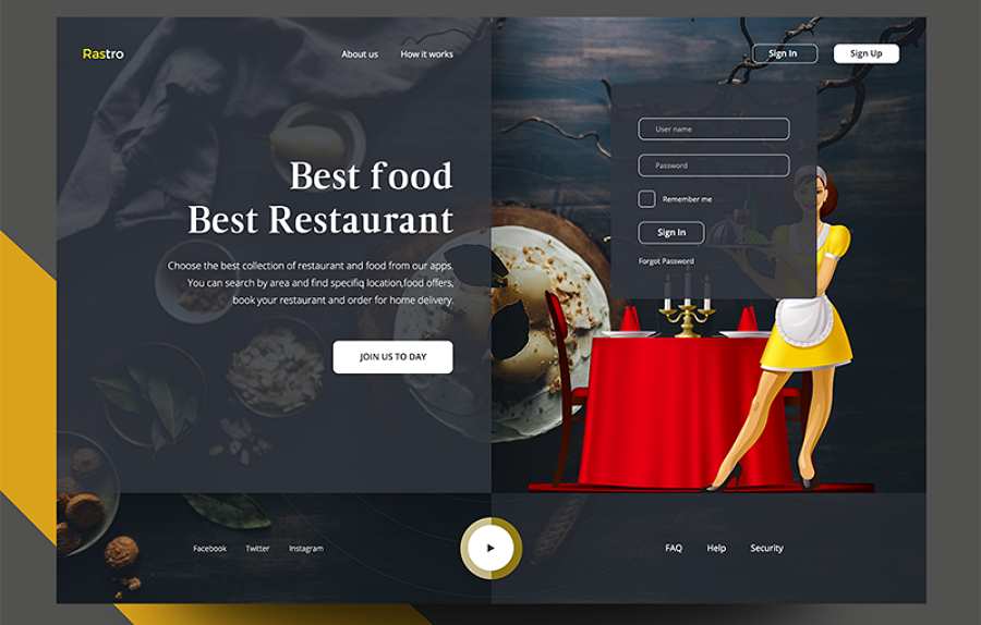
18. Web Apps Restaurant Sign In

19. Sign Up Form

20. Contact Us Monica

so far, we've looked at web design best practices gathered from Dribbble.com. We hope they help you find some inspiration.
5 Best Free HTML & CSS Web Form Design Templates You May Need
Next, we will look at 10 of the most creative free HTML & CSS web form design templates:
21. Interactive Sign Up For

Free download
22. Progressive Sign Up

Free download
23. Responsive Flat Order Form Design Template

Preview online
24. Web Form UI Template (Adobe XD)

Preview online
25. Customize Form Template

Preview online
26. Free Sign Up Form Template (PSD)

Preview online
27. Free Landing Page Template

Preview online
28. Flat Login Form Template

Preview online
29. Contact Form UI Inspiration

Preview online
30. Modish Login Form Responsive Widget Template

Preview online
5 Must-Read Web Form Design Books You Should Read
Not sure how to design a great form for your website/app? No problem. Below are 5 must-read web form design books for your consideration:

This book systematically illustrates everything you need to know about building effective and engaging web forms based on the author’s original research and design experiences.
This book offers readers a practical guide to designing and coding simple and exclusive forms for the web. It is a good choice for web form design beginners.
This book covers all aspects of form design, from form grids and graphic devices to fonts and formatting. It also compares all design options and explains the advantages of every form design methods in detail.
This book clearly illustrates how to create great designs for the web. Many practical and useful suggestions are explained to help you create an attractive and effective web form.
This book will walk you through every part of designing a gorgeous web form to enhance user experience.
All the above books are excellent choices to help learn web form design systematically.
Prototyping and Collaboration Tools to Create the Best Web Form Designs
Apart from creative design ideas, handy tools are also essential to build an impressive and effective website form:
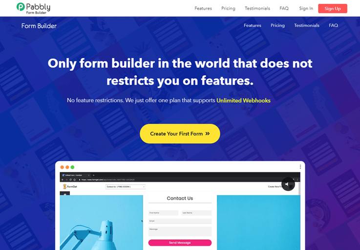
Easy and effective web form bulider with Pabbly Form Builder

Pabbly Form Builder is the cheapest and most effective form builder that comes with a handful of unbounded features that takes an innovative approach to the world of form building.
Using this online form builder, you can create any kind of form in a blink of an eye using drag and drop builder. Also, you can further enhance your created form with the in-built conditional logic
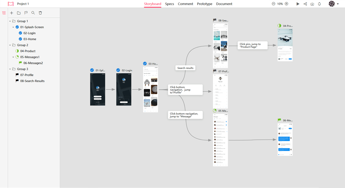
Prototype, test and iterate your web form with Mockplus
To create an effective and pleasing web form, designers should pay attention to every detail. A handy prototyping tool, which can help designers prototype, test, polish and iterate all possible details of web forms, is always essential.

Wrap Up
Creating a great web form design from scratch is not easy. To improve user experience, designers should focus on all possible details.
Overall, we hope these exceptional web form design examples, principles, templates and books inspire you to create an amazing form of your own.
Of course, also do not forget to use a handy prototyping and collaboration tool, to create a creative and effective web form.
Free prototyping tool for web and mobile app design
Get Started for Free
Free prototyping tool for web and mobile app design
Get Started for Free
Free prototyping tool for web and mobile app design
Get Started for Free


