Creating an impressive portfolio is not easy. If you need a spark to ignite your creativity, here are 24 of the best web developer portfolio websites.
One of the toughest tasks of a new developer is to make a personal web developer portfolio that helps get a potential employer’s attention in the overcrowded job marketplace. Undoubtedly, an awesome online portfolio not only showcases your design works, but it also highlights your accomplishments and expertise, leaving a strong impression on your visitors.
Since it’s not just a collection of work samples, there are some factors worth considering when creating a web developer portfolio website. Some of the most important questions to ask:
- Is there a clear call-to-action button for others to quickly learn about you?
- Is there any confusing part in the website layout?
- Is your copy too wordy?
- Does the site take a long time to load? Slow loading time is equivalent to being late for an interview and should be avoided by all means.
- Does the webpage show the core issues that users care about, or is it just a collection of unorganized achievements meaningless to the user?
- Can the webpage be loaded and displayed normally on mobile?
Compared with commercial websites, web developers’ personal websites need to pay more attention to personality and independent thinking. Below, you will find 24 of the best web developer portfolios from both individual designers and creative studios worldwide. Scroll down and get inspired.
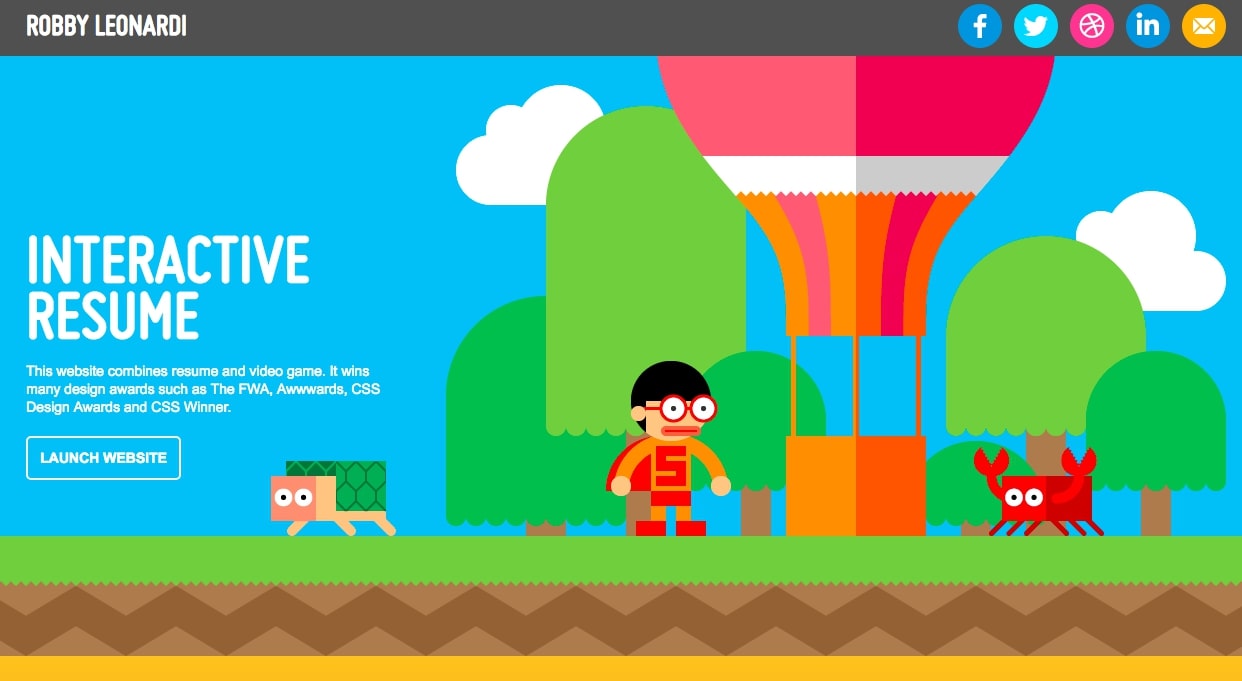
Made by: Robby Leonardi
Background info: A multidisciplinary designer, tech enthusiast, and NBA fan.
What's special: It incorporates interactive experiences and video games from our childhood.

This site looks like an online video game, and you will feel as if you were playing when scrolling the mouse to learn about Robby’s work experience & professional skills. If you are looking for a novel way to present a seemingly boring but important piece of information, then this website is a perfect example.
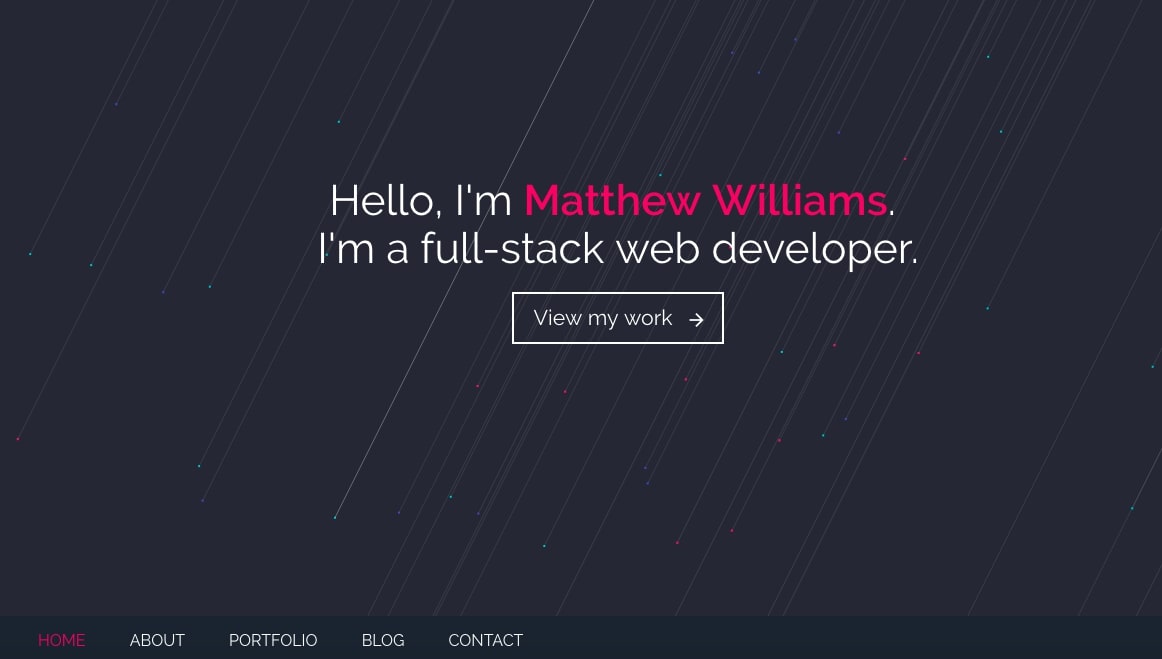
Made by: Matthew Williams
Background info: A front-end development engineer who loves UI effects, animation, and dynamic user experience.
What's special: A single page with a black background and clean interface.

If you want to make a creative front end developer portfolio with a beautiful interface, then you can’t miss this one. It has a black background, which makes the site look both stylish and clean. There is a concise self-introduction on the loading page. As you scroll down, different sections load, including professional skills, blog posts, portfolio, and contact details.
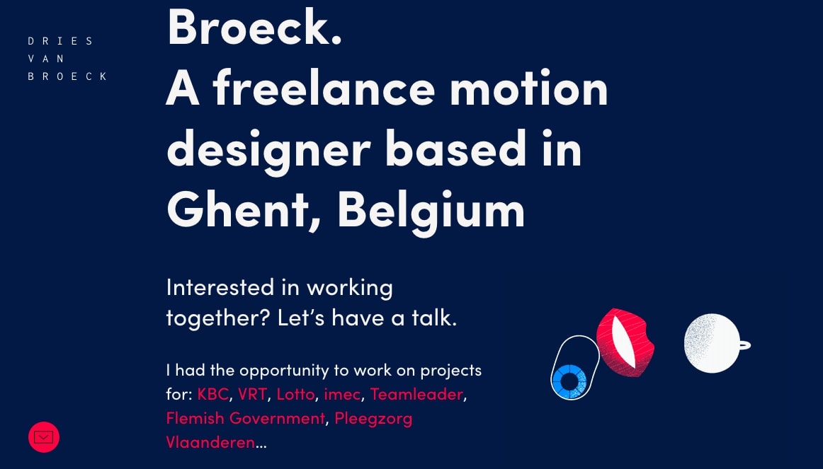
Made by: DRIES VAN BROECK
Background info: A motion designer.
What's special: While the design may seem distracting, it highlights the important elements with a masterful touch.

According to the general rules of programmer portfolio website design, the dynamic effects might get people easily distracted. But you will find that the website is well-designed with details, including the beautifully displayed the carousel, bright prompt text to highlight the author info, and the animated small icons to draw the user’s attention to the most important parts of the webpage. This leaves no doubt about his advanced development and design skills.
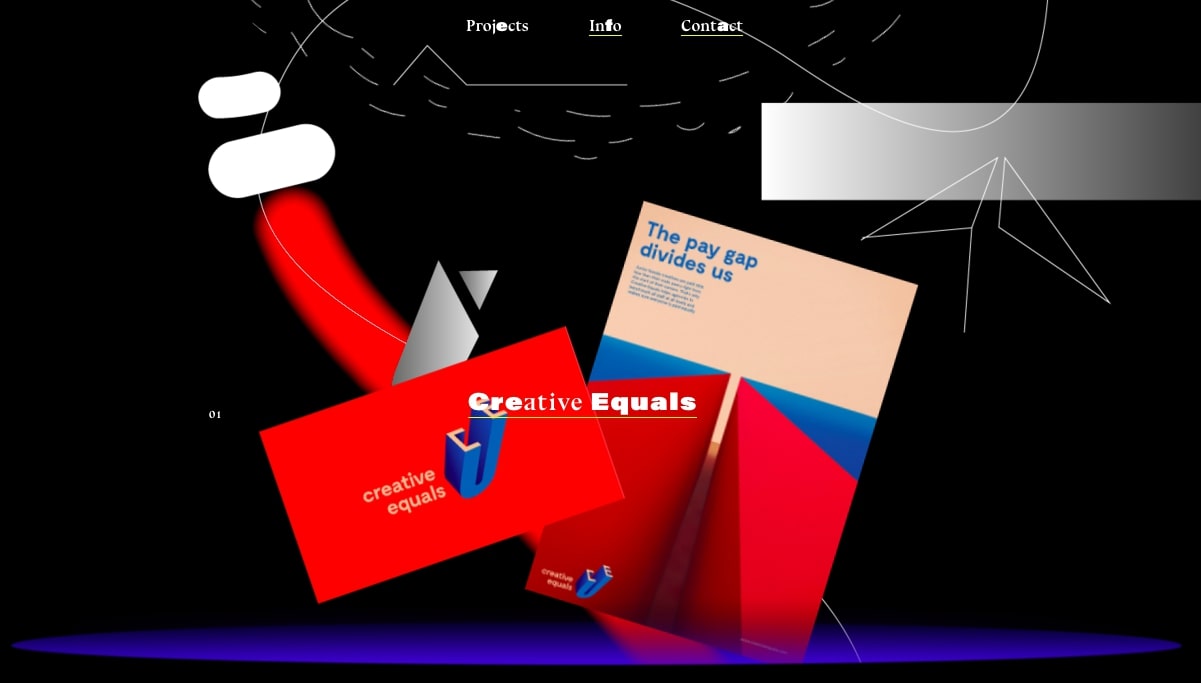
Made by: Malte Gruhl
Background info: A freelance designer.
What's special: This is an all-inclusive designer that gives a deep sense of mystery.

This site gives people a sense of mystery, piquing their interest. Call it what you will - minimalism, art, or abstract - words are hardly enough to describe this site’s design features. As you scroll down the page, you’ll find elements of physics and chemistry.
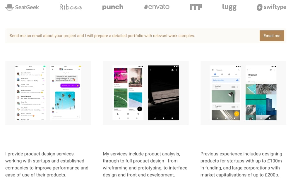
Made by: Ben Bate
Background info: A product designer who often works with startups and large companies in order to create influential electronic products.
What's special: Brilliant copy that snags the visitor’s attention.

The design is made using Bootstrap. Though the visual design is not particularly outstanding, the content more than makes up for it.
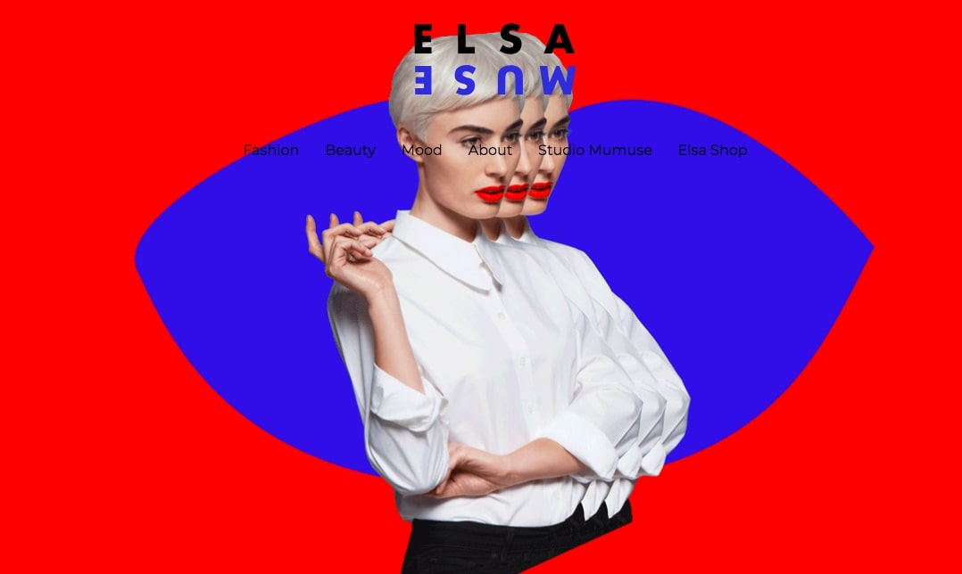
Made by: Elsa Muse
Background info: A French fashion blogger.
What's special: Bold color scheme and textbook-like minimalism.

We have to say that Elsa Muse’s design work is particulary artistic, which is also highlighted on her website. Studying the site design is a good way to broaden your vision, especially in regard to the color scheme and textbook-like minimalism.
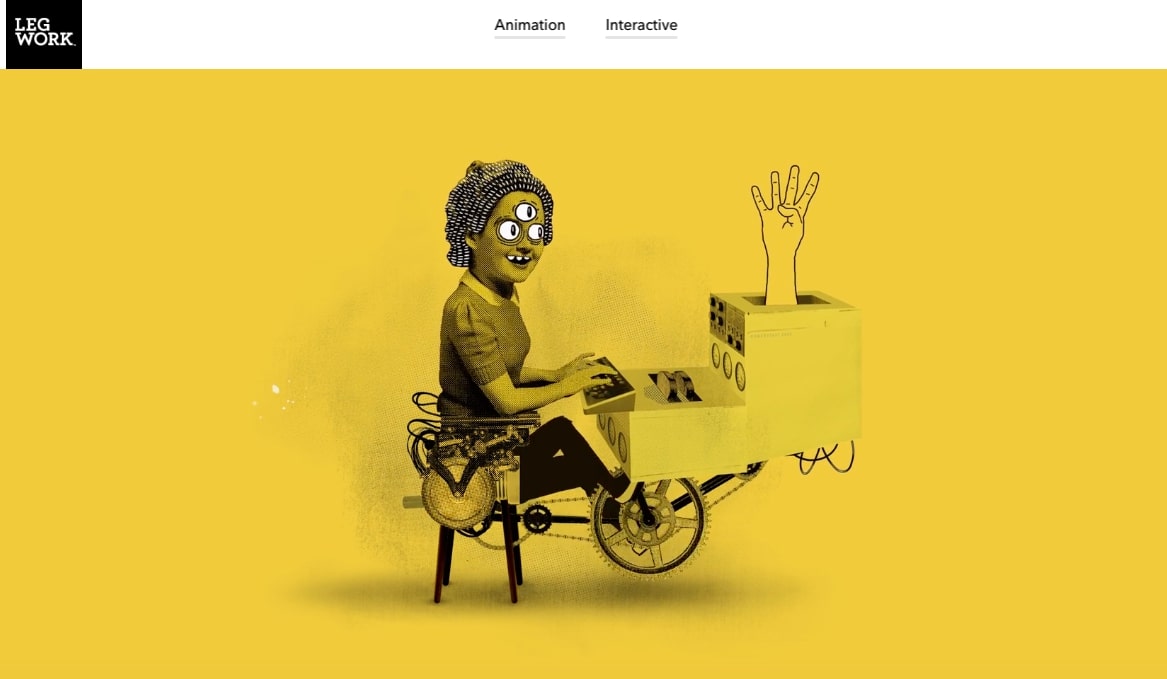
Made by: Legworkstudio
Background info: A personal studio located in Colorado.
What's special: Animations and interactive experiences that you have never seen before.

The animation and the interactive effects combined make this website stand out. Visitors will be impressed by the unique hand-drawn animations on the homepage. The key is that these animations unlike anything you’ve seen before.
Made by: - Lounge Lizard
Background info: A web design company in NYC.
What's special: This site looks unconventional yet professional, exuding confidence and comfort at the same time.

To make a website look professional yet unconventional is not easy, but Lounge Lizard company makes it look effortless. From the brand showcase to the photo display of the workplace, this bar-themed website does a good job of establishing brand identity and promoting company reputation.
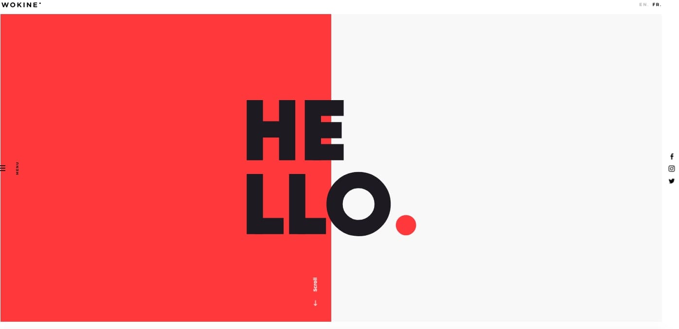
Made by:
Background info: A web design company located in Paris.
What's special: Visual design with split screen.

This website follows a very popular visual design approach – split screen. The overall design of this site is very straightforwardsimple, using a lot of spacing and a simple color scheme. This results in a good visual hierarchy.
Made by:
Background info: A freelance graphics and web designer.
What's special: A lot of graphics and animated techniques.

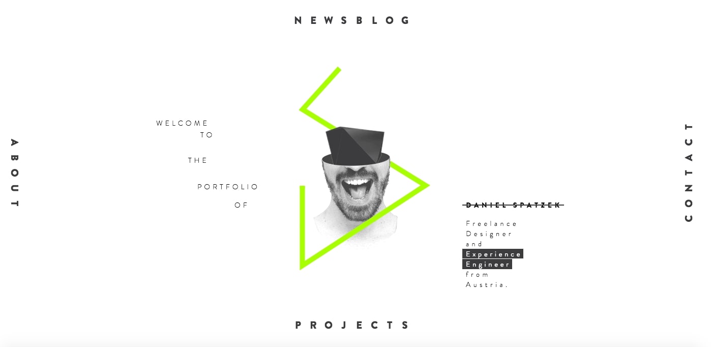
This site uses a lot of CSS technology and animations to create an amazing dynamic experience. Unlike other long page designs, the navigation of this website is distributed in four directions. By deviating from traditional arrangement, the site makes for a refreshing change.
Made by:
Background info: A web designer and developer from Toronto.
What's special: It's a huge personality in a small package.

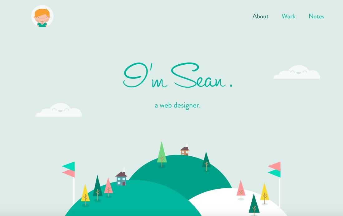
This is a perfect example of a full stack web developer portfolio, which presents both the author’s skills and personality. The entire site looks like a designer’s little green world. Sean also helps others build personal websites.
Made by: Denise Chandler
Background info: A female designer with a solid background in programming.
What's special: Perfectly incorporates the 4 basic principles of web design with personalized elements.

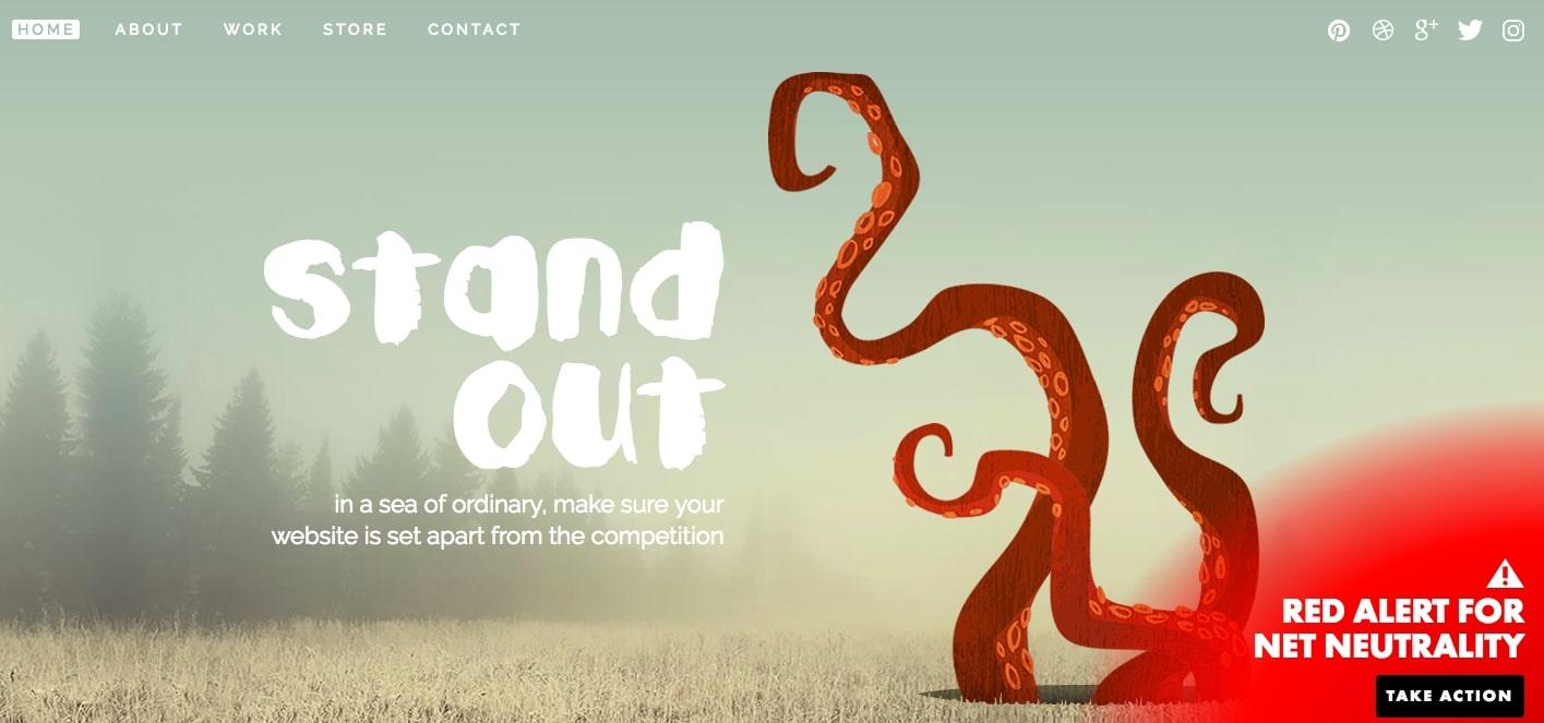
This freelance web developer portfolio perfectly illustrates the 4 basic principles of design: alignment, repetition, contrast, and intimacy. Additionally, it has a lot of personalized elements, making it more eye-catching.
Made by: Yul Moreau
Background info: Digital art director born in Seoul, living in Paris
What's special: Unique atmosphere and dynamic electronic music

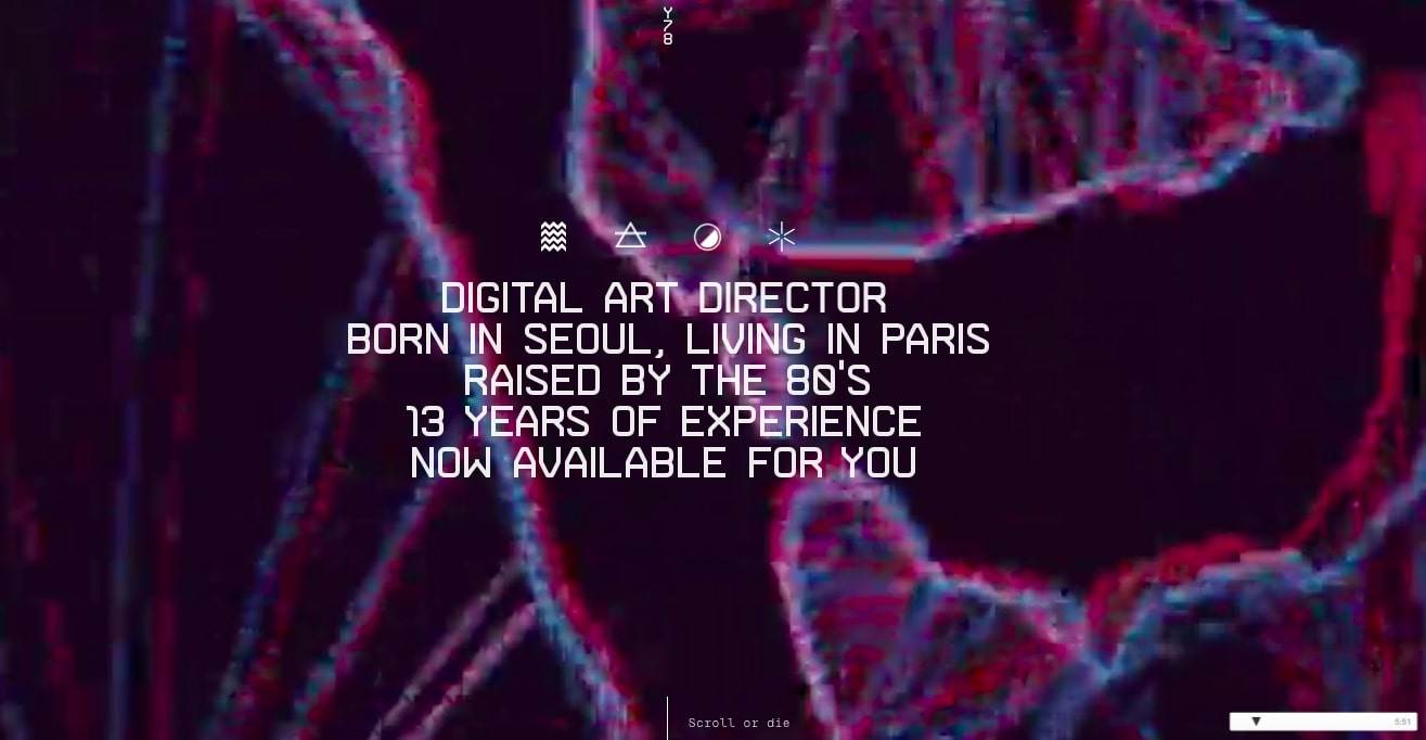
Yul Moreau takes inspiration from the 80s in creating his portfolio website, and it’s a great examples of using visuals to increase user engagement. His experience and skills are displayed expertly by embedding videos, images, and scroll effects in a single page.
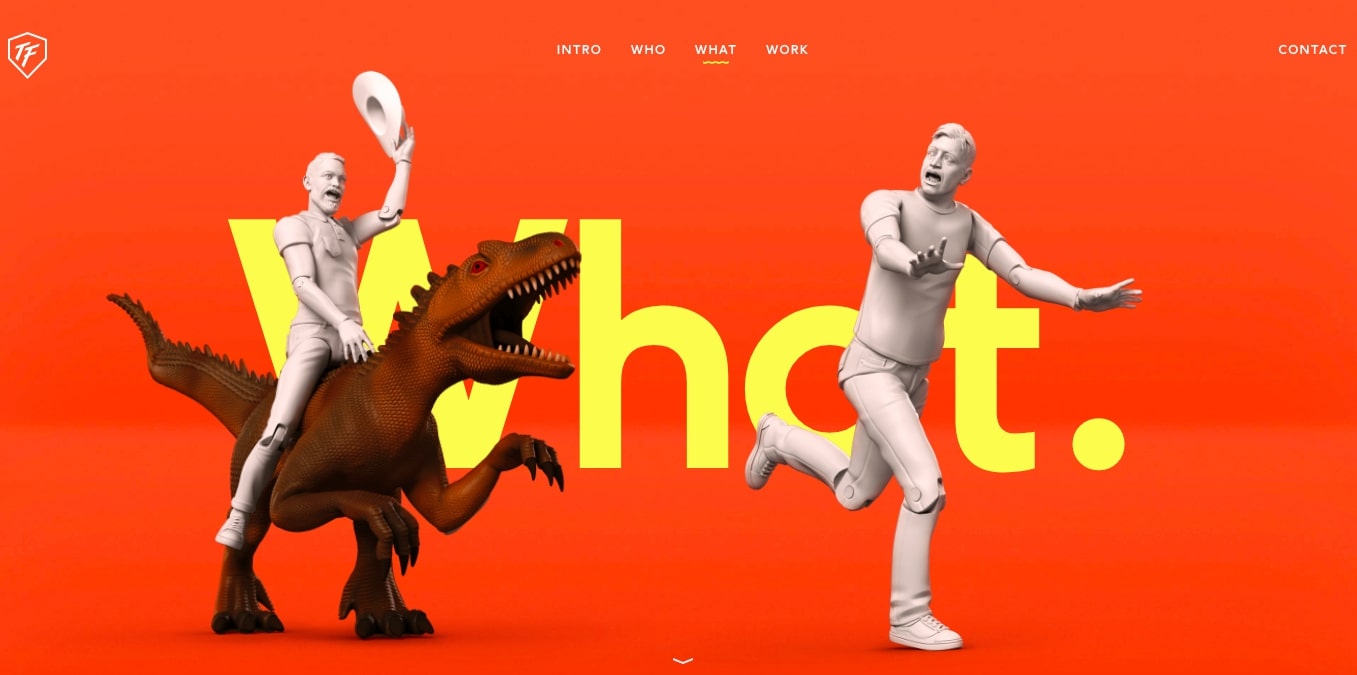
Made by: ToyFight
Background info: They are a team of designers, directors, strategists, and dancers.
What's special: The eye-catching color scheme immediately draws visitors’ attention.

This website uses a combination of vibrant color and minimal design to grab visitors' attention and engage them to keep them longer on the site. The easy-to-navigate menu and minimal style makes for yummy eye-candy and pleasant user experience.
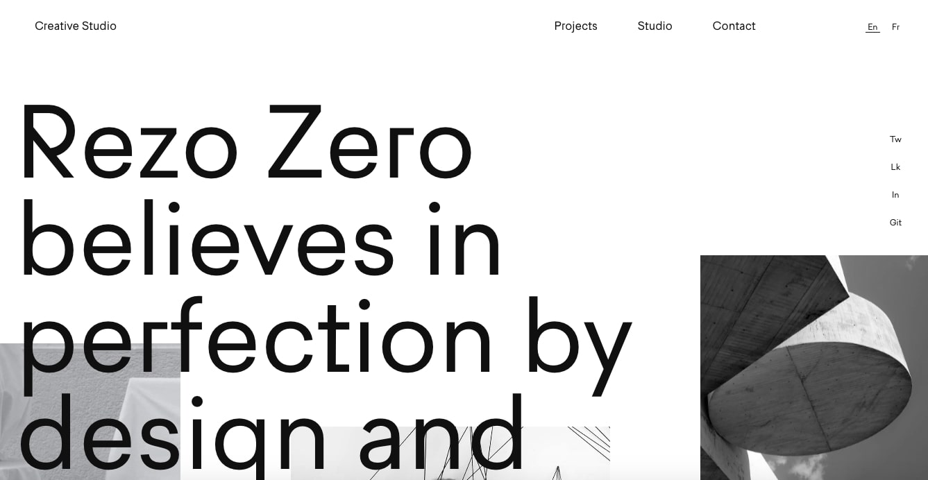
Made by: Rezo Zero
Background info: A graphic and digital studio that designs and develops unique brand identities.
What's special: Rich case studies for various projects.

This portfolio looks like a digital magazine with nicely placed beautiful images and hand-picked typefaces. Its detailed and illustrated case studies for each project gives it an edge over its peers.
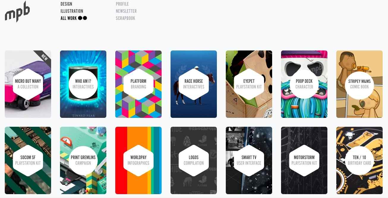
Made by: Tim Smith
Background info: A London-based designer and writer, also a global auto director.
What's special: Easy to navigate and card-based site layout.

This site uses a simple but stunning way to present the designer's portfolios. Combined with the deft use of animation effects, the card-based layout easily engages users.
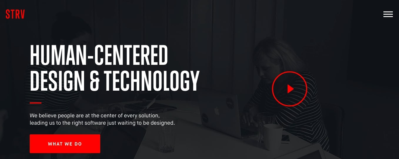
Made by: STRV
Background info: A team of designers and engineers specializing in digital solutions.
What's special: The use of videos presents how the agency works very clearly.

The videos in the background expertly conveys how the digital product agency works. To illustrate, if you click on the play button on the full-screen video, it will display the process in details.
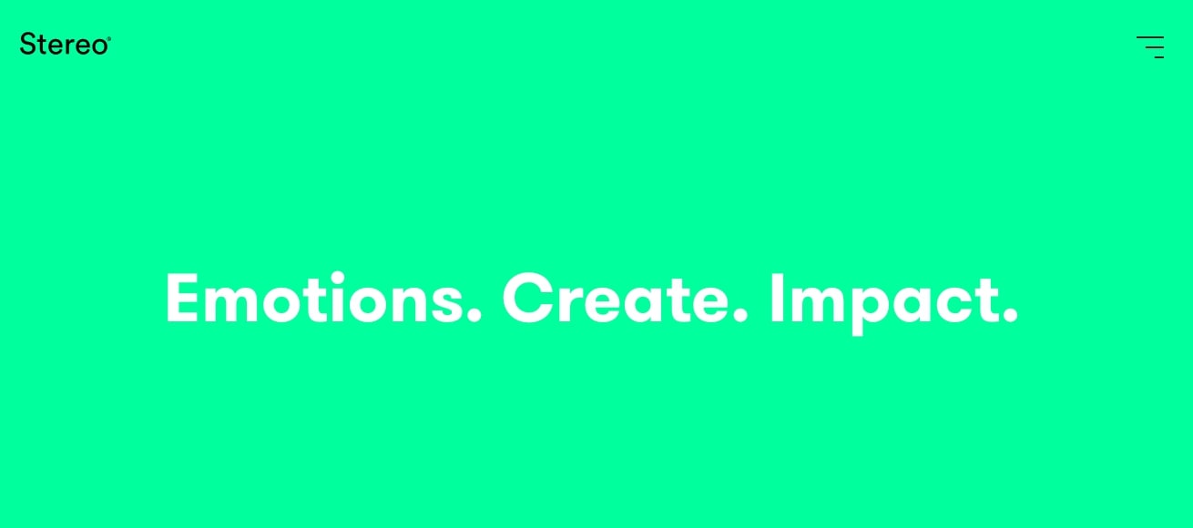
Made by: Stereo
Background info: A team of creative thinkers based in London.
What's special: It focuses on the consumer’s emotional relationship with the brand.

This is a simple yet striking portfolio website. The agency makes use of colorful images and vivid videos at the center of their site to show off what they can do. Its goal is to create a deeper emotional relationship with visitors.
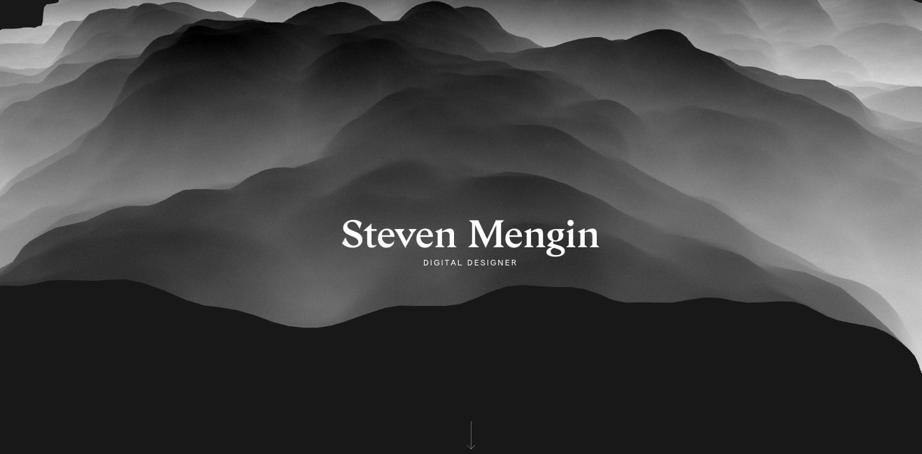
Made by: Steven Mengin
Background info: A London-based digital designer.
What's special: A unique and visually stunning portfolio website.

The use of strong visuals shows what Steven Mengin can do at glance. When a visitor enters the website, he/she will see a beautifully-animated cloudspace effect, with the designer's name at the center. It's quite a joy to watch the subtle animations.
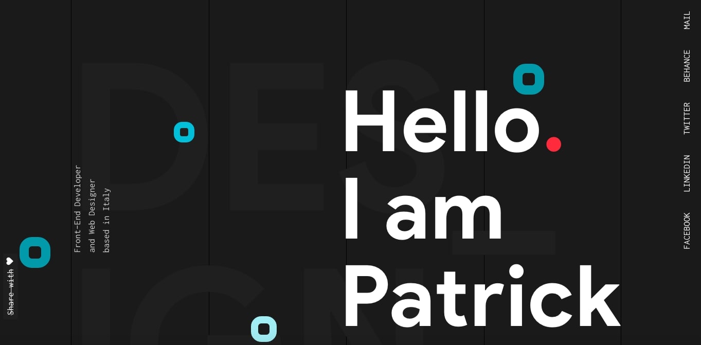
Made by: Patrick David
Background info: A front-end developer and web designer based in Italy.
What's special: This is a typical example of fitting the entire portfolio into a single page.

This is a typical example of a one-page and long-scroll website, simple yet effective. When you scroll down, you’ll see a beautiful hero section and a number of example projects.
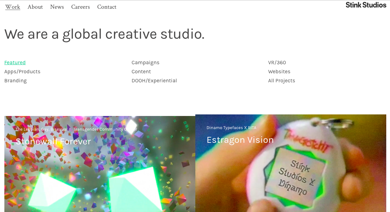
Made by: Stink Studios
Background info: A global company launched in 2009, focusing on advertising, technology, and entertainment.
What’s special: It demonstrates a variety of projects in a clean but creative way.

The studio places their work front and center using a masonry layout. Projects include promo campaigns, websites, and 360/VR experiences.
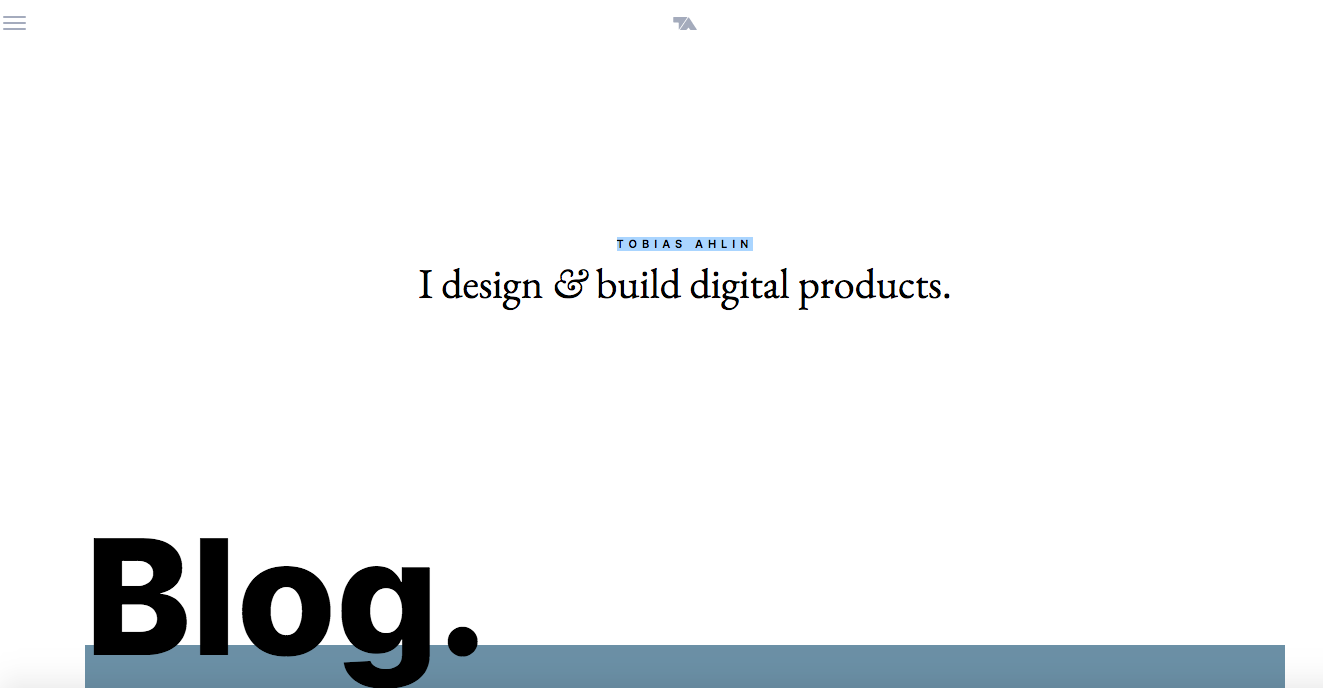
Made by: TOBIAS AHLIN
Background info: A digital designer, speaker, teacher, and consultant for tech companies and startups.
What’s special: It lets the works speak for itself.

At the very center and top of the page, Tobias Ahlin gets straight to the point:, "I design and build digital products". This site uses a card-based and minimalistic layout, with case study links included in the final product.
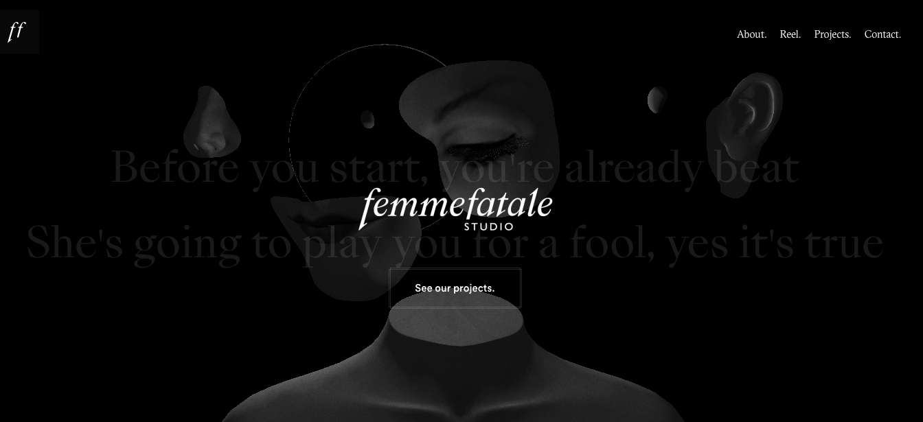
Made by: Femme Fatale
Background info: A creative studio focusing on culture, luxury, editorial, and art.
What’s special: It exudes an alluring sense of luxury.

This site perfectly embodies the team's self-description of "somewhere between sophistication and simplicity". It reflects this tone by using bold imagery, crisp typefaces, and black color schemes - all of which contribute to creating a sophisticated look.
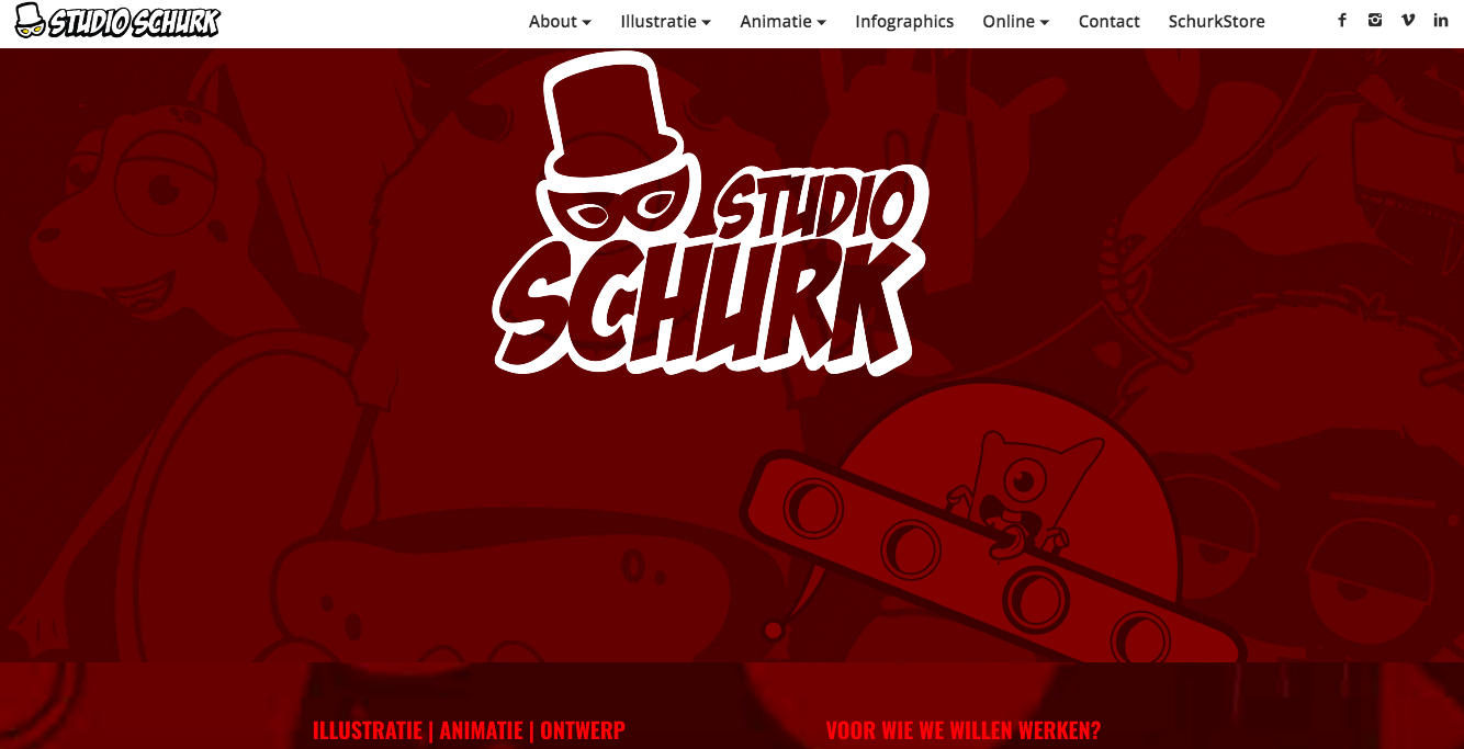
Made by: Wendy Van Veen
Background info: A illustrator, animator, and grafisch ontwerper.
What’s special: It uses illustration and humor to engage more users.

This website gives the users a peek into Wendy's persona. When scrolling down, the users will see fun and interesting animations that show off the designer's talent.
Closing Thoughts
We hope that these hand-picked web developer portfolios will inspire you and ignite your creativity. However, it is good to remember that inspiration or talent will only get you so far. A useful design tool is a must to help you get your work done faster and more efficiently.
If you are looking for a combination of functionality and ease-of-use, then Mockplus is a good choice. Not only does it provide a wealth of web design examples, but it also includes ready-made components/UI elements to get you started on design with the least efforts.
Free prototyping tool for web and mobile app design
Get Started for Free
Free prototyping tool for web and mobile app design
Get Started for Free
Free prototyping tool for web and mobile app design
Get Started for Free


