Nowadays, since internet speed has been highly improved, people can smoothly open a website/app within seconds and get their desired information quickly. However, sometimes, it is unavoidable to let them wait since there is a large amount of data/pages that need to be processed/loaded/downloaded.
In such cases, what are you supposed to do for keeping them stay on the website/app longer instead of leaving directly as a UX/UI designer? How about adding a beautiful, interesting and eye-catching loading animation to retain visitors in your site/app design? But, don’t know how to design such an eye-catching and user-friendly loading gif that makes user enjoy waiting?
Here is our collection of 15 latest and best loading animations for you to get inspiration:
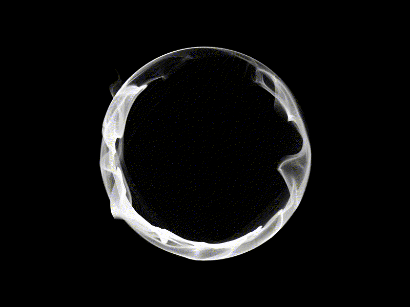
1. Orb animation wip
Designer:Aleksey Tsvetkov
Highlights: Mysterious smoke effects
After entering this page, you are naturally attracted by this rotating circle with mysterious smoke effects and also cannot help watching it for a while? OK! That already perfectly proves how greatly this loading animation is.
What can you learn:
In your design, you can also create such rotating circles/columns with smoke effects to make them different. Of course, you’d better also adopt a black background to strengthen the white smoke effects, if possible. And such designs can make your loading animations extremely mysterious and eye-catching.

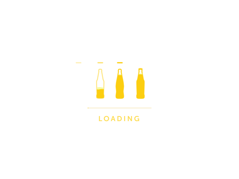
2. Loading Micro Animation
Designer:Nick Buturishvili
Highlights: A good combination of web product features
As a loading Micro animation specially designed for a brewery website, the designer of this animation combines the features of web products perfectly and create an animation that presents the production process of its brewery products.
This can not only arouse the interests of users and reduce their frustration (when they have to wait), but also let users know more about the companies and products in a vivid and intuitive way.
What can you learn:
In your loading animation design, you can also learn to combine the features of web/app products, companies and even brands for impressing visitors, improving user experiences and finally increasing sales, etc.
For example, except showing the production process in your design, you can also dynamically display hot products, company/staff/cultural photos and more interesting events, etc.

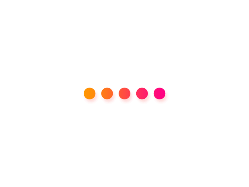
3. Avanti e indietro loader
Designer:Vitaly Silkin
Highlights:Simple position transformation of graphics and beautiful color gradients
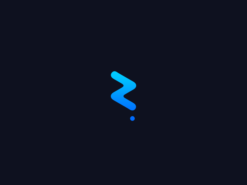
Avanti e indietro loader is trying to attract the attention of users by transferring the positions of graphics in due order. It is simple, intuitive and effective. Moreover, the use of color gradients makes the entire animation more beautiful and comfortable. Of course, it is also a good attempt to enrich the tedious time while users have to wait. (Click to know how to use color gradients in app design)
What can you learn:
In your design, you can also use similar position transformation of different graphics back and forth, right and left as well as up and down in a proper order. Moreover, in order to make your design more attractive and interesting, you can also add some glowing and fluid effects for these dynamic graphics. In short, a clean and simple graphic animation is also able to be fun and attractive.

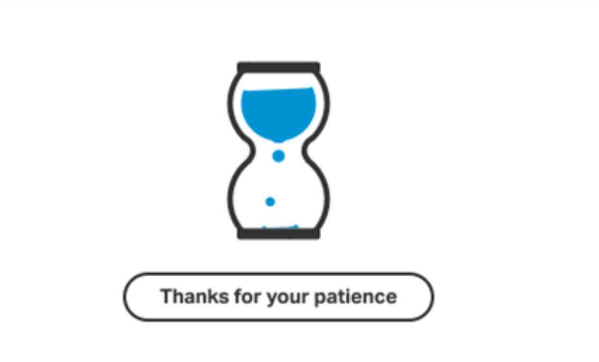
4. Loading Screen Animation - Hourglass
Designer:Makito Ninomiya
Highlights:Vivid hourglass and a perfect combination of animation and microcopy
Hourglass is undoubtedly an excellent example of a perfect combination of animation and microcopy for you. The hourglass themed animation is very effective to attract user attention and narrow the distance between them. And the microcopy saying “Thanks for your patience” is also a deeper attempt to gain users’ understanding and achieve an emotional communication with them.
What can you learn:
In your loading animation design, you’d better also add some well-designed texts to get users’ resonance/understanding and improve user experience.

5. B&W loading animation 9
Designer:Lilian Tedone
Highlights:An excellent combination of shapes, jumping and rotating
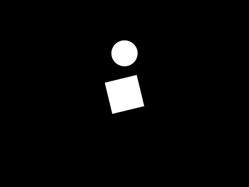
Even though this simple loading animation is merely designed with only one circle and square that is jumping and rotating, that does not mean it is bad and boring. Oppositely, with an excellent combination of shapes, jumping and rotating, this design is very lovely and appealing. Of course, it is also another good shot to let users enjoy the wait.
What can you learn:
In your design, you can also imitate this loading animation and try to use different shapes with jumping, rotating and more dynamic effects or with color and shadow changes, etc., to make your design more lovely and changeable. It is also useful to strengthen the visual effects and improve user experiences of your design.

6. Melting loader
Designer:Vitaly Silkin
Highlights: Interesting fluid and glowing effects
Firstly, Melting loader adopts an excellent fluid effect (for the moving-forward line) which is really a nice attempt to make people naturally cry out “Hey, that line is melting”. It’s cool. Moreover, its black and blue color scheme also makes this “melting” line glowing in the dark which is extremely interesting and unique.
In addition, the infinite and slow extension of this “glowing” line is also a good strategy to soothe users’ emotions and let them wait for a much longer time.
What can you learn:
So, when you are trying to design a loading animation for a website/app, you can also adopt similar fluid, water-drop, melting and glowing effects to make your design more outstanding and eye-catching.

7. Loader of things
Designer:UI8
Highlights: Great nesting patterns and 3D effects
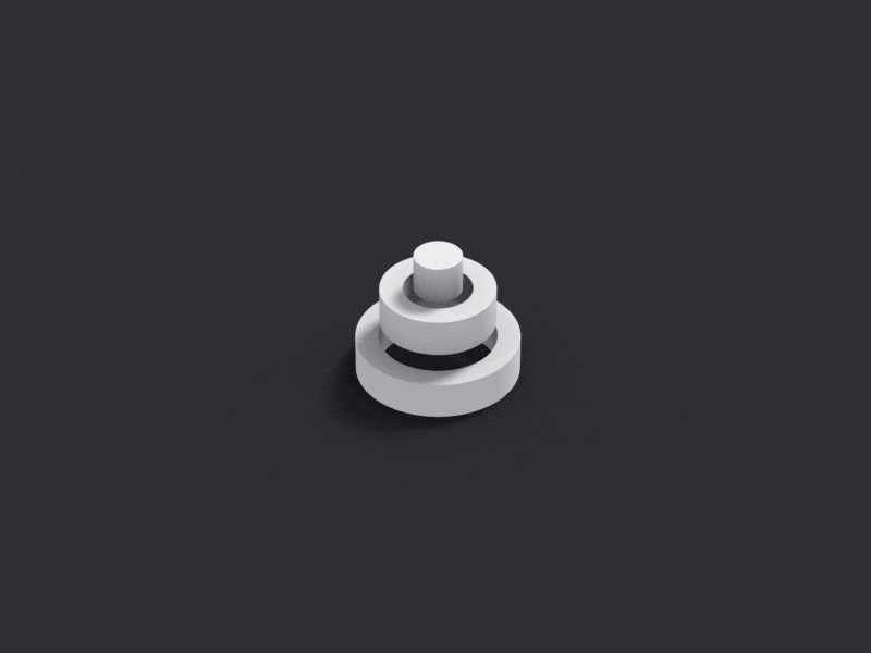
Loader of things adopts a ring nesting pattern, which is simple and smooth. Its 3D effect for these rings also makes the entire design more intuitive and fashionable. And these design skills are really worth trying in your design.
What can you learn:
So, as with your design, you can also adopt a similar nesting pattern to make your animation more changeable and flexible. The intuitive 3D technology is also worth imitating to enhance the visual effects and user experiences of your gif design.

8. Preloadeer Animation
Designer:Rodetyo Prast
Highlights:Lovely illustration style and an interesting combination of Christmas features
This Preloadeer Animation adopts a lovely illustration style that is beautiful and unique. Moreover, it also perfectly combines the features of Christmas and takes a cute reindeer as its main part. So, this loading animation is really ideal for some children-targeted online courses (especially some painting courses), online shopping and more similar websites/apps made for children to make an attractive Christmas column.
What can you learn:
So, you can also choose a festival theme and appropriately add some festival elements, such as festival customs, stories, events and typical figures, to create a much more interesting and distinctive loading animation.
If possible, also combine the features of website/app products to make the entire design more unique and useful. In short, no matter which skill you will choose finally, all of them are good attempts to grasp users’ attention and ease their anxiety when they have to wait for the web/app data processing/downloading/loading.

9. Loader Animation
Designer:Burhan Khawaja
Highlights:Multi-screen display pattern, color gradients and rotating effects
Unlike some common loading animation with only one screen to show all dynamic shapes/illustrations/graphics, this Loader Animation adopts a multi-screen display pattern, which makes it really cool and eye-catching. Moreover, the use of color gradients and rotating effects also makes this design more gorgeous and dazzling.
What can you learn:
While making a loading animation for your app/website, you can also adopt such a multi-screen display pattern in combination with the change of colors, dynamic effects and shapes to improve your design.

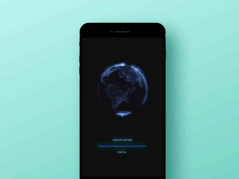
10. Loading screen visual for app
Designer:Nguyen Tran
Highlights:Color contrasts to create a cool sci-fi visual effect
As a loading animation especially designed for android/iOS mobile app/web, this Loading screen visual for app showcases a light blue rotating globe and moving-forward progress bar in the black background. And such color contrast creates a sci-fi visual effect, which is cool and fashionable.
What can you learn:
So, you can also use similar color contrasts and add an intuitive progress bar to create a cool sci-fi visual effect for your iOS/android loading animation.

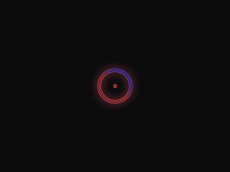
11. Loading animation
Designer:Alex Sailer
Highlights:Rapidly number changes for a better user experience
The worst thing that users are afraid to encounter while waiting is that the loading interface offers no information and also never changes. They just feel lost in infinite darkness and cannot help leaving.
And fortunately, the designer of this animation realizes this psychological fact of users and especially add quickly rotating color bars and rapidly changing numbers to tell users that this web/app is processing their problems in the background quickly. This Loading animation is really a nice shot to offer users a much more pleasant experience.
What can you learn:
In your design, you can also imitate this animation and add some changing numbers or moving progress bar to retain users and improve user experience.

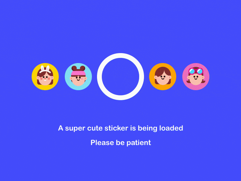
12. U3D loading animation
Designer:Alex Sailer
Highlights:Directly displaying loading contents
The most creative part of this loading animation is to dynamically display the loading contents of the original web/app.
U3D loading animation is really informative and lets user forget the dullness of waiting. Moreover, showing some cute and colorful stickers to attract users’ attention is also very interesting and effective. The color changes also make the entire design more changeable and appealing.
What can you learn:
In your animation design, you can also directly present the interesting loading content to arouse users’ interests and keep them stay on the website/app for a much longer time.
For example, when you are trying to create a loading animation specially for a UX/UI design portfolio, you can directly introduce the author or present the UX/UI design photos in loading animation, such as showcasing some author photos, interface design photos and more.

13. Spinning Spiral Geometry
Designer:Danny Perry
Highlights:Smart rotation of color bars
The rotating of color bars is already very cool and impressive. And when you add more rotating patterns for these color bars, the entire loading animation could be more variable and attractive.
What can you learn:
So, you can also use color bars and design more rotating patterns for them to make your loading animation more impressive and distinctive.

14. Loading animation icons
Designer:Zach Roszczewski
Highlights:A splendid combination of different icons
Loading animation icons dynamically presents some icons to attract the attention of users. This is simple and interesting.
What can you learn:
When you get no idea about how to design and improve your loading animation, you can learn this animation and try to dynamically showcase a series of highly-used/typical icons in your website/app to make it different. Moreover, when you display them in combination with the change of rotating patterns, colors and positions, your loading gif is also able to be unique and excellent.

15. Glowing loading cube
Designer:Graig Mederios
Highlights: The use of company/product logo and the glowing effect
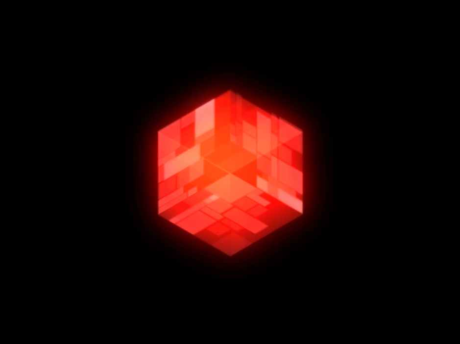
Glowing loading cube straightly presents the process of how to create a 3D logo of web/app company or product. This is very cool and intuitive. And the glowing effect of this 3D logo is also effective to grasp the attention of different users.
What can you learn:
In your design, you can also make full use of the company/product logo.

In short, no matter whether you are trying to make a loading animation for a web/android/iOS app, I hope this collection of 15 latest and most creative loading animations can be inspiring enough for you.
Mockplus Helps Make, Test and Evaluate a Web/App Loading Animation Easily and Quickly
No matter how cool and attractive a loading animation is, it is still a part of a web/app and can only be accurately tested and evaluated after it is nested back to a web/app. So, are you urgently looking for a proper prototyping tool that can not only help you create a web/app prototype soon but also easily and quickly embed a loading animation and test its feasibility and effectiveness accurately?
OK! Mockplus, as an easier and faster design and collaboration tool, can not only translate your ideas into interactive prototypes within 10 minutes but also help you easily test, share and evaluate a web/app with your loading animation embedded:
Step1. Mockplus helps create a web/app prototype with loading animations easily and quickly
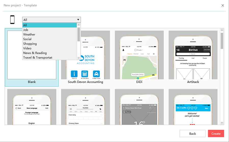
1). Use built-in samples and templates to make a required web/app prototype quickly
Only need a proper web/app prototype that can quickly embed your loading animation to test its feasibility and do not want to make this prototype from scratch?? All right! Mockplus offers many built-in and well-designed samples and templates to help you make a web/iOS/android prototype with ease. What you are supposed to do is only importing the desired one and edit it as you wish.

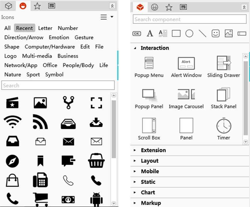
2). Use powerful component and icon library to easily create a required prototype manually
Want to make a more suitable web/app prototype manually so that you can test your loading animation more accurately as a professional and serious UX/UI designer? Mockplus also offers powerful features for you to create and improve a prototype easily and quickly, such as its powerful component and icon libraries, smart interactions, diverse popup options and more. Moreover, there are also many new features that are really worth trying.

3). Use GIF components to embed your loading animation as you wish
After completing a web/app prototype, you can also easily drag and drop GIF components of Mockplus to embed your loading animation as you wish. It is really simple and convenient to add your loading animation to any interface or location.
Step2. Mockplus help test the feasibility and effectiveness of loading animation easily
1). Use 8 ways to test and share a prototype for quickly collecting feedback
Mockplus offers 8 ways to test and share a prototype. And this is really convenient for designers to test and share their projects with loading animations as well as collecting feedback quickly.
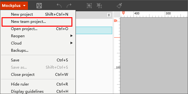
2). Use team collaboration to edit and improve your loading animation collaboratively
Want to get more inspiration and feedback from other UX/UI designers? Mockplus offers team collaboration which allows designers to edit and improve a prototype collaboratively. And it is also a good choice for designers to edit and improve a loading animation collaboratively.

Overall, no matter whether you are trying to create a prototype or test the feasibility and effectiveness of a loading animation easily and quickly, Mockplus is absolutely your best choice.
Wrap Up
Loading animation, as an important element to make a web/app beautiful, interesting and outstanding, also plays an essential role in improving user experience and keeps them stay on the web/app for a longer time. So, in the actual design, you’d better make full use of every loading animation to stand out your web/app.
Overall, hope the introduced 15 latest and most creative loading animations can inspire you anyhow. And the mentioned prototyping tool, Mockplus, can also help test and improve your loading animation as you wish.
Free prototyping tool for web and mobile app design
Get Started for Free
Free prototyping tool for web and mobile app design
Get Started for Free
Free prototyping tool for web and mobile app design
Get Started for Free


