iOS 11 was announced and the first beta version released to developers at the Worldwide Developers Conference on June 5, 2017, and the stable version for consumers was released in most countries on September 19, 2017. Compared to iOS 10, is there any special change in the UI and interaction in iOS 11? iOS 11 vs iOS 10, which is better? Let's take a look.
Homepage

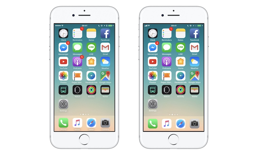
iOS 10 vs iOS 11: Homepage
The whole iOS UI design takes a smoother change. The navigation on the upper left corner has changed significantly from small dots into a classic signal bar. The APP name has been removed in Dock, application name font gets bolder, that makes app relatively clearer and easy to read.


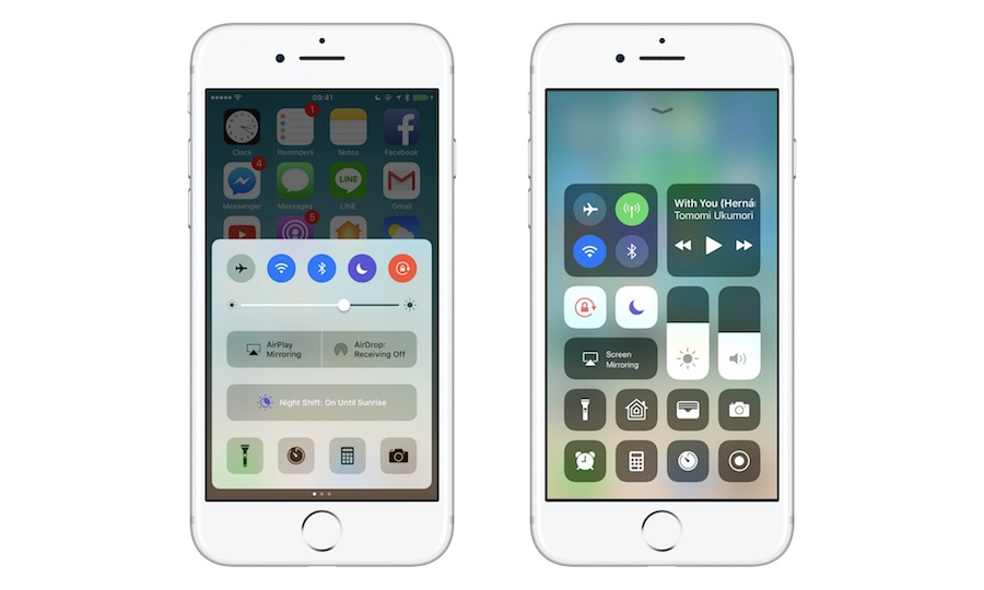
iOS 10 vs iOS 11: Control Center and Voice
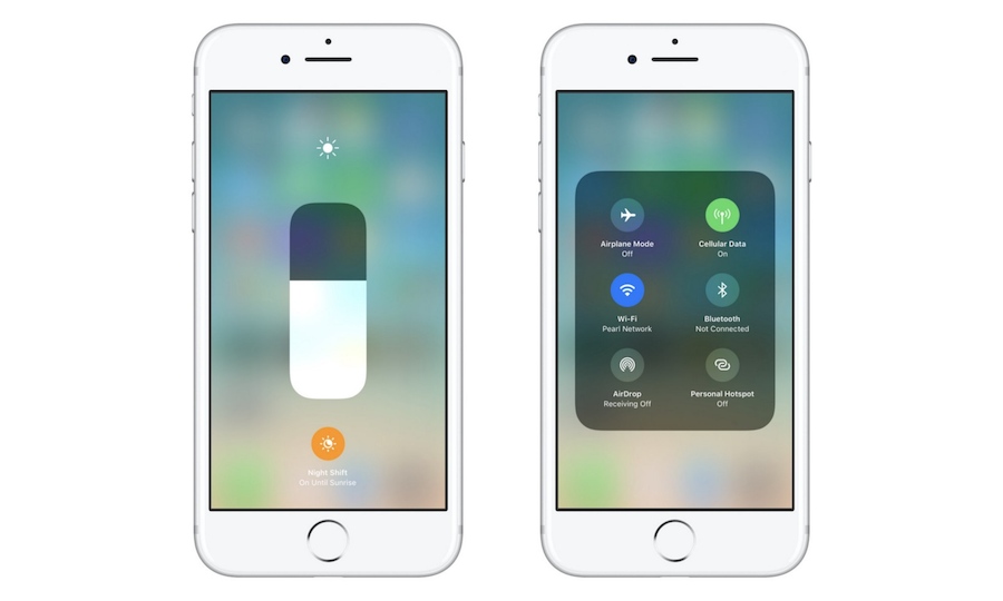
Adjustment in Control Center is one of the biggest bright spots in iOS 11, the user can customize the commonly-used function blocks, and brightness and volume can be adjusted through the 3D Touch, the control bar changes from the horizontal to vertical columnar, saving the area of the control center. The layout becomes more reasonable and refreshing.
Icons

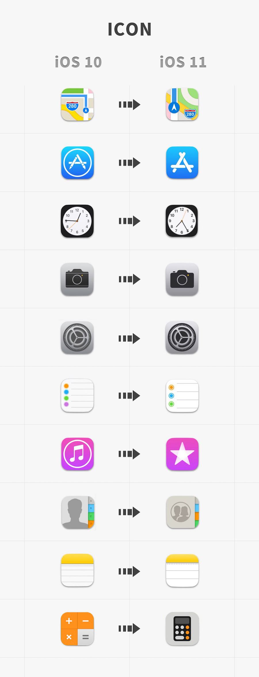
iOS 10 vs iOS 11: Icon
There are 10 icons with obvious changes: Maps, App Store, Clock, Camera, Settings, Contacts, Reminders, iTunes store, Contacts, Notes and Calculator. These changes on Maps, Clock, Camera and Contacts are more user-friendly.
The classic App Store icon has undergone important changes, the original pen and ruler, expressing the nature of "tool", now have changed into three sticks, forming a triangle represents a stable structure, it is more likely to emphasize the relationship between App Store, developers and users.

iOS 10 vs iOS 11: App Store
And Calculator‘s icon changes more thoroughly, from the flat style to rounder, we infer that Apple pays it's respect to the early iPhone OS.

iOS 10 vs iOS 11: Calculator
There are some other icons also carrying out corresponding changes, the whole becomes simpler and contrast becomes deeper, matches the overall style of iOS 11. You can also find vector icons for iOS here.
App Store
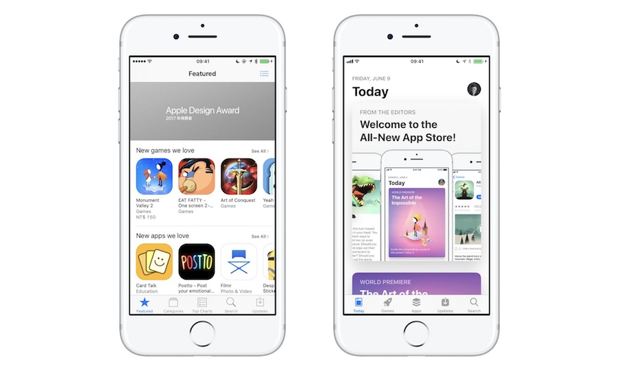
App Store's new design highlights the card view, with using a large area shadow, enhancing the page hierarchy and contrast. This bold layout enhances the App Store's sense of design and art, highlighting the hierarchy and navigation.

iOS 10 vs iOS 11: App Store Homepage Card View
Notification

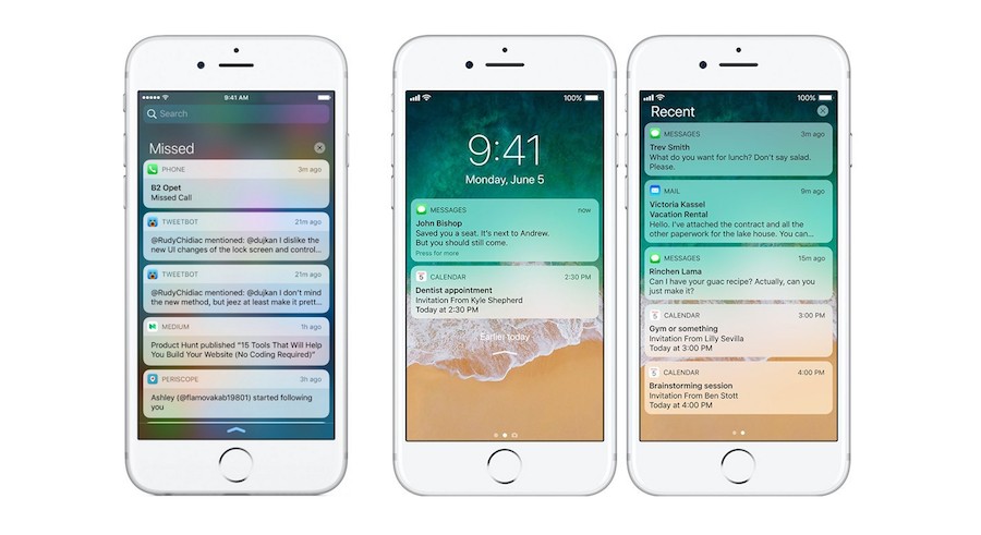
iOS 10 vs iOS 11: Notification
In the new notification, when we slide down notification from the top bar, the background is no longer using glass blur, same with the lock screen, which retains the time and date on top; when the screen switches vertically.
Time and date will be presented on the left side, the right side is placed with notification information, design style and control center unifies modular design style, compared with iOS 10 it becomes more concise and generous, more in line with the use of habits, space utilization is more reasonable.
Lock Screen

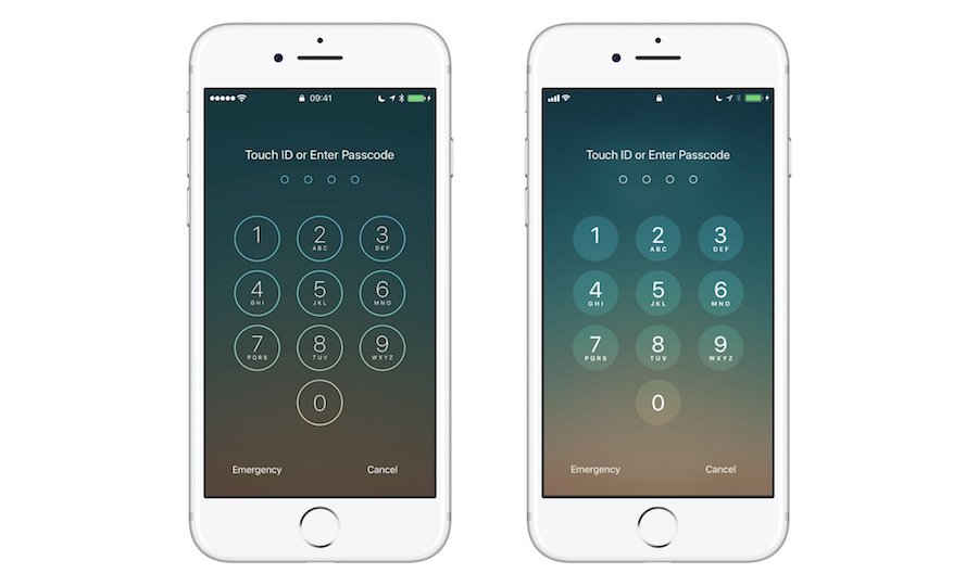
iOS 10 vs iOS 11: Lock Screen
The numeric key of the lock screen in iOS 11 becomes solid, and this design improves the readability of the interface and reduces the interference and impact of the thin frame and thin lines on reading.
In addition to the iPhone, iOS 11 for iPad's performance can be described as very stunning, especially in terms of interaction, iOS 11 makes iPad a new look.
New Dock

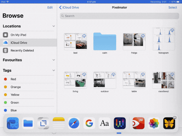
Dock in iOS 11
The biggest change in iOS 11 for iPad is the update of a new Dock, similar to the experience on the MacOS Dock. First, the Dock can display up to 15 applications, and the recent use of the three applications will show in the Dock on the right of the partition, and application in Handoff will appear in the Dock on the far right.
The new Dock can be called out from the bottom, which replaces the previous control center. It is worth mentioning that, when an application is already launched, we can call out Dock from the bottom of the screen and open an application, drag it to the interface, the application will be on the right side of the interface with the form of hover box

Dock in iOS 10
The combination of the new Dock and the suspension window solves the problem that under the split-screen state in iOS 10 you can only slide through the application list to find the application. The biggest difference with Slide Over in iOS 10: While the main application is unavailable using Slide Over in iOS 10, now you can interact and manipulate the main application while operating the hover box, greatly improving the experience.
App Switcher

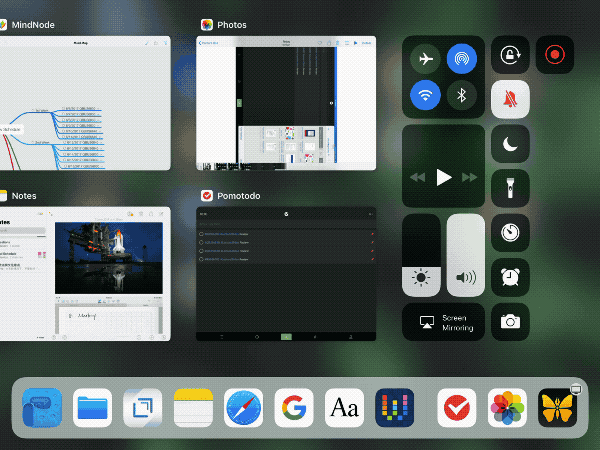
App Switcher in iOS 11
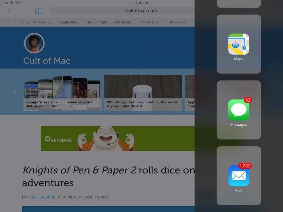
What makes me most impressed is more than that I finally no longer feel hard to double-click the Home button to call out homepage. After calling out the Dock from the bottom of the screen I can continue to open App Switcher.
The whole process is very smooth, which not only reduces the discomfort due to the sudden switch to the physical operation, as well as enhances the sense of immersion using the system. If you want to return to the homepage, it's unecessary click the Home button, just click the blank area in App Switcher.
Drap & Drop

Drap & Drop in iOS 11
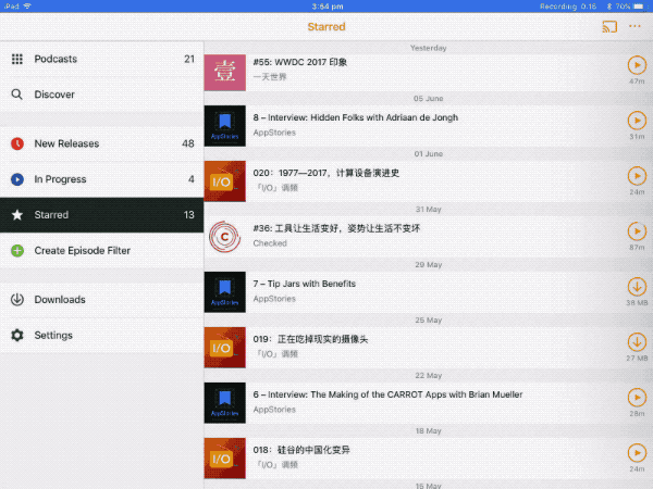
Drag and drop with file have finally been achieved in the iPad. You can drag and drop files from the hover box easily. Simply drag out the selected files and then they will form as a stack that can be easily drag to the main app in batches,
Secondary menu

Secondary Menu in iOS 11
Another point worthy to be mentioned is the new secondary menu. So far, iPad has not yet supported 3D Touch yet, but the similar effect of 3D Touch can be achieved by long pressing on apps or through control center.
After analyzing the difference between iOS 10 and iOS 11, we can see that iOS 11 mainly enhances the overall sense of the line, the fonts and icons both have been deepened and bold, the contrast is higher. All the changes represents a calm evolution and fine-tuning of the user experience.
iOS 11 for iPhone is more smooth, which focuses more on the details of the visual effects and operating experience; and iOS for iPad can be said to be remarkable, especially on interaction, not only making iPad a more productive device but also allow developers to gain greater freedom and platform, making iOS application ecosystem more efficient and practical.
With iOS 11, you can deliver more powerful, user-friendly apps than ever before. As is known, to do good work must first sharpen his tools, I collect some useful tools for you, which can make your work more efficient.
Tools for iOS 11 design
(1) Sketch
Sketch is a vector drawing application on Mac. Compared with Photoshop, Sketch is much lighter and simpler. A wave of enthusiasm for prototyping with Sketch has swept recently because it is very easy to design mockups. With its rich component library, Sketch could produce prototypes more realistic, more conducive to the communication and presentation.
iOS Human Interface Guidelines has updated the official UI Kit for iOS 11, which can be adapted or iterated to your product in Sketch after a careful reading of the design specifications.
(2) Mockplus

While interaction is the soul of a prototype design that is the most intuitive way to show the logic and ideas of a prototype.
After designing in Sketch, If we want to continue to make interaction design and team collaboration, it is recommended to install the Mockplus plugin in Sketch. Once you completed design in Sketch, you can export it as an MP file and make Sketch prototyping in Mockplus, which allows designers collaborating and adding annotate with team members.
After comparing iOS 11 vs iOS 10, we can see that iOS on both the interaction or UI maintains innovation and power. In addition, we should also see the human spirit and user experience behind Apple. In the product design process, we should also keep the product calm and smooth, making the product fresh and vivid.
Free prototyping tool for web and mobile app design
Get Started for Free
Free prototyping tool for web and mobile app design
Get Started for Free
Free prototyping tool for web and mobile app design
Get Started for Free


