Nowadays, increasing numbers of UX/UI designers are adding interactive and animated elements, like hover states, audio or video media, scrolling interactions and more, to their websites in the hope that the interactive features will attract and encourage more site visitors to read and engage with the site contents.
The success of these sites explains why interactive design has become such an overwhelmingly popular trend in current website design.
However, achieving a good interactive design for your website is not as easy as you might imagine. How can we combine these commonly-used interactive and animated elements together more wisely to create an unforgettable interactive website? First, you should always keep the interactive prototyping tool in hand to test the interactive features without sacrificing usability.
And, Take a look at this list of 25 latest and best interactive website examples for your inspiration:
1. Visit Humboldt

Visit Humboldt is a wonderful interactive website that lets visitors learn all about Humboldt county, which is a wonderland from fairy tales.
Designers use whimsical navigation to help visitors explore the place and pin locations freely as they wish. A series of full-screen videos and beautiful background music also make the entire website irresistible for visitors.
Once opened this website, just free up yourself, follow the magic to explore this wonderland and enjoy your journey.
Sounds too good to be true? Try it yourself and you won't be disappointed.
2. Pierre Herme Nicolas Buffe

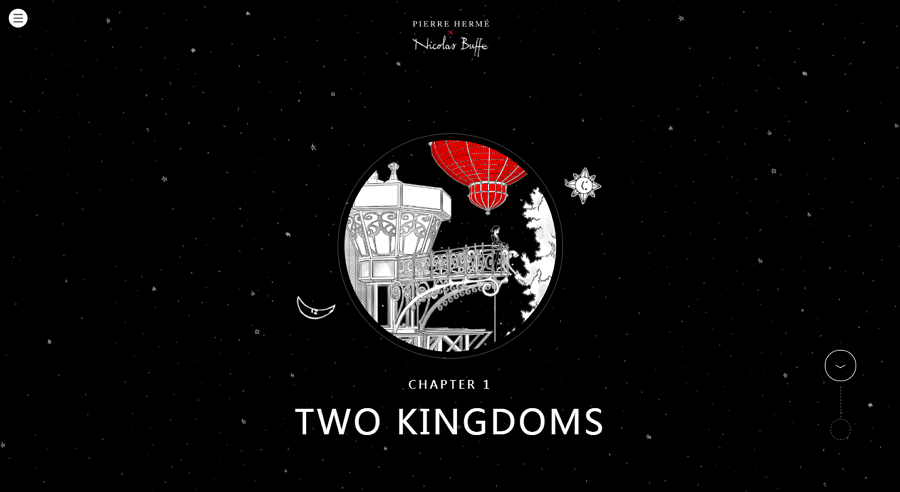
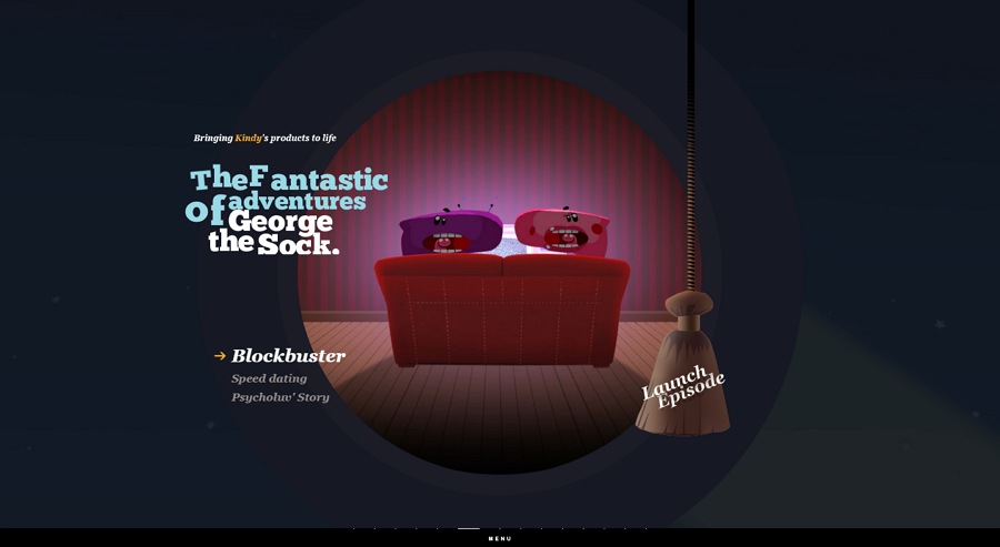
Pierre Herme Nicolas Buffe is an interactive storytelling website that allows users to explore the story (called “A Story of the Kingdoms of the Moon and the Sun”) with simple drag-and-drop. Its fancy scenes, a large number of vivid animations, eye-catching illustration design style and perfect micro-interactions leave visitors in a fantastic adventure within these two opposite kingdoms.
Reading this story is anything but boring. This interactive website gives you a unique experience.
3. The Cool Club

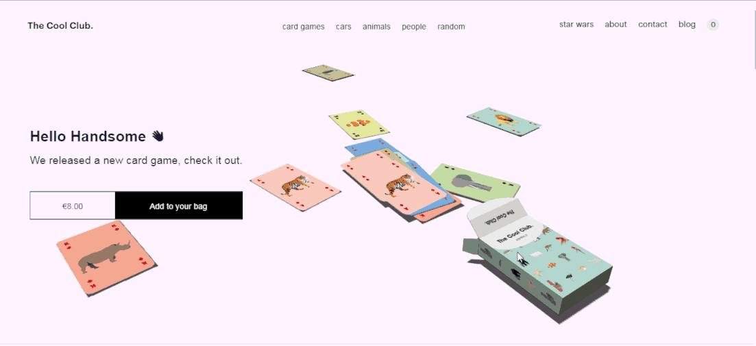
The Cool Club is an interactive website with many tantalizing micro-interactions. Click the card box on the Home page to try a new card game personally. Also hover over the card boxes at the bottom of the screen to get different themed playing cards.
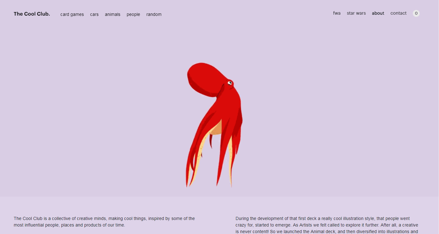
This website boasts a series of interesting hover effects along with many cute dancing animal animations. You won't be able to tear yourself away.

4. Interactive Music Video

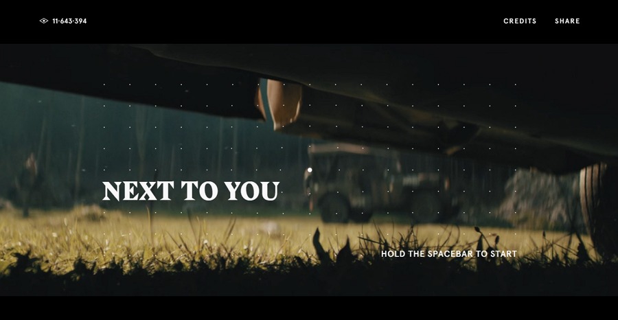
Interactive Music Video is an interactive music video website. Unlike most music websites that allow users to add and listen to different songs with different listening modes, this interactive website enables visitors to listen and interact with the music by simply holding down the “Spacebar” key. Also set the music progress & language, and download the desired music freely there.
Various small animations also help improve UX.
5. Residente

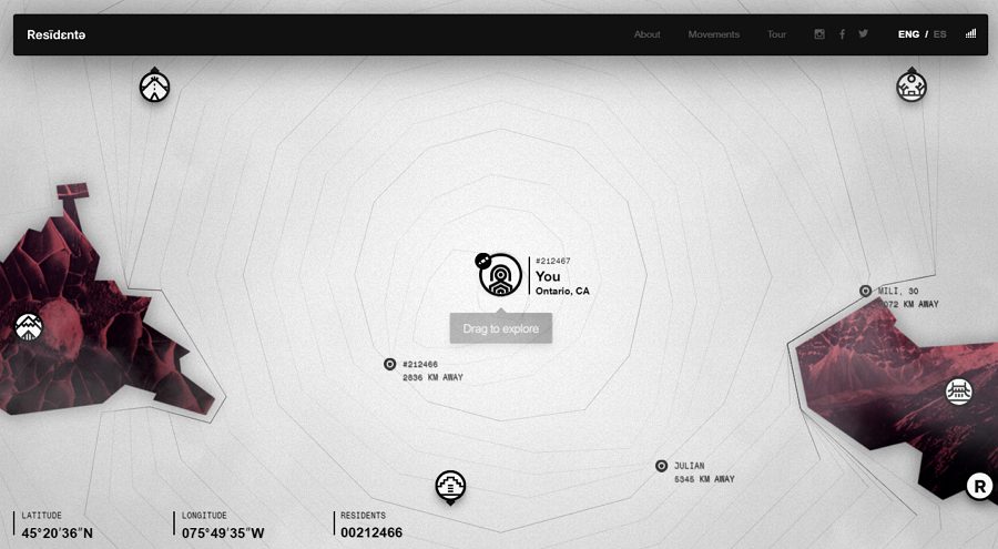
Residente is an interactive website made by a musician – Resident. This website shares his travels around the world and features an interactive map that allows visitor easily locate the position to view details of his travel stories and photos as well as listening to different music.
The site features an excellent vertical linear navigation bar that is also very intuitive and easy to use.
6. Style Novels

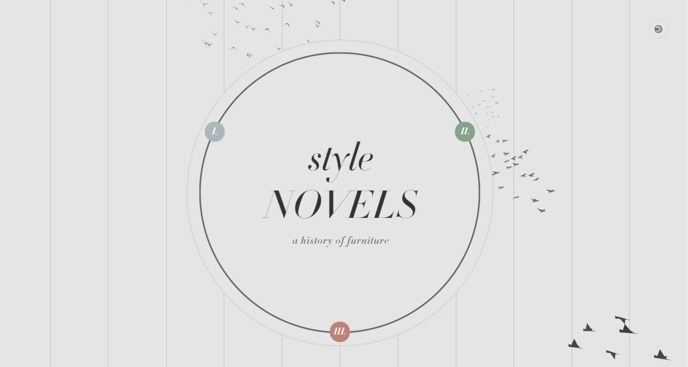
Style Novels is an innovative furniture website featuring some beautiful animations and high-quality photography. Unlike most furniture websites which display the furnitures with simple photos and descriptions directly using grids or card designs, this website has been designed with a user-driven navigation system which enables visitors to explore different products according to their own needs.
Related article: 15 Best Examples of Popular Card UI Design for Your Inspiration
7. Villes Paysages

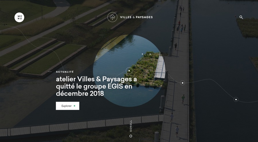
Villes Paysages is an interactive architecture and urban plan agency website that features an outstanding “map” navigation design. Visitors can easily drag and drop the focus on the map to locate and view their desired agency projects. Many hover effects and page transition effects are used which are worth learning and imitating for designers.
8. Nurture Digital

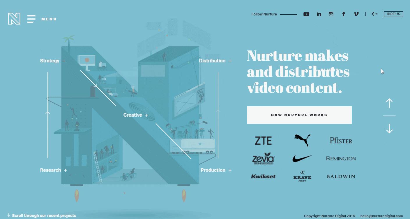
Nurture Digital is an interactive portfolio website for a digital product agency. Except for some gorgeous interactions, animations and videos, this website uses rich colors, which really grab the users’ attention.
Related article: 7 Best Practical Tips for Creating UI Color Schemes
9. Black Negative

Black Negative is an interactive digital design studio website that allows designers to view different projects using horizontal scrolling, rather than the common vertical scrolling. The navigation bar at the bottom is very creative and user-friendly.
10. Renaud Rohlinger Portfolio

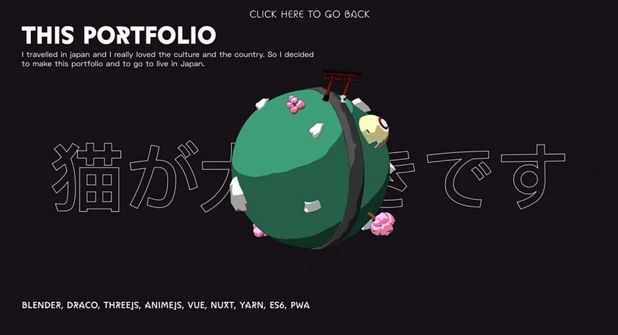
Renaud Rohlinger Portfolio is an interactive developer portfolio website that allows users to follow a cute cat with simple clicks through different design projects. While browsing the website, visitors are just like in a 3D game. You can not fail to find it fascinating.
11. Resn

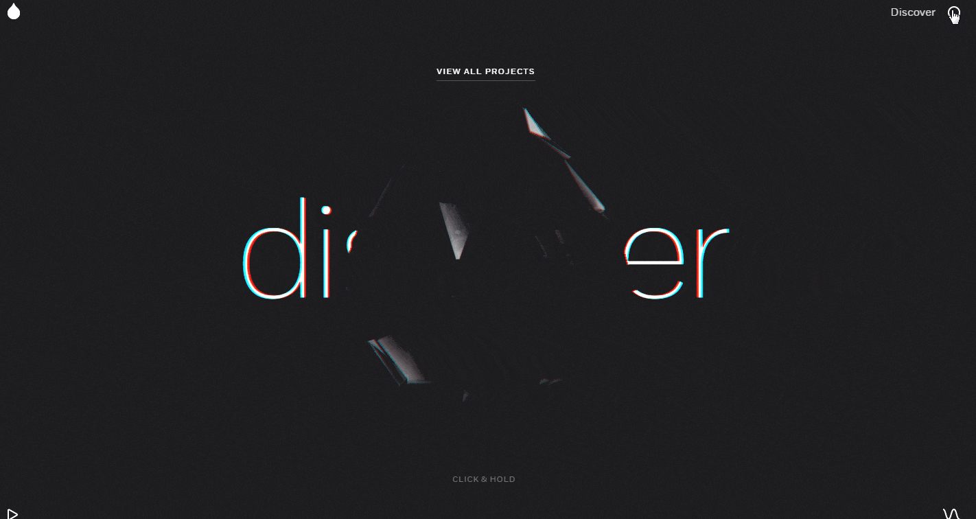
Resn is an interactive design agency portfolio website that features a 3D crystal diamond. Visors can easily rotate the crystal diamond to view all the agency's projects and to switch website pages. It also offers a range of cool page transition effects, such as the trendy fluid/shaking/rotating effects and many more.
The minimalist design style and high-end back & white color scheme help it to stand out from other agency websites.
Related article: Top 10 Free Online Portfolio Websites to Create Perfect UX/UI Design Portfolios
12. Ocean School
Ocean School is an interactive adventure website that allows visitors to explore and learn all about the oceans by scrolling mouse. It is packed full of different ocean-related designs, including the 3D images of marine animals, the fluid effects and animations, and the blue & white color schemes, etc.
It has a linear navigation design on the right side of the screen, which makes it much easy to get around.
13. Hi Fly

How about following this website to fly in the sky? As a leading airline website, the moment when you enter this Hi Fly website, the fly journey gets started immediately. Simply follow the interactive guide to choose the aircraft you want, your desired aircraft route, and all the services you usually only dream about.
The interactive aircraft models, introduction videos, and small animations make it a memorable website to visit.
14. Navigator

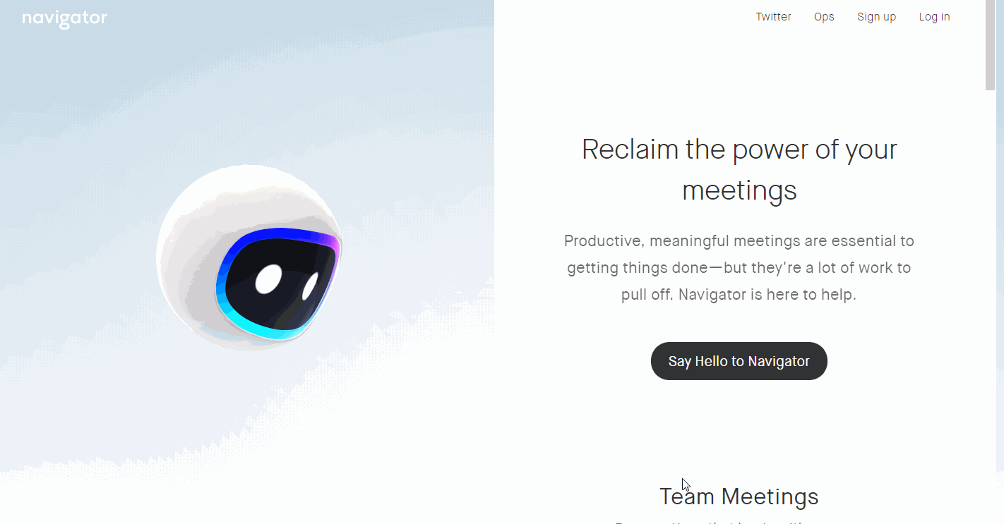
Navigator, as a teamwork assistant site, is a clean and interactive website, which can help people run productive and meaningful meetings with simple conversations. It features an interactive and super cute robot on the Home page.
With a two-column design, this site is very easy to use.
15. Syriastories Arkivert

Syriastories Arkivert is an interactive website to call on people to help others. It uses 28 videos to show what life is really like for people in war zones. Supported by powerful copy designs, these videos are genuinely moving and touching. The minimalist design style also adds to the power of the message.
16. APPS
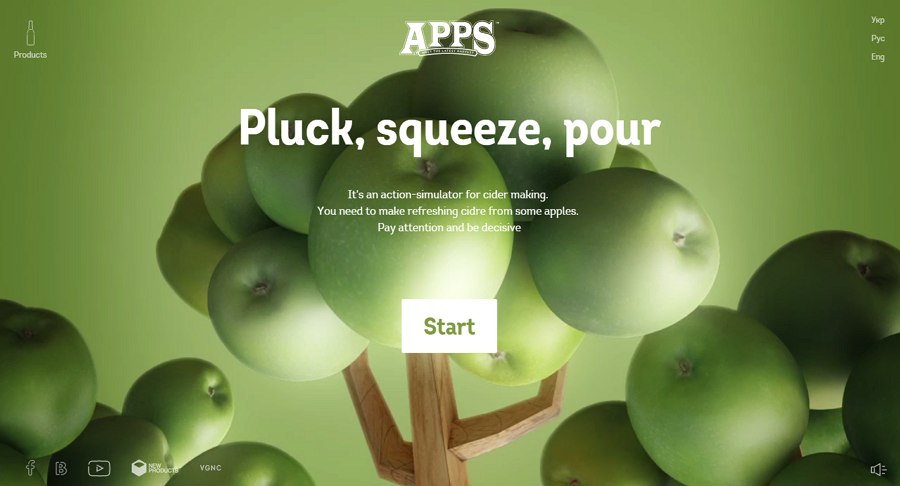
APPS is a great interactive website created by VGNC company for liquor brands. Even though it is not easy for designers to build or accomplish an online website for alcohol products, this site has introduced its flagship product, APPLE CINDER, in a very cool and intuitive way.
How does it achieve that? The answer is actually very simple.
Firstly, the designers of this site have added a cool visualized action-simulator that has briefly and vividly introduce the process of cider making. And, site visitor or customers can easily follow the guide of this remarkable action-simulator to know how apples can be processed into APPLE CINDER wines with simple clicks.
Moreover, its simple and neat Product page with a nice color scheme is also remarkable to let visitors focus on product features for increasing product sales.

17. Webflow
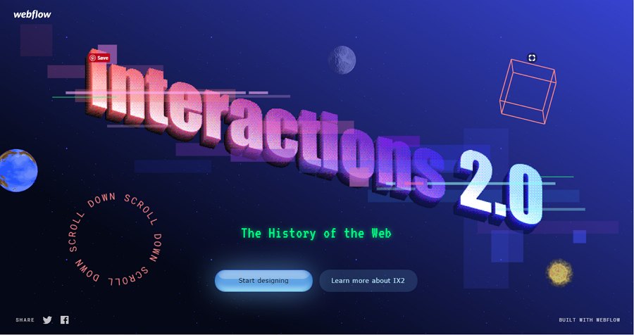
Webflow is not only an interactive website with a wide variety of animations, but also a useful online tool that helps designers and developers create responsive and visualized websites easily and efficiently.
Nowadays, designers like to encourage visitors to download and use products from their sites by displaying products and key features with clear download links/buttons on their Home pages. However, Webflow is completely different. It begins with an interactive and visual history of the web to engage the interest of the visitor. It then invites you to “start designing” with easy-to-use buttons enabling you to use the tools or to continue reading as you wish.
When exploring this website, visitors can pick up a lot of useful information about the history of website development, as if they were watching a movie. Added to all that, there are animated photos, texts, and geometric, eye-catching designs to keep the visitor engaged.

18. Polish Christmas Guide
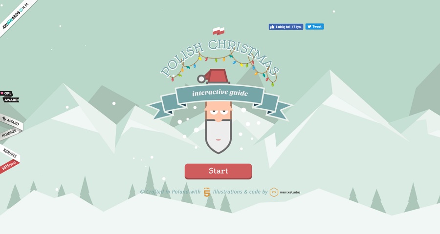
The Polish Christmas Guide website is an interactive website that enables visitors to learn a bit about Polish Christmas traditions. With a cute cartoon feel, the site is great for children. They can take a ride with Santa Claus, collecting gifts on the way that represents different Polish Christmas traditions.
However, the site is illustration-driven and voice-activated, so the feeling is more like playing an online game than just scrolling through a website collecting Christmas gifts. So, the site manages to grab and maintain the visitor’s attention.
The site also puts across some powerful messages about abused children, who appear at the end of the Christmas game. It is an impressive way to encourage people to reach out and help under-privileged kids at Christmas-time.

19. Cyclemon
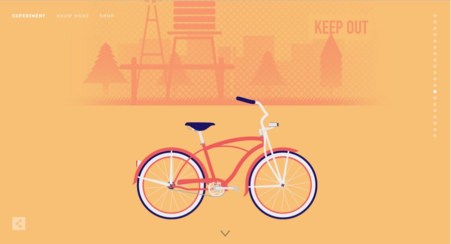
Cyclemon is a simple, beautiful interactive site that introduces a wide range of bicycles. Its colorful illustration style makes it stand out from the crowd. Cycling enthusiasts can browse a range of beautiful illustrations about cycling in different categories.There is a simple parallax scrolling system to help you navigate the site with ease, all helped by a comfortable, fashionable color scheme.

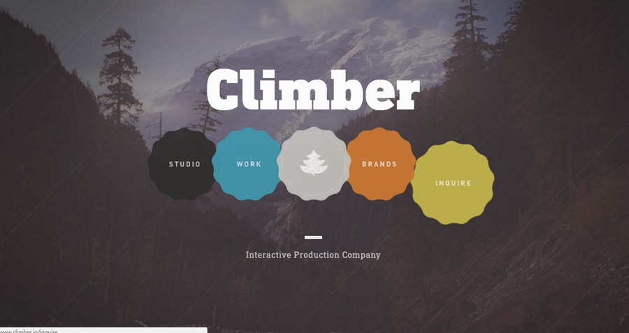
20. Climber
Climber is an online interactive website that introduces the Interactive Production Company who create compelling digital products and experiences. Its forest theme is very distinctive. Moreover, the various interactive and animated elements make it easy to check out its design work and related studio information with simple clicking and scrolling.
If you are also thinking about designing or creating a similar website for your own creative digital company or studio, Climber is a great example, showing you how it can be done. Some of its interactive designs are really worth trying.

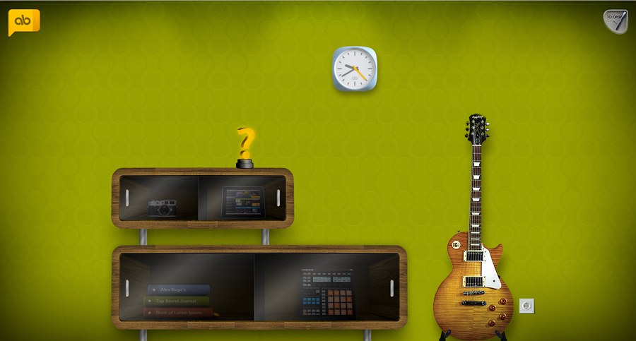
21. Alex Buga
Alex Buga is an excellent interactive portfolio website that nearly covers all aspects of designers, such as his personal photos, website design works, favorite songs, journals and blogs, etc.
Unlike some standard online portfolio sites that tend to display a designer’s work in a mechanical way, this website puts the visitor in a cool room with modern furniture and decoration. And there are a variety of sections, showcasing different design works, songs, blogs, etc, all placed casually around the room, like the other decorations. The visitor can click freely on different sections to check out any information they wish.
Finally, the “My Music” section is the perfect place to relax and get to know more about the designer.

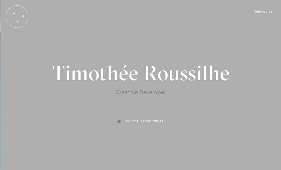
22. Timothee Roussilhe
Timethee Roussilhe is a simple and creative resume website of a designer called Timothee Roussilhe. It uses a range of impressive interactive features to enhance the visitor’s experience.
For example, the designer’s name - Timothee Roussilhe - is displayed in white letters which themselves form an interesting game. You can drag any one of the letter to knock over all the others, as if you were bowling!
There is a button marked “Do not press this!”. If you hit it—and who wouldn’t!—you knock down all the letters at once.
As you move the cursor over the site’s icon in the upper right corner, it turns into different stick figure showing a range of expressions, which change with each click.
So, for me, it is really a very interesting experience to find out such interactive designs one by one.
And, how about finding something cool by moving your mouse cursor to the designer photo?

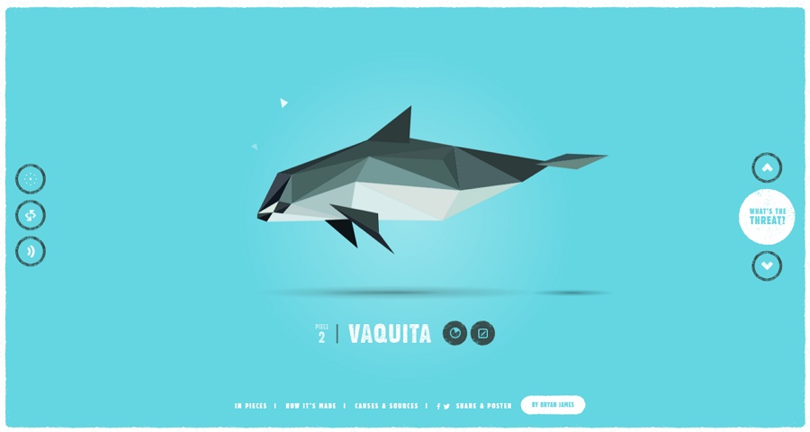
23. Pieces
Pieces is a unique interactive website with 30 separate pieces that can form animated animals, all of which are endangered species, like helmeted hornbill, Vaquita, golden lion tamarin, golden poison frogs, and more. And you can easily cycle through each animal and check their information and stories, including the dates of discovery, histories, videos and more, by simply clicking and scrolling.
So, in this aspect, it is really a nice website to raise the awareness of people to help and protect endangered animals in a vivid and visualized way.

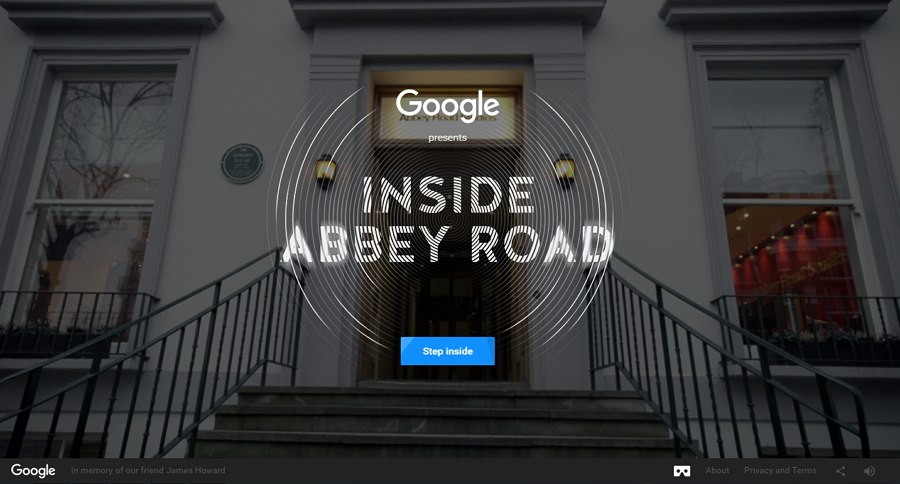
24. Abbey Road Studio
Abbey Road Studio is an interactive website that gives site audiences an opportunity to step inside the famous British recording studio, Abbey Road Studio, online. It shows every nook and cranny of this famous studio in a visual and interactive way. And you can easily follow its footsteps to feel it and also discover some stories, images, videos and music related to this studio.
Moreover, with sound-activated interfaces, 3D scanning technologies, inline videos and other advanced web technologies, this site tends to give visitors a feeling of exploring and seeing everything as you are actually visiting Abbey Road Studio personally in UK.

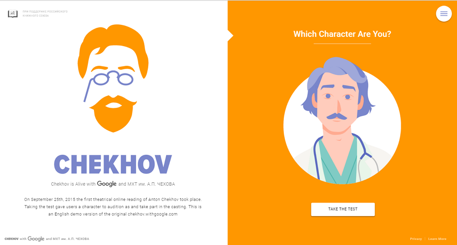
25. Chekhov
ChekHov is a fun interactive website with a unique illustration style. It allows users to take a simple test ( answering 7 questions) to see which character they will be in the works of Chekhov.
This could also be an inspiring idea to design an excellent online website for you.

Wrap Up
These are our collection of 25 latest and best interactive website examples that wisely and creatively use interactive/animated elements to give their visitors memorable and interesting experiences. You could learn a lot from many of the features they exploit, like adding interactive games, using cute illustration or cartoon styles, inserting animated photos or icons, and so on. These ideas are worth imitating.
Hope you will get inspired and build a funny/cool/unique/interesting interactive website smoothly.
Free prototyping tool for web and mobile app design
Get Started for Free
Free prototyping tool for web and mobile app design
Get Started for Free
Free prototyping tool for web and mobile app design
Get Started for Free


