Looking for a guide to help create an infinite scroll design that allows users to scroll down, giving continuous scrolling without reaching the bottom of the window?
This article covers everything you need to know about infinite scroll UI/UX design. We’ll define what an infinite scroll design is, the pros and cons of using it in your website or app, and when, and how to use infinite scroll. Finally, we will show you examples of both the basics and best practices from around the web.
Table of Contents
What is infinite scrolling in UI/UX design
Infinite scrolling vs pagination vs load more
The advantages and disadvantages
When to use infinite scroll
How to design infinite scroll
Best infinite scroll website examples
What is infinite scrolling in UI/UX design?
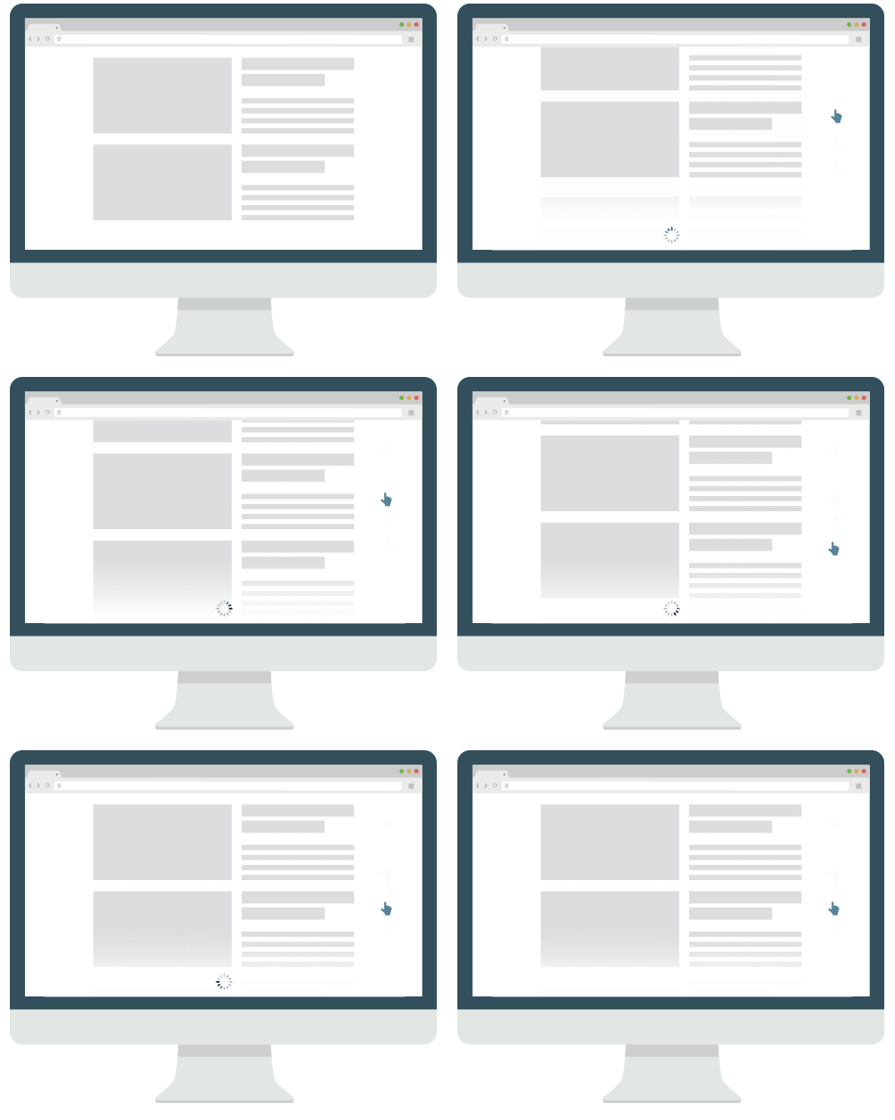
Infinite scrolling (also referred to as endless scrolling) is a page layout that ensures content is always loaded up when a user gets to the bottom of the screen, giving more and more content for the user. This is the opposite of pagination, allowing users to scroll on the web page forever, viewing a huge amount of content without getting distracted.

Social media websites all use infinite scroll to continuously keep users engaged. As seen on Twitter, Instagram, Pinterest, Facebook, TikTok and more.
Infinite scrolling vs pagination vs load more
When discussing infinite scrolling, there are several terms you should know:
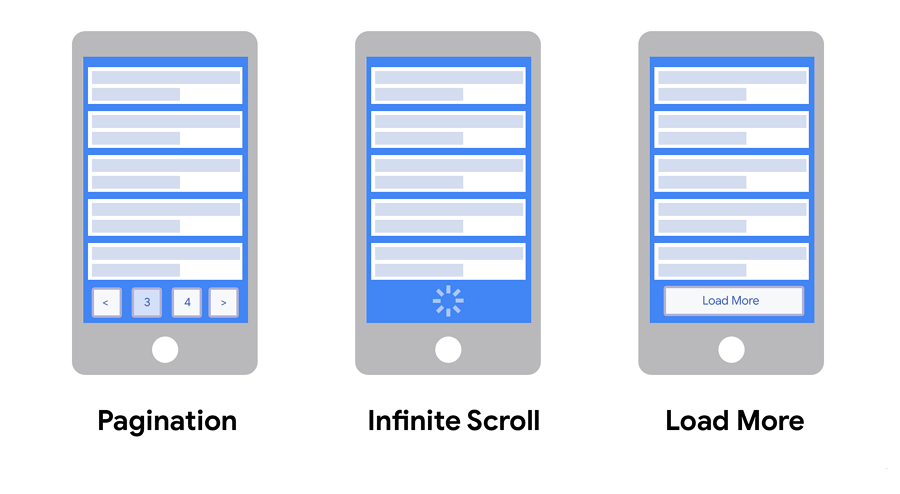
Infinite scroll is a technique that allows users to continuously browse the page content without seeing any finish line or button. Even when the users have scrolled down to the bottom, the web page automatically loads new content. The users can just scroll forever without being interrupted.

Pagination is the effect of dividing up the content of a site into pages. When users scroll to the bottom of a webpage, page buttons appear and users can then navigate around the website through these pages.
Load more is similar to infinite scroll web pages. When the user arrives at the bottom of the webpage, a Load more button will appear, unlike infinite scroll, which gives the user the choice to load more content or not.
Advantages and disadvantages
Infinite scrolling is great for some websites and apps, but sometimes, it might not suit it and annoy users. Before starting to design an infinite scroll website or app, weigh up the following advantages and disadvantages to see whether or not it is the best choice for you.
The advantages of infinite scrolling
Designers create an infinite scrolling since it:
Without an endpoint, infinite scrolling allows uninterrupted scrolling for users to constantly view new content until the user leaves the page, creating engaged users that interact with a website or app for longer.
When viewing a website with infinite scrolling, users don’t need to choose between pages or have to find content themselves, all they have to do is scroll. This is great for users on both computers or phones and creates simple navigation.
A good infinite scrolling website often provides a clear overview of a page's content by using engaging and appealing visuals, such as high-quality images, fun gifs, bright colors, intuitive card UI designs, and others. This allows users to quickly find what they want quickly.
Infinite scrolling provides an app or web page without page numbers or buttons to navigate around them, providing a seamless browsing experience. This is perfect for a mobile project where users don’t want to frequently tap on the screen when interacting with an app or website to load new pages.

Now let’s imagine you are viewing a project on a mobile device. With infinite scrolling there isn’t constant tapping, all you have to do to see more content is scroll, perfect to show users lots of content, right?
Disadvantages of infinite scrolling
However, infinite scrolling can bring difficulties to users such as:
As new content is automatically loaded when users reach the bottom of the page, content in the footer becomes inaccessible. Important links such as About Us, Contact Us and more need to be located somewhere else on the website.
When viewing an infinite scrolling website, if you navigate away from the page at any time, your position on the original infinite scrolling page will be lost, as the back button no longer takes you back to the previous position.
As a result, you have to go to the top of the page and scroll all the way back to find the specific content you are looking for.
When users with a specific goal visit a website, they often first check the website’s top navigation menus, footer, and other navigational designs to find the content the current website has presented. Then, users try to click these navigation options to jump between different pages to see whether the shown content is what they are looking for.
However, with inaccessible footers and no pagination, infinite scrolling makes it difficult for users to quickly find what they need. Users often don’t even know where they are on the page, and how they can get back to their previous page or position.
Presenting an ever-increasing amount of new content can be addictive as users get hooked on viewing more and more content. This is especially prevalent on social media apps, where companies attempt to constantly engage users and get them to view more posts and adverts. This design is made worse when designers use a full-screen design to hide the status bar on phones, helping users forget how long they’ve stayed on the website or app. Knowing this, you should choose an infinite scrolling design carefully.
When to use infinite scroll?
Infinite or endless scrolling is good for content-heavy, design inspiration, or storytelling projects. The following are the main project types that can use infinite scrolling:
news websites or apps
social media websites apps like Instagram, YouTube, or TikTok
design resource websites or apps, like Dribbble and Behance
Search pages, such as Google
Storytelling sites that tell product or brand stories in an immersive way

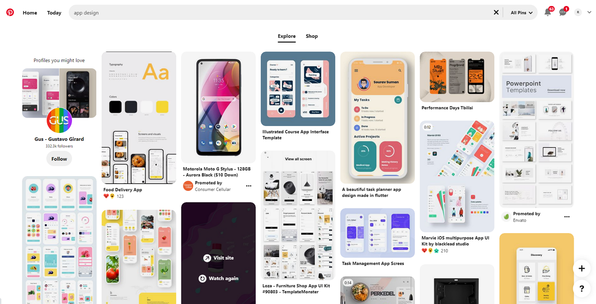
Pinterest uses infinite scrolling to showcase all searched image results.
However, this scrolling way is not suited for ecommerce, goal-oriented websites, or mobile apps, since endless scrolling is not good for users to find something specific (such as a product).
How to design an infinite scrolling website?
Here are some best practices that you should follow to create a better infinite scroll:
Content-wise, on the one hand, you should make your page accessible and scannable to users. This includes presenting important content with eye-catching visuals, such as a card-based UI, or immersive images, bright colors or fun gifs.

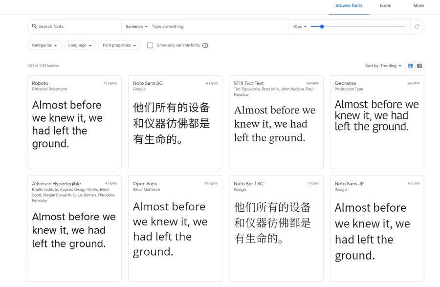
Google Fonts uses infinite scrolling to help users find the font they want. The intuitive card UI designs help users preview different fonts and also create a clean and neat layout for better accessibility and readability.
On the other hand, you should add short and easy-to-understand descriptions, titles, or subtitles to guide users to find what they need quickly.
To help users navigate throughout the whole website or app, you should fix the position of the navigation bar or footer to make it always accessible whenever they are.

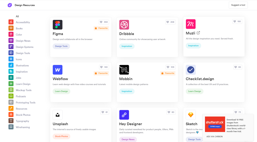
The Design Resources website shared a list of the best design resource websites. Apart from infinite scrolling, it also has a fixed sidebar to help users filter the design resources.
When navigating to a previous page, Infinite scrolling websites take you back to the top of the page, losing all of the loaded content and losing your position further down the page.
This can force users to leave the website out of frustration, so when designing an infinite scrolling website, remember to pay attention to details about scrolling. Make sure users can go back without losing their position or the extra content loaded on the page.
Infinite scrolling has its own pros and cons, in some cases, the cons can even outweigh the pros, bringing a really bad impact to users. So, you and your team should prepare several scrolling backup options. Users may want to disable infinite scrolling for any number of reasons, so make sure you allow users to disable infinite scrolling and choose another scrolling option, such as load more, or pagination.

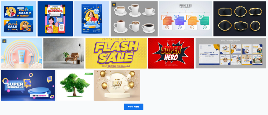
The well-known image resource website, Freepik, uses infinite scrolling to help users find their best design images. For better user experience, there is also a "View more" button to help users lead more image resources.
Scrolling down the page and viewing options one by one can get frustrating for users who want to find something specific. In this case, both web and mobile users value speed overlooks, and you should include a powerful search bar for those users to find the information they’re looking for quickly.
No matter what great ideas you've got for your infinite scrolling website or app, prototype, test them all out, and gather real user feedback to see whether they are workable and optimal.
Nowadays, there is a wide range of prototyping tools that designers can use to create lifelike infinite scroll websites or mobile prototypes and test them on real users to gather feedback.
An online prototyping tool that helps you visualize design ideas with drag-and-drop components, online sharing, and gathering feedback through a single link is a perfect option for you and your team.
Best infinite scroll website examples
Here, we’ve also handpicked a list of infinite scrolling website examples for your inspiration. They have found great solutions to some of the negative effects of infinite scrolling mentioned above. Check them out and see if you can adapt some of the best solutions and examples into your own project.
1.Icons8

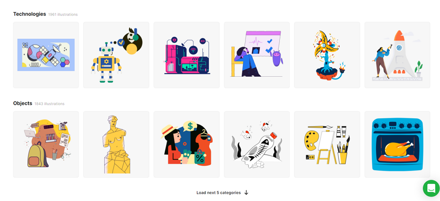
Like other design resource websites, icon8 uses a powerful sidebar and search bar to help users narrow down options and find exactly what they want as fast as possible. It also has an infinite scrolling design to help users view lots of images in a short time.
Of course, to avoid overwhelming users with too many design images at once, there is a button at the bottom of the page to help users manually load more resources. Furthermore, the load more button dynamically adapts to different situations, such as "Load next 5 categories" or "Load next 30 illustrations".
2.Unsplash

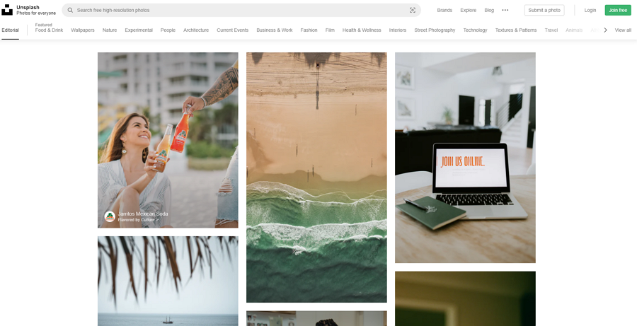
Unsplash shares free images and photos that designers can download and use for any project, and is especially useful when designing an infinite scroll website or app.
Since infinite scrolling isn’t good for users who want to access the footer, Unsplash directly removes the footer and places all web page links and categories on the top navbar. When users are scrolling down the page to view more searched images, the top tool always sticks to the screen, making it easy for users to navigate around the website at any time, wherever the user is on the page.
The natural asymmetric grid layout perfectly presents all images in different sizes on one page.
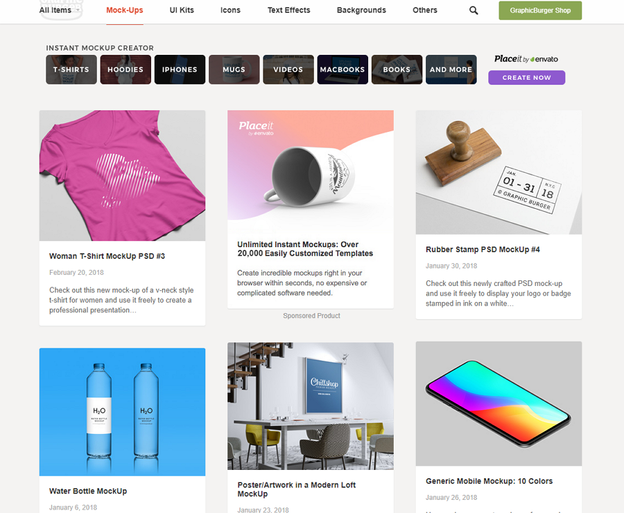
3.Graphic Burger

Graphic Burger rounds up thousands of design resources that are free for personal or commercial use. With infinite scrolling, web visitors can easily scroll forever until they find what they need.
When users want to return to the top, there is a simple back-to-top button that, along with the sticky top navigation bar, is a useful element to help users explore and find what they need.
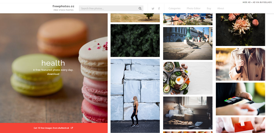
4.Free Photos

Free Photos enables you to find and download royalty-free images for your project or print. The home page of this resource website has two columns.
The column on the left showcases the free featured photo collections that you can download every day. And the other column displays all the hottest free photos. Similar to Unsplash, the column on the right lets you scroll forever until you find the right image for your project.
5.Squarespace Browser History

Apart from design resource and design inspiration websites, there are also some incredible portfolio websites and themed websites that use unique and innovative infinite scrolling implementations. Some use the vertical layout to tell immersive stories.
Squarespace Browser History is a concept exhibition website that uses infinite scrolling to tell the story of the Squarespace browser. By using infinite scrolling, the user can be immersed in the historical story Squarespace is telling the user.
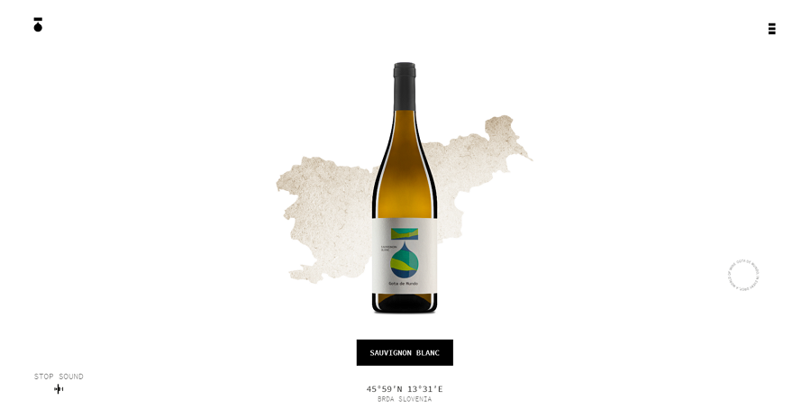
6.Gota de Mundo

Gota de Mundo also explores the use of infinite scrolling to tell the story of their wine. Unlike the Squarespace example, Gota de Mundo uses high-quality images, maps, and immersive wine gifs to introduce all the different wines on offer, where they come from and information about their region.
When scrolling through this website, the experience is like watching a movie about wine and traveling around the world in person.
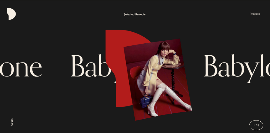
7.Simon Daufresne

Simon Daufresne is an independent graphic designer based in Paris. His portfolio website uses infinite scrolling to present his best projects in an endless cycle.
To view more details about his projects, the visitor should scroll through them one by one. His selected projects will go around in a cycle with infinite scrolling until you click on a project.
This is a very unique and good use of infinite scrolling and shows another useful variation of infinite scrolling.
8.Kiriaze Portfolio

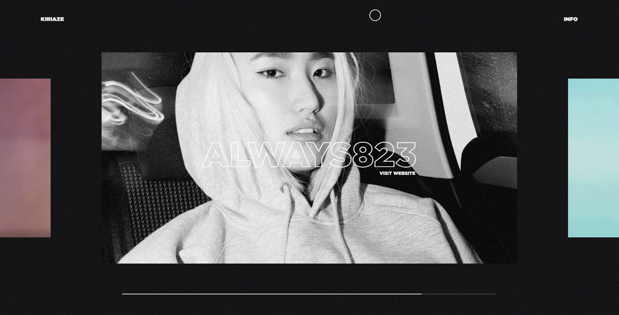
Kiriaze’s portfolio uses a horizontal infinite scroll to showcase an endless cycle presenting their UX projects in an immersive and captivating way. Helpfully, the designer added a navigation bar on the bottom to specify exactly where to go when you’re scrolling.
9.Yusuke Fukunaga

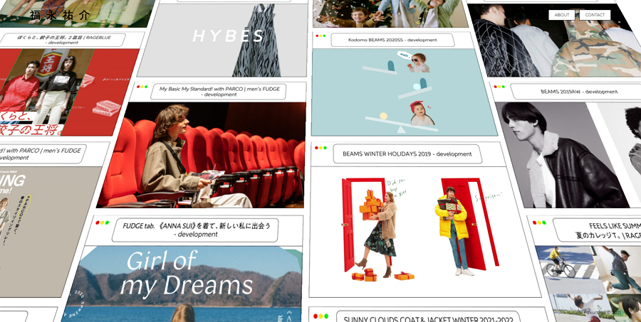
Yusuke Fukunaga is a freelance front-end developer from Tokyo. This portfolio website lays out all his projects on the home page in tiles. Website visitors can scroll the endless page to browse all projects listed, once a project is found, you can view more details about that project in a new window.
For better usability, every project is independently illustrated in a new window. There is no "back" button to help you navigate back. So, after checking out one project, you can just switch to the original page tab on your browser to carry on browsing his projects, exactly where you were previously.
There is no need to remember the previous position or content. No data is lost again.
10.Foodisforeating

Foodisforeating is a website that uses infinite scrolling to tell the story about life and food. With colorful images, clear data visualization and inspiring words, the content combined with infinite scrolling helps arouse people's respect for life. It also encourages people to adopt more green habits such as avoiding food waste. With the clear presentation style, visitors are captivated and quickly become engaged with the website's message.
Conclusion
As with any layout, infinite scrolling has many pros and cons and is an incredibly useful asset to a website if used in the correct way. But it is not suitable for every website or app. Every designer needs to carefully evaluate their purpose, along with the benefits and drawbacks an infinite scrolling design may bring.
Test out your infinite scrolling design with prototyping tools and ensure that you can gain the most from an infinite scrolling design, when used effectively, it can bring your website incredible engagement with your audience.
Free prototyping tool for web and mobile app design
Get Started for Free
Free prototyping tool for web and mobile app design
Get Started for Free
Free prototyping tool for web and mobile app design
Get Started for Free


