Just like typography is the key to excellent web design, so is the font the key to excellent typography. Google fonts came strong with its rich resources and quickly became the number one choice of web designers and developers.
Google fonts offer both aesthetics and functionality and are available for both personal and commercial use. Their selection is available for both web typography and mobile typography.
In addition to the thousands of other sites that use the service, Google itself uses these fonts on their own platform. Google Fonts has also improved its interface and download system to increase accessibility.
The service decreases the cognitive cost on the user by providing useful information about each font. To narrow down the range, this article introduces 20 of the best Google fonts that you can easily apply to your next project.
To make the whole passage more clear, it has been divided into 3 main parts:
- 20 best Google web fonts recommendations
- How to use Google fonts
- What font does Google use
20 best Google web fonts recommendations
1. Dosis

Designer: Impallari Type
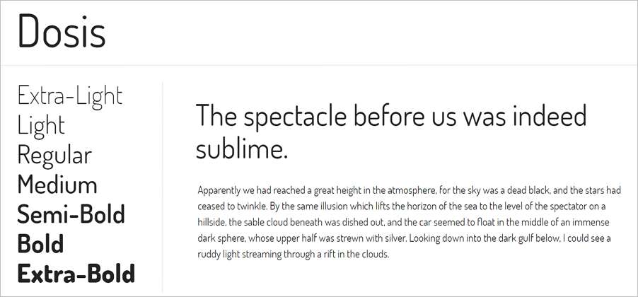
Dosis is a rounded sans-serif type with superb charm. The Extra Light style, useful only at size 36pt and up, and the Extended Latin character set which includes many alternative characters, can be widely used in art design and advertising, including posters, PPT files, film, and television production.
It is featured on more than 860,000 websites. Popular Pairings with Dosis are Roboto, Open Sans, Lato, Oswald and Raleway.
Free download
2. Roboto

Designer: Christian Robertson
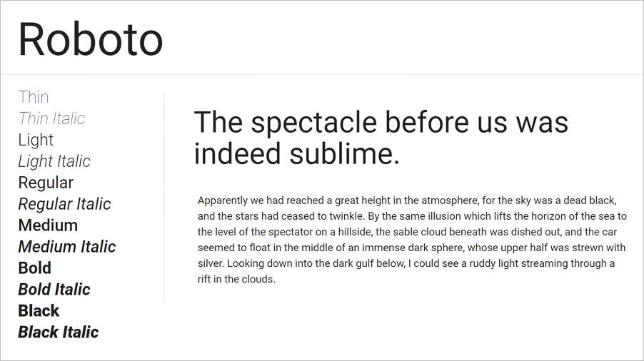
Designed entirely by Google's interface designer Robertson within the Google system, Roboto is the sans-serif font family for the Android operating system, Chrome OS and Google’s Material Design system. This is the font that Google uses.
It’s extremely popular and is featured in more than 24,000,000 websites for its aesthetics and functionality. Roboto’s popular pairings are Open Sans, Lato, Montserrat, Regular, Raleway and Oswald.
Free download
3. EB Garamond

Designer: Georg Duffner
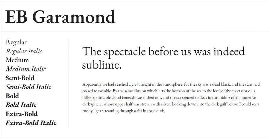
EB Garamond is an open Garamond font with retro, classical qualities. Many big companies have versions of Garamond. Apple has the system Garamond while Adobe has Adobe Garamond Pro.
Popular Pairings with EB Garamond are Roboto, Lobster, Montserrat, Lato, Anton. More than 2,200,000 websites use EB Garamond in typography.
Free download
4. Poppins

Designer: Indian Type Foundry
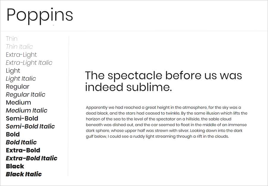
Popins is a geometric sans-serif font. It is very attractive and can be widely used in business card design, news media, posters, PPT files, film, television production and content display.
Poppins is featured in more than 4,000,000 websites. Popins’s popular pairings are Roboto, Raleway, Oswald, Playfair Display and Lato.
Free download
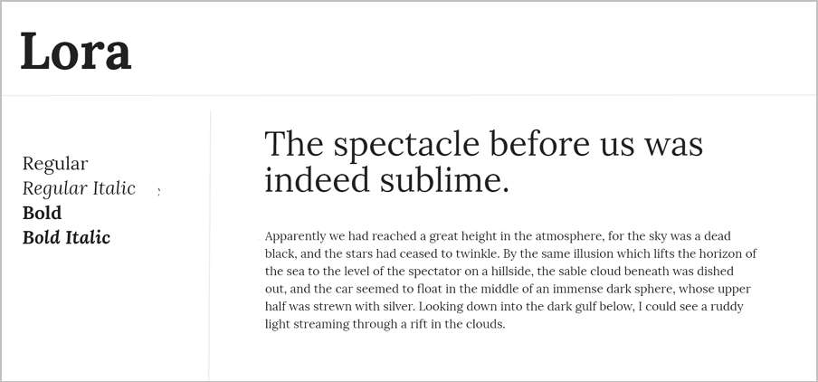
5. Lora

Designer: Cyreal
Lora is a well-balanced contemporary serif font with roots in calligraphy. It's been optimised for the screen but works equally well in print. The moderate contrast is well suited for body text. It is ranked in the top 20 in Google fonts.
You should however, be careful when using it, because if the contrast ratio is too high, it may not be suitable for retina screen displays.
You can use Open Sans, Lato, Montserrat, Roboto with Lora. Lora is now featured in more than 1,600,000 websites.
Free download
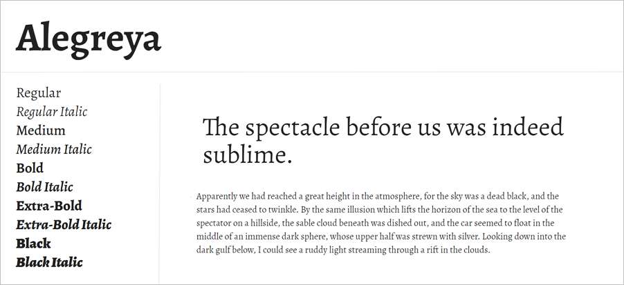
6. Alegreya

Designer: Huerta Tipográfica
Alegreya is a typeface originally intended for literature. Among its crowning characteristics, it conveys a dynamic and varied rhythm which facilitates the reading of long texts. It was chosen as one of 53 "Fonts of the Decade" and one of the top 14 text type systems. It was also selected in the 2nd Bienal Iberoamericana de Diseño, the competition held in Madrid in 2010.
Alegreya is featured in more than 340,000 websites and the popular Pairings are Alegreya are Roboto, Lato, Lora, Playfair Display, Montserrat.
Free download
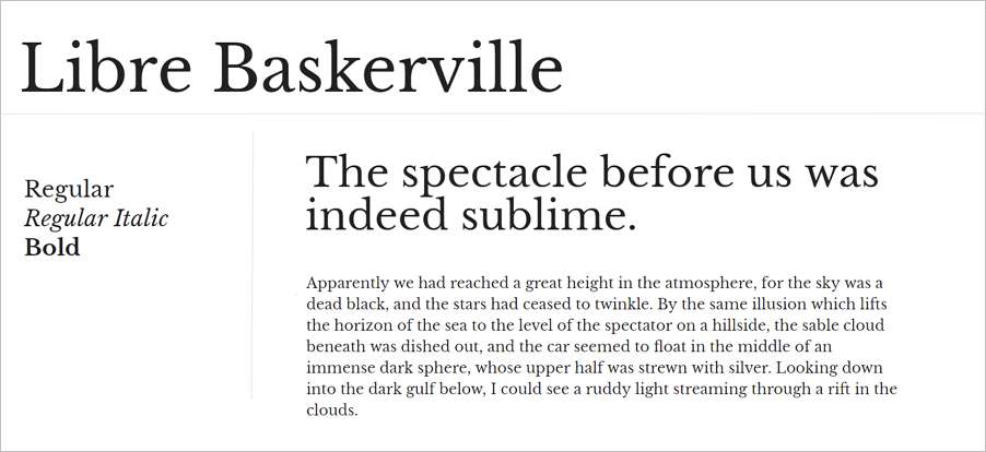
7. Libre Baskerville

Designer: Impallari Type
Baskerville is not a web-safe font, but Libre Baskerville is a great alternative. This web font is optimized for body text of around 16px. It has a taller x-height, wider counters and a little less contrast, which makes it work well for on-screen reading.
Libre Baskerville is featured in more than 3,100,000 websites and its popular pairings are Montserrat, Roboto, Lato, Raleway and Playfair Display.
Free download
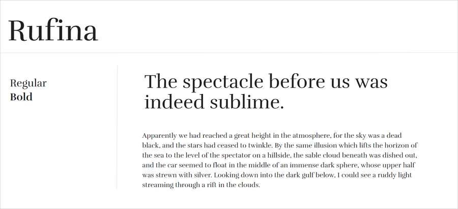
8. Rufina

Designer: Martin Sommaruga
Rufina is the perfect font for magazine-related or fashion websites. It's very elegant with noble and charming tones of Paris and Milan. Actually, due to its high contrast, it is not very friendly for reading, and you may generally perfer to use it for a title or headline.
Rufina is featured in more than 36,000 websites. You can use it with Roboto, Open Sans, Montserrat, Lato and Raleway.
Free download
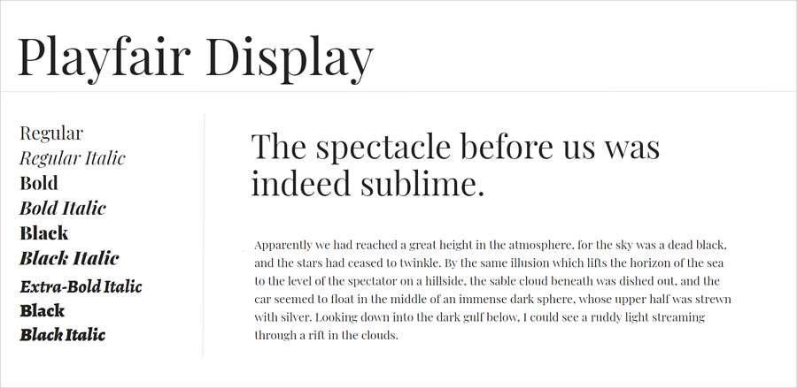
9. Playfair Display

Designer: Claus Eggers Sørensen
As one of Microsoft's web core fonts, Playfair Display is perfect for title design. It features rough, bold and extra-thick strokes perfect for use when spacing is tight.
Popular pairings are Roboto, Lato, Montserrat, Raleway and Oswald. Playfair Display is featured in more than 4,500,000 websites.
Free download
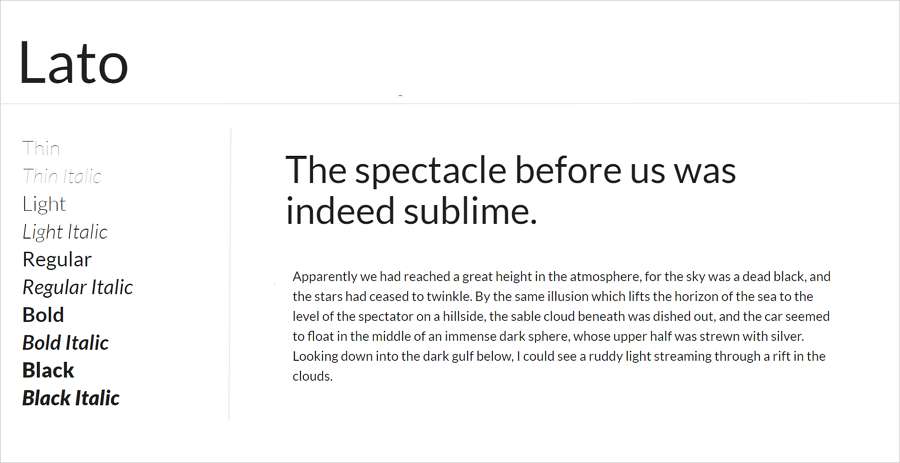
10. Lato

Deisnger: Łukasz Dziedzic
Lato is a sans serif typeface family. The semi-rounded details of the letters gives Lato a feeling of warmth, while the strong structure provides stability and seriousness. “Male and female, serious but friendly. With the feeling of the Summer,” says the designer Łukasz.
Free download
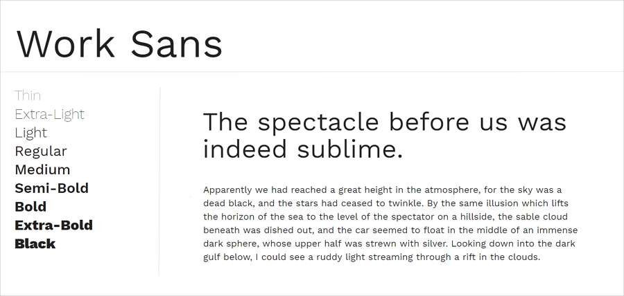
11. Work Sans

Deisnger: Wei Huang
Work Sans is a typeface family that is optimized for on-screen text usage at medium-sizes (14px-48px) and can also be used in print design.
Free download
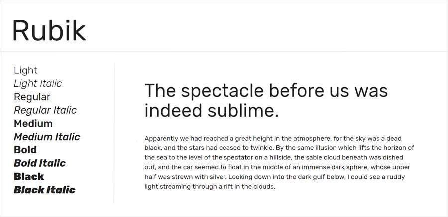
12. Rubik

Designer: Cyreal
Rubik is a sans serif font family with slightly rounded corners designed by Philipp Hubert and Sebastian Fischer.
Free download
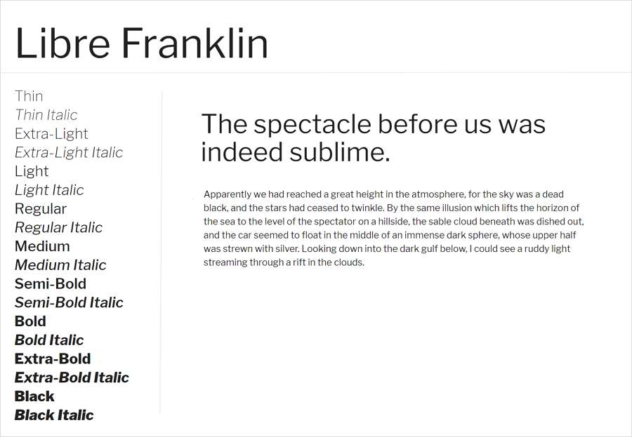
13. Libre Franklin

Designer: Impallari Type
Libre Franklin is frequently used in the USA. It is an interpretation and expansion of the 1912 Morris Fuller Benton classic.
Free download
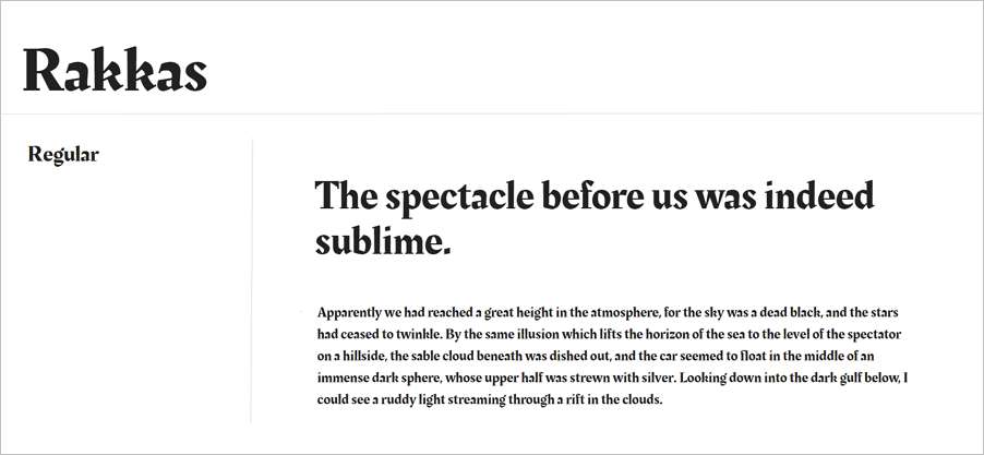
14. Rakkas

Desigenr: Zeynep Akay
Rakkas is single-weight display typeface that supports Arabic and Latin scripts.
Free download
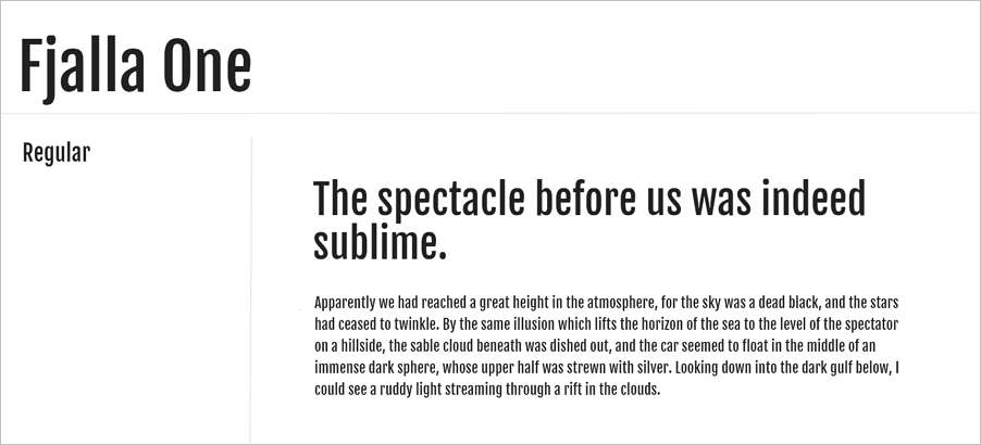
15. Fjalla One

Designer: Sorkin Type
Fjalla One is a medium contrast display sans serif.
Free download
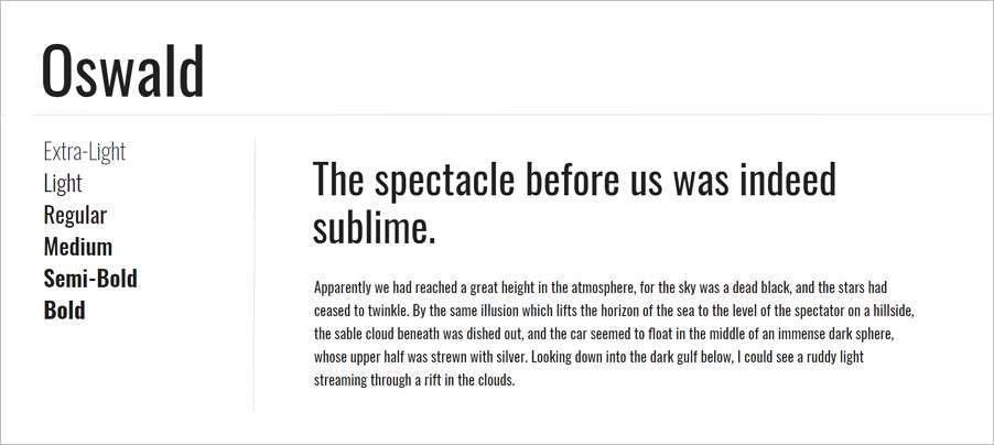
16. Oswald

Desinger: Vernon Adams
Oswald is better at fitting the pixel grid of standard digital screens.
Free download
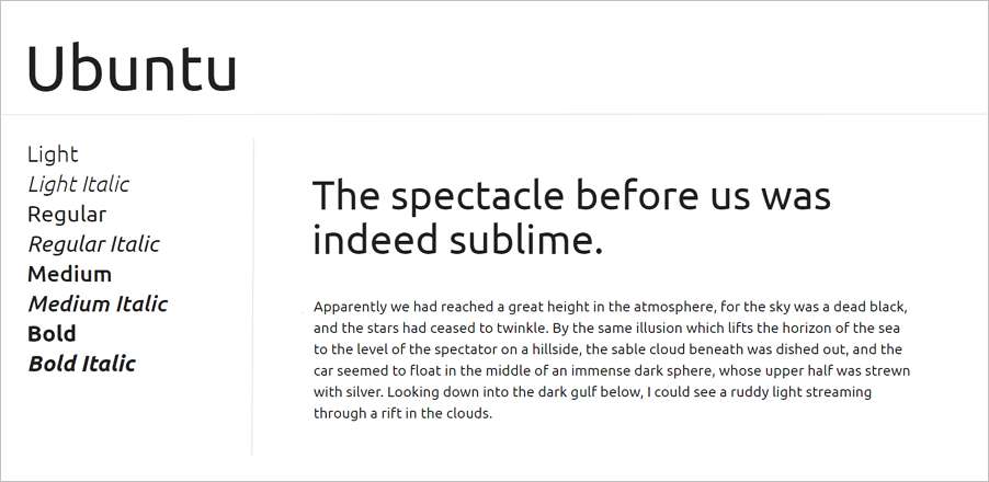
17. Ubuntu

Desinger: Dalton Maag
The Ubuntu Font Family is a set of matching new libre/open fonts developed in 2010-2011.
Free download
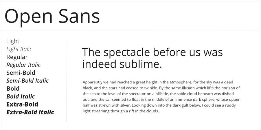
18. Open Sans

Designer: Steve Matteson
Open Sans is a humanist sans serif typeface optimized for print, web, and mobile interfaces. It has excellent legibility characteristics in its letterforms.
Free download
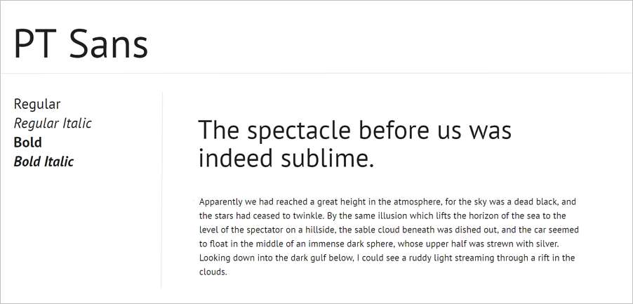
19. PT Sans

Desinger: ParaType
PT Sans is based on Russian sans serif types and gives the people of Russia the ability to read and write in their native languages.
Free download
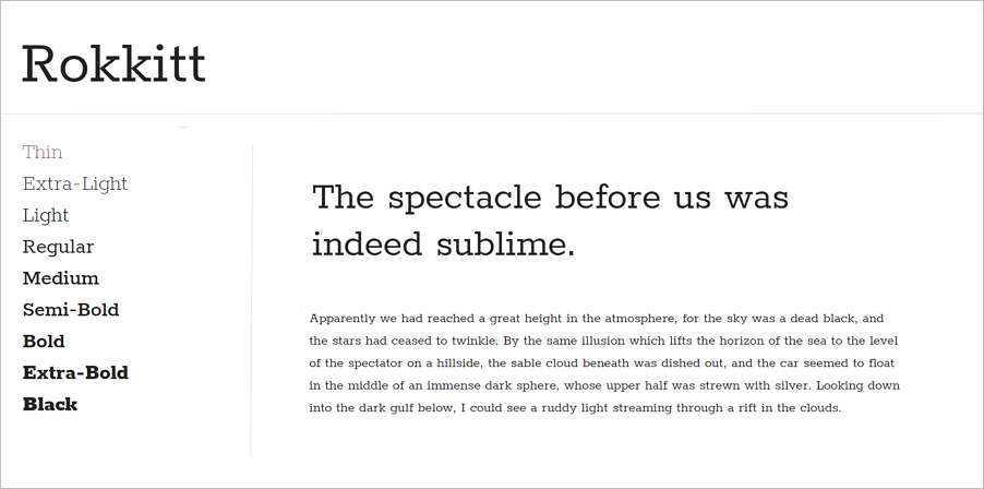
20. Rokkitt

Designer: Vernon Adams
Rokkitt is used as a display font in headings and headlines, though it can also be used as an alternative to sans serif designs at certain text sizes.
Free download
How to use Google font?
Google has improved the facility in implementing its fonts in your device. You can just follow the guide that Google provides to Get Started with the Google Fonts API.
What font does google use?
Google creates friendly and engaging interfaces with its own aesthetically pleasing typography, thanks to the fonts like Google Sans and Product Sans. Google Sans is a font that can only used by Google. Google Sans is very similar to Poppins and Montserrat, which are both available via Google fonts.
Above are the 20 best Google fonts. The full Google font list is way longer, however, these are just some of the high-quality Google web fonts that might interest you. If you have your own recommendations, please let us know.
Free prototyping tool for web and mobile app design
Get Started for Free
Free prototyping tool for web and mobile app design
Get Started for Free
Free prototyping tool for web and mobile app design
Get Started for Free


