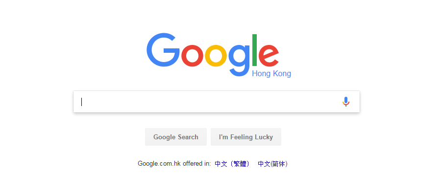
When you visit a page to look for the content you need, but you can’t find the search box to perform the action, isn’t it frustrating? The search box is usually the most commonly used design element in a website and a good search box will make a site user-friendly, when users visit a relatively complex site, they will immediately find the search box to help them to reach he/she ultimate goals. This article shared some useful tips and principles to design a search box that user will please, hope this article can be useful and helpful to you.
What is search box?
The search box is a commonly used interactive component,especially, on websites and APPs. The core of search box is to extract exact content from massive amounts of information accurately, such as music libraries, e-commerce sites and etc.
Two types of search
1. Instant search:
The results are displayed immediately on the user interface, no buttons are required, the magnifying glass is only displayed as an icon, and when user enter the keywords, it can search immediately.
2. Regular search:
User need to clicks the search button to perform the search
When to use the search
1.The target object is hard to find
A) There are many objects; Like we need to find a particular icon in 3000 icons from the Mockplus icon library.
B) The target object is not in the same location; It’s like you need to find a type of file on the disk.
C) The search data is hard to find; Like you want to search for a specific character in a long text.
2. The specific content needs to be found; for example, we search for a certain characteristic of the goods in Amazon.
3. The required results can not be found in 5 seconds.

Design concept
1. The search box is a part of the interface, so it has to be placed in a conspicuous position, and be easy to find
2. In the same application or website, they should have a unify appearance
3. The function should be valid, the results should be accurate, and the search speed should be as fast as possible.

Appearance features
1. Label is unnecessary, you can use an optional hint
2. The prompt can be an instruction (such as the search type), or a range
3. The prompt language should be short and clear
4. When performing the instant search, capitalize the first letter; while performing the regular search, lowercasing the first letter.
8 tips before you design a search box
1. Use the magnifying glass icon

2. Place the search box where the user can find it easily
3. Provide a search button for the search box
4. Place the search box on each page
5. Make the search box look like a search box
6. Adaptive field size
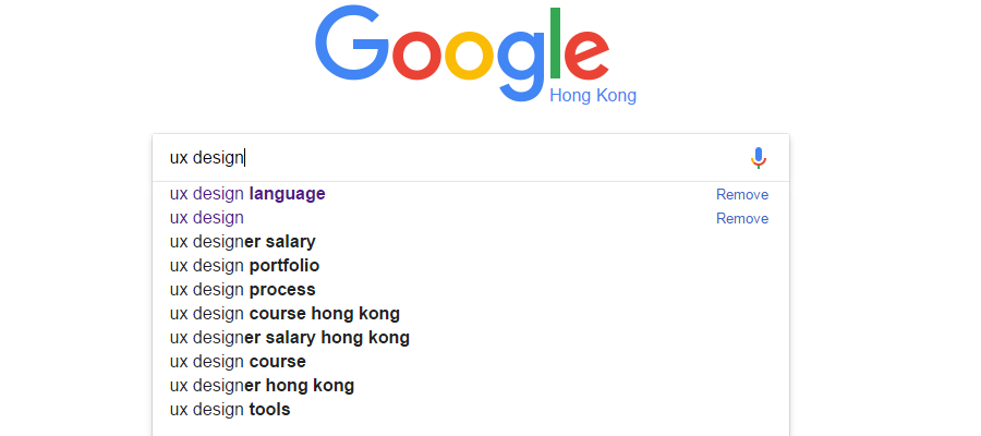
7. Use the automatic suggestion mechanism

Conclusion
We can find that design a search box needs to follow the design rules and interactive principle, and every detail of the improvement can make a better user experience. A good user experience website not only can please the users but also can benefit from it.
Free prototyping tool for web and mobile app design
Get Started for Free
Free prototyping tool for web and mobile app design
Get Started for Free
Free prototyping tool for web and mobile app design
Get Started for Free


