Animated websites, one of the hot website design trends of 2022, has become an inseparable part of user experience for modern websites. You can find animations on websites everywhere, whether it be subtle transitions or an entire website with cool animations. Illustrations, interactive details, and the dynamic effects make the modern website fundamentally different from the previous designs.
Why You Need an Animated Website?
For designers, the maturity of CSS and HTML has made designers more creative than ever before, bringing life to websites with CSS animations. Cool animation and creative UX writing are always impressive. They can also help to explain complex ideas quickly and easily, as well as guide users' actions with the help of appropriate CTA.
For users, a cool and logical animated website has a better guide on actions. If you checking the data, you can find that the interactive website will hold a longer visit and higher conversation than the static one. Because animated and illustrated websites have more personalized dynamic visual effects that contribute to user satisfaction and longer site visits.
8 Best Animated Websites with CSS & HTML Animation
We’ve pulled together a well-selected list of the best animated websites available today. These web animation examples use cool animations and illustrations to demonstrate products and services, display brand style, create mood, and even lead the user through a story.
1. Your Plan, Your Planet
by MediaMonks
Animations:
- Hover
- CSS3 animation
- Storytelling animations

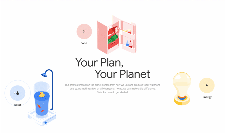
Your Plan, Your Planet is a CSS animation website example designed by MediaMonks. The concept of this site is to help people plan for a more sustainable future in a playful way through simple tips and isometric illustrations that take Material Design to another dimension.
A good example of interactive website with a story
The creative navigation design is based on life elements such as water, food, and energy. When the mouse slides to select different elements, it shows hovering effects in a large color block to guide users to move on to the next step. The interactive illustrations make the planning of a sustainable future engaging and relevant. From another point of view, it is also a great material design example. For more on this, check out the best material designs for Android apps.
In summary, the storytelling animation with UX writing of each element guides the user through a logical progression of the website. With a playful design, it's a great web animation example that encourages learning and enhances the user experience.
The storytelling animation with UX writing for each element has a clear logic and guide for users. Through playful visiting, users are impressive and happy to stay and learn from this web animation website.
2. Species in Pieces
By Byan James
Animations:
- Transition
- Micro animation

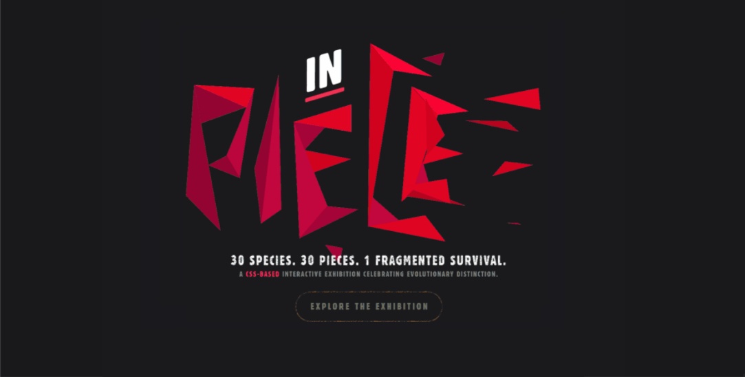
Species in Pieces is a CSS animation website that uses only triangular pieces to showcase 30 of the most interesting, but unfortunately, endangered species – their survival lays literally in pieces.
All triangular pieces are transformed into different colors, with each transition animation forming a different species. Each animal is equipped with a statistical chart that visualizes their evolutionary history and the number of species that have declined year after year. Designers use JavaScript, CSS animation, and SVG shapes to transform into transitional movements to create a website that promotes species conservation.
Species In Pieces hopes to educate and inspire, provoking thought on this complex and intricate topic.
If you are interested in creating an animated website, this 8 best free resposive CSS website templates would help you with ease.
3. New Tactics - Sneak Peak
By Quintin Lodge
Animations:
- HTML5 animation
- Data animation

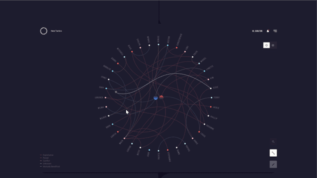
New Tactics uses HTML5 animation design and data animation. It’s not only a well-designed web animation example, but also a good example of how to use gradient colors to improve your design. Gradient color, real-time interactive design, and the dark background create a dynamic effect. The information icon on the page switches to a different mode to expand and scale the data.
When you first see this page, you might ask yourself "What am I looking at?".
In fact, this is a two-view tactical map designed to help solve human rights violations. The first view is a map of the terrain, or the overall health, of the problem. The second is the connection view, which illustrates the nature and impact of the individual associated with this violation and other participants on the map. The color and animation points of the connecting lines in the second view represent the nature of these relationships as well as its power or influence.
4. Miki Mottes
by Miki Mottes.
Animations:
- Typography animations
- Scroll triggered illustration animation
- Waiting animation

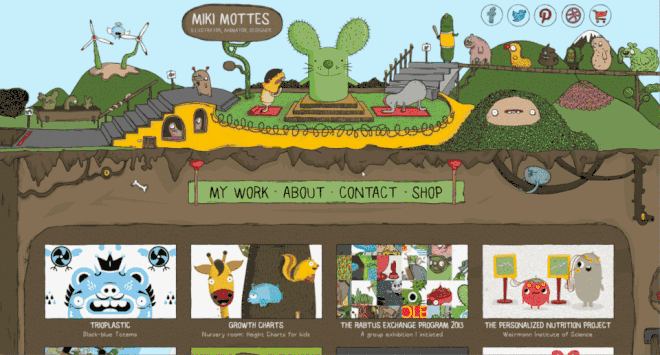
Miki Mottes demonstrates a very cool interactive website with an illustration style. Of course, that’s because Miki himself is an illustrator, animator, and designer. If you want to learn how to make an animation website by adding partial animations, this website is a great one to prototype and learn from.
Miki Mottes is a unique CSS animation website. Not only that, but its excellent navigation bar design also provides a good user experience. The scrolling effect of the floating navigation bar makes navigation logical and clear. If you have time to browse the web carefully, the effect of the waiting animation is also very interesting.
5. Genesis
By Sam Day
Animations:
- Scroll triggered illustration animation
- Hovers
- Cursor

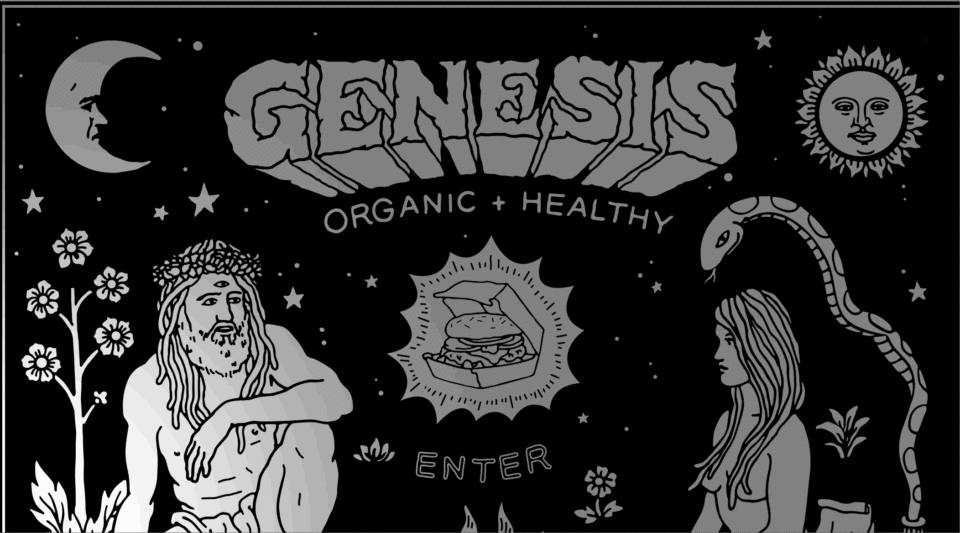
At first glance at the homepage, you would not connect this website with food or restaurants. In fact, Genesis is a website that promotes vegetarianism and focuses on fast, casual dining and organic comfort food.
One web design feature is the mouse-over flashlight effect. As you move the mouse over the page, the area becomes highlighted. The combination of perfect single page design, mouse-over micro-interaction design, and scroll-triggered animation effects makes the entire site engaging and create a great user experience. It peaks the users’ curiosity and promotes an extended visit to the page.
6. KIKK Festival
By DOGSTUDIO
Animations:
- Hovers
- Cursor
- Micro interaction

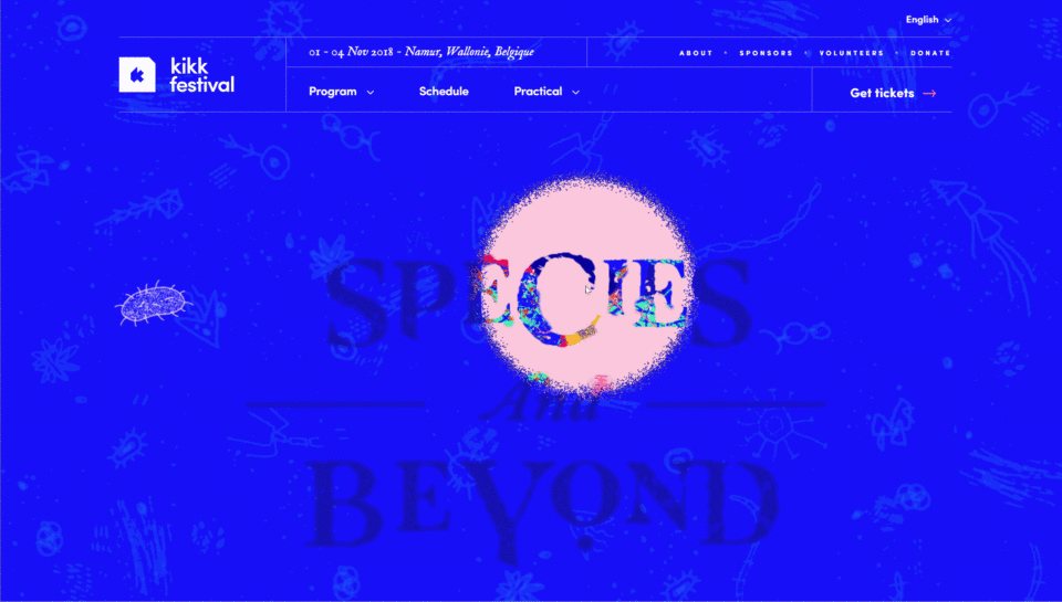
KIKK is a cultural education website. It is creatively designed with a cursor effect that acts as a magnifier to help you find useful information. When you move the cursor, the background color is made viewable from behind the blue mask. The cute illustrations, cursor effect, and micro-interactions create a wonderful animation effect.
Also read this to learn how to design Micro interactions for better UX.
7. Onedesigncompany
By Onedesigncompany
Animations:
- Micro interaction
- Loading animation
- Storytelling animation

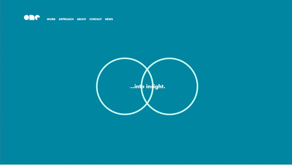
While animations make for cool web design. Onedesign company can also create longer waiting and loading times. Adding a creative loading animation to the progress bar during the waiting process can help divert the users’ attention from waiting. Simple loading animations are better than complex ones. This UX writing promotes the micro-interactive animation display in a narrative manner, which is also a commonly used animation in web design. Remember, impressive UX writing is very important to build a better product.
8. Marie Morelle
By Marie Morelle
Animations:
- HTML5 animation
- Scrolling navigation bar

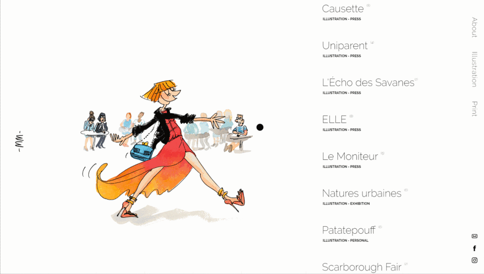
Marie Morelle is an illustrated portfolio website. The combination of French-style illustrations and HTML5 animated web design makes the site very attractive. The interactive right navigation bar, which switches pages with mouse scrolling, as well as page interactions, makes this website design clean and unique.
If you are planing to create such an brilliant portfolio website, these 10 best online portfolio websites can help you create one with ease.
1. ANIMATE.CSS
Animate.CSS has more than 60 animation effects, including almost all common animation effects. With this animation library, designers can easily and quickly create CSS3 animation websites.
2. MAGIC ANIMATIONS
Magic Animations is a unique CSS3 animation effect package that designers can use freely in their own website projects. Designers need only introduce CSS styles on the page: magic.css or the compressed version magic.min.css.
3. BOUNCE.JS
Bounce.js is a very powerful visual CSS3 animation code generation JS library plugin. You can edit various animation effects of CSS3 using their visual interface. In addition, Bounce.js can also be used alone to complete various CSS3 animation effects through JS code.
4. Mockplus
Mockplus is a web prototyping tool to create cool interactive websites with navigation bar switching designs and scroll-triggered animation effects.
Conclusion
Modern website design focuses more on visual effects and user experience. Learning from these 8 best-animated websites, you will know how to create a cool and visually appealing HTML/CSS animated website. We hope you are inspired and ready to learn!
Create your best animated website prototypes in Mockplus
Get started for free
Create your best animated website prototypes in Mockplus
Get started for free
Create your best animated website prototypes in Mockplus
Get started for free


