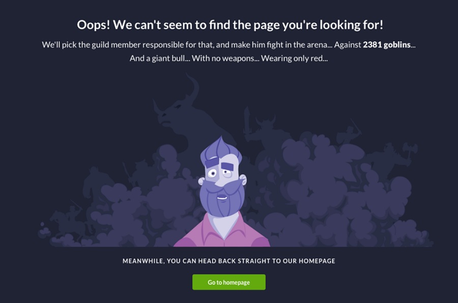
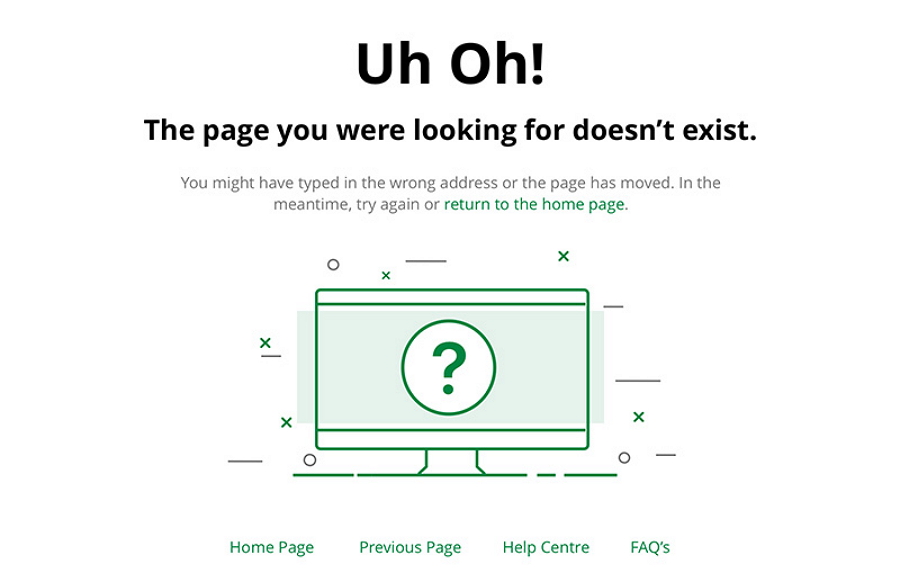
A 404 error page, which often serves to alert web/app visitors that the page they are trying to reach does not exist, is often regarded as one of the most possible elements to lose users/visitors with boring and dull logging-in/out/loading/leading pages in a web/app. However, that does not mean such error pages will be a nightmare in all cases.
Actually, a creative, cool, interesting or informative 404 error page can not only lead customers to other parts of your websites/apps smoothly, but also reduce customer frustration and let them stay on the site/app much longer.
So, how can you create such a cool, interesting and creative error page to attract users’ attention and keep them staying on the site/app as a web/app interface designer or product manager? Let’s keep reading this article and enjoy 14 latest and best 404 error page designs to get inspiration and learn how to make a beautiful, interesting and attractive 404 error not found page design:
First, What Are the Common Error Messages Used in 404 Error Pages?
In these days, more and more designers realize the importance of copywriting in their web/app designs and carefully select each text to make their designs more humanistic, unique and clearer. So, with this in mind, before introducing and enjoying the 14 best practices for 404 errors, we’d better first learn some common error messages often used in 404 error pages so that you can also design a unique and creative copywriting for your error pages based on these common error messages:
*The requested URL was not found on this server
*404 File or Directory Not Found
*HTTP 404 Not Found/404 Page Not Found
*404 Error/Error 404/HTTP 404
*The page cannot be found
Of course, in some cases, UI/UX designers also especially add some customized words/sentences with a "404" logo for making their error page more impressing and interesting.

14 of Latest and Most Creative 404 Error Page Designs for Webs/Apps
*Designer: Tajana Barac
*Highlights:Color contrasts, color gradients, shapes and shadows
The color contrasts of classic blue and white, color gradients and shapes with shadows in this error page, all of them give people a sense of peace and serenity. This is really an excellent strategy to effectively reduce the negative emotions caused by suddenly popped-out 404 error warning.
Moreover, its perfect color scheme and illustration style are also really eye-catching, which can naturally attract users’ attention and reduce their unpleasant experiences there.
*What can you learn
Optimize your error page design with various design trends.
In recent years, mixing different design trends in design, such as color contracts, color gradients, shapes, shadows, layers, etc., will never be a bad idea to help designers create an outstanding UI/UX design. So, you can also apply various design trends together to optimize your 404 error page designs. (Click here to check Top 9 UI design trends for mobile apps in 2018 )

*Designer: From limpfish.com
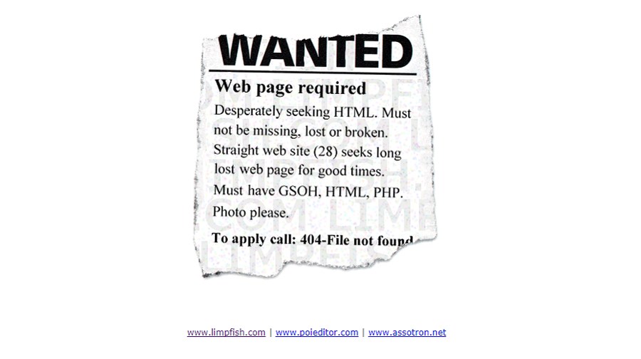
*Highlights:Unique form to show the 404 error message
Unlike some frustrating error pages that merely display the error messages in a boring way, the designer of this 404 error page adopts a unique form, which is very similar to a wanted poster, to intuitively explain the errors and provide multiple options to link to other parts of this site. This is really creative and interesting.
Moreover, this “wanted poster” is also intentionally designed to be very old and even broken, which makes it more real and noticeable.
*What can you learn
Customize a special form for your 404 error page.
Also customize a special form for your 404 page. With enough time, you can even create a series of 404 error pages with different forms and add them all to your design journal. Of course, also turns them into intuitive prototypes with the help of a useful prototype tool so that you can check and use them freely in the future.

*Designer: From cssninjas.com
*Highlights:Progressive disclosure
Except giving a general explanation of 404 page not found error, the designer of this error page adopts a design technique called “Progressive Disclosure” to extend the page functions. People can easily click the linked words/phrases to switch to other pages easily.
*What can you learn
Also use progressive disclosure technique in your page design.
In your error page design, also adopt progressive disclosure technique and add links, buttons, sidebar menus or hidden menu bars to extend the functions of your 404 error pages.

*Designer: Ash Rahal
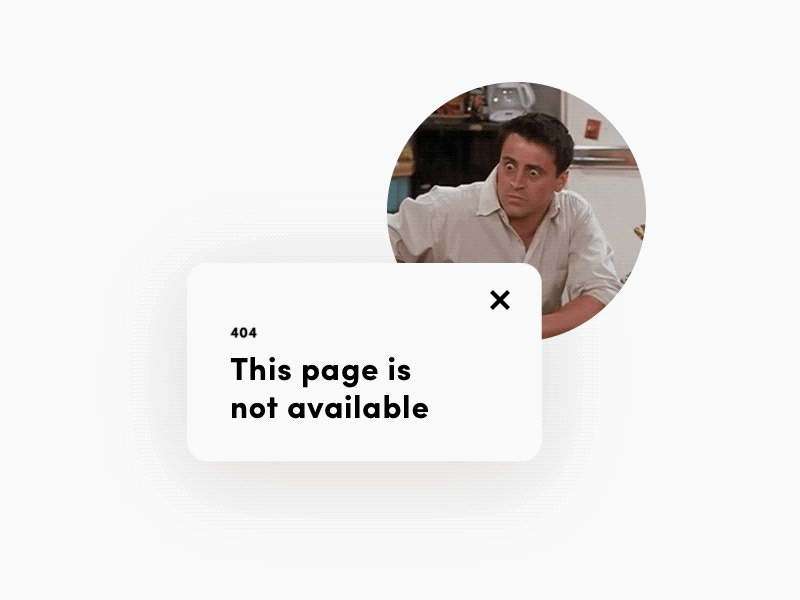
*Highlights:Overlap, emotional elements and funny photos
The designer of this 404 error page uses overlapping of words, photos and shadows to create a sense of space. Moreover, in order to relieve the negative emotions caused by 404 error pages, the designer also adds many emotional elements, such as its humorous explanation and the funny photo showing a depressing man, to gain users’ understanding and resonating.
*What can you learn
Add emotional elements to improve emotional experiences of your designs.
The emotional elements, such some humorous words, funny expression icons, interesting photos, smarter and smoother interaction designs and color scheme that can let users calm down, etc., are able to make your error page design more humanistic and keep them staying on your page much longer.

*Designer: Alana Brajdic
*Highlights: Options and simplicity
As the designer of this error page writes: “404's need to be meaningful. Tell the user what happened, why, and what they can do to resolve it”, the designer displays simple words and photos to explain the 404 error clearly and provide various options for them to jump to other parts of this site. This is also useful to offer site visitors a better user experience.
Of course, the simple design style of this page is also in accordance with the increasingly simplified design trends rising in recent years.
*What can you learn
Adopt a simple design style with more functional options and better user experiences.
The error page does not have to be complicated. When you are not able to balance the functions andoutlooks of a web/app page perfectly, a simple and intuitive page with more functional options and better user experiences can also be successful.

*Designer: Mario Sestak
*Highlights:Strong visual effects and a perfect echo of its images and contents
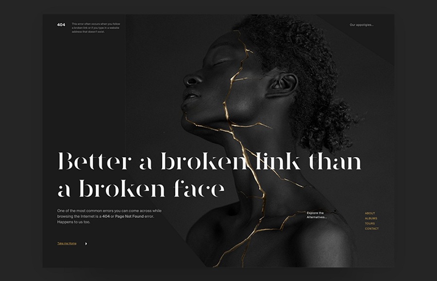
The black background photos with strong visual effects can not only highlight the white texts of the 404 error page, but also attract the attention of site/app visitors quickly once they have entered this page.
Moreover, a perfect echo of images and contents also makes its text more convincing and effective to reduce the negative emotions of users.
In addition, the sidebar with extra links, like “Help”, “About” and more options, also effectively enhance user experiences.
*What can you learn
Also use strong visual effects to improve your error page designs.
There are many visual effects that you can adopt to create an outstanding 404 error page, such as high-quality photos, proper color schemes, creative theme, etc.
*Also use sidebars to expand the page functions and improve user experiences.

*Designer: Hossein Mahmoodi
*Highlights: Movie poster style and science fiction theme
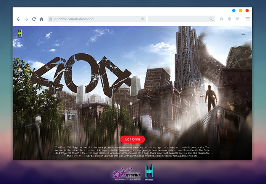
This error page design features for adapting a movie poster style and choosing a science fiction theme. The words “404” is designed into the “sci-fi movie poster” perfectly, which can make site/app visitors naturally fall into a reverie. And this is really creative and interesting.
*What can you learn
Also choose a proper theme for your page design.
A proper theme for your 404 error page can twice your work and make it more attractive. So, you can also choose a right theme for your page design, such as the above mentioned movies, animations, cartoons, festivals and different cultures, etc.

*Designer: Nayab Fatima
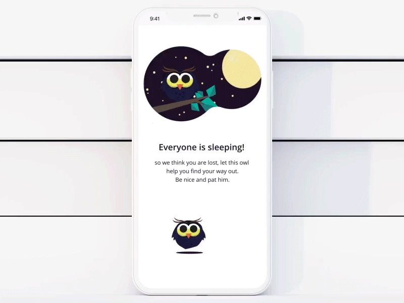
*Highlights: Vivid animation and adorable illustration style
The most distinctive part of this 404 error page design is the two animated owls that continuously blink their big and clean eyes, which make people feel peaceful and comfortable. Moreover, the adorable illustration style and white space also make the page more beautiful and dreamy. When you enter this page, it is like falling into a fairy tale world that the designer has elaborately created. And this also is an effective way to ease the frustration of site visitors.
*What can you learn
Also add some animations /interactions to your 404 error page.
An illustration style also makes your design more beautiful.

*Designer: Carlos Pariente
*Highlights: Humorous animations and film related elements
Cannot help laughing out while seeing this error page? OK! No matter whether it is in accordance with somecommonly-used interface design principles, it is at least very successful in attracting the attention of users and creating more pleasant user experiences, right? In addition, the humorous animation with well-known film-related figures in this error page not only match perfectly with its showing 404 error message, but also is pretty attractive to people who love films very much.
*What can you learn
Also add well-know or fashionable elements to your designs.
Also add humor or funny elements to your design.

*Designer: Andrea Hock
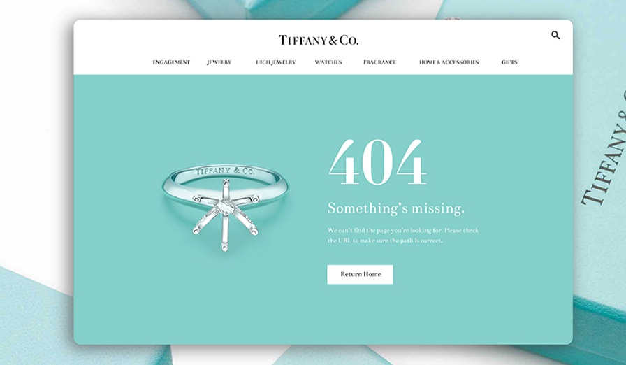
*Highlights: A nice shot to combine the features of web/app
Except adding related animations and high-quality photos to improve your error page designs, you can also easily combine the features of the targeted websites, apps and promoting products. For example, this 404 error page is a nice shot to combine the features of its promoting products and is used as another good platform to show various pieces of jewelry. In this way, even when people are suddenly interrupted by this error message while browsing different pieces of jewelry, they can also go on previewing their preferable ones. And this is really a good way to reduce page bounce rate.
*What can you learn
Also combine the features of a web/app to enrich the error page content.

*Designer: Deanna Lam
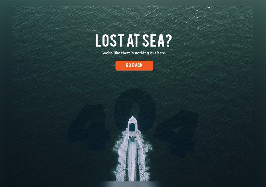
*Highlights: Beautiful scenery photo
In a 404 error page design, it is really a good idea to add a life or beautiful scenery image to make users feel more relaxing and comfortable.
*What can you learn
Also add a comfortable life or scenery photo to your 404 error page.

*Designer: Anton Borzenkov
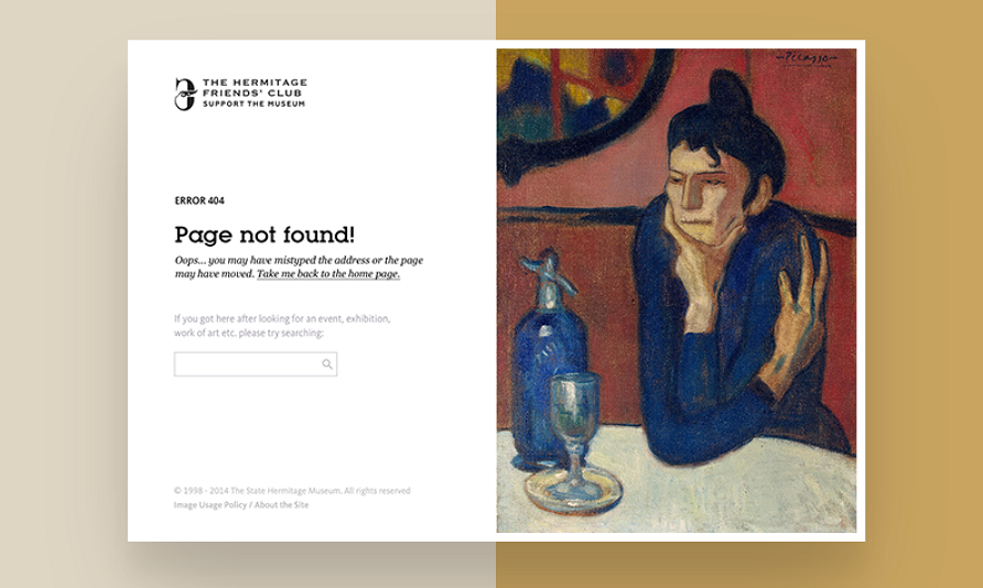
*Highlights: Interesting oil painting style and thoughtful searching box
The designer of this page adopts a unique and interesting oil painting style to attract site visitors. Moreover, in order to create more pleasant and smoother user experiences, the designer also adds a searching box following the 404 error message so that every user can freely search and jump to their preferable links/pages as soon as possible once they encounter 404 error problems.
*What can you learn
Also adopt a unique oil painting or Chinese ink painting style.

*Designer: David Kovalev
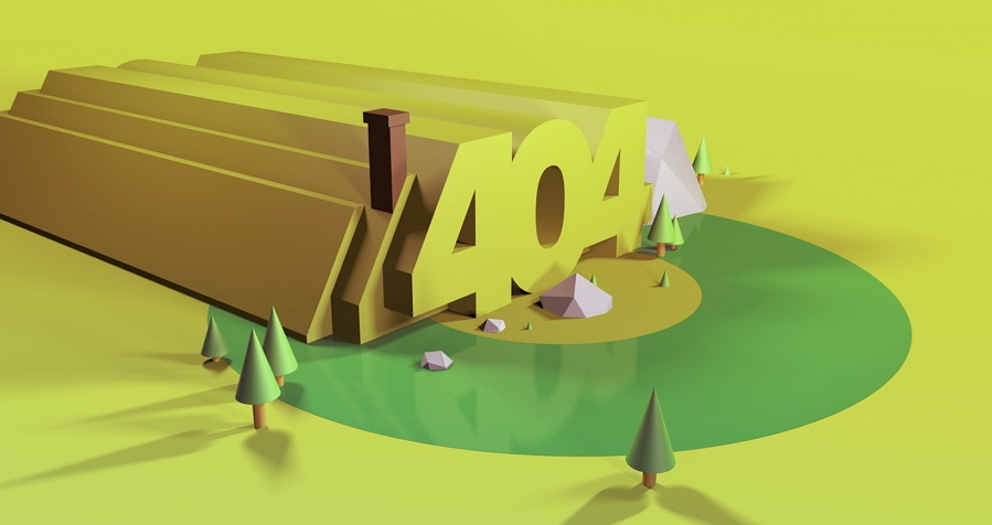
*Highlights: 3D technology
The designer of this page uses the advanced 3D technology to show the 404 error, which is really interesting and intuitive.
*What can you learn
Also use the advanced technologies to improve your designs.
In these days, there are also many advanced technologies that could be used in your error page design, such as video/audio media, 3D technologies and more.

*Designer: Shremal
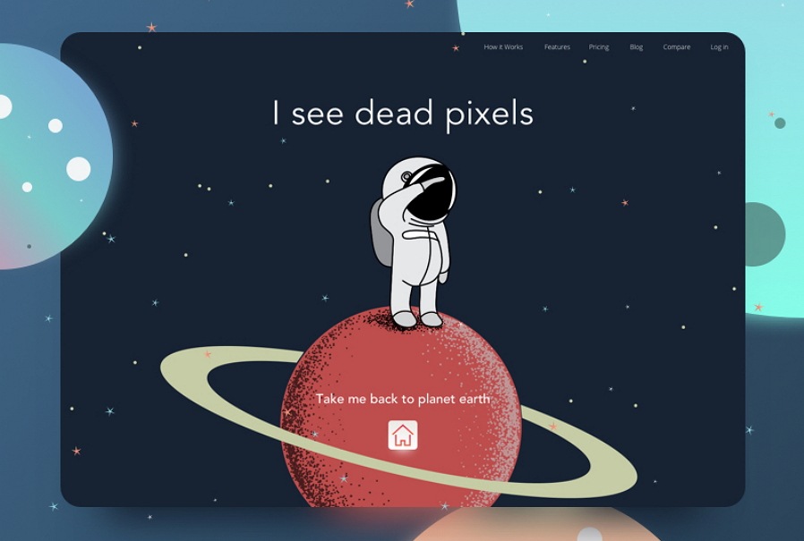
*Highlights: Use error page to tell a story
The designer of this error page uses shapes, colors, shadows, texts and all other elements included to tell a story: “Your searched page cannot be founded on earth” or “The page has taken you to another planet”. This is really impressing and interesting.
*What can you learn
Use your imagination to tell a story in your page design.

Overall, hope you can easily get inspiration these newest 404 error page designs and also learn something useful to improve your page design.
Mockplus Helps Save and Iterate Your 404 Error Page Design Ideas Easily and Quickly
Get lots of good ideas from these excellent 404 error examples? Don’t want these precious ideas to disappear without any trace? How about turning them all into visualized prototypes rapidly with a good prototyping tool, iterating and saving them well in your design diaries for a better use? OK! If you coincidentally think about it, you can give Mockplus, (an easy and fast prototyping tool) a good try to translate your 404 error page design ideas into beautiful and interactive prototypes within 10 minutes.
Let’s take a quick look at its powerful features that you can use to create and enhance your 404 error not found page design:
Step1. Add/import static/dynamic images easily and quickly in Mockplus
As an easier and faster prototyping tool, Mockplus provides designers a wide range of user-friendly image-related components and functions:
*Use Image components to add photos for your error page
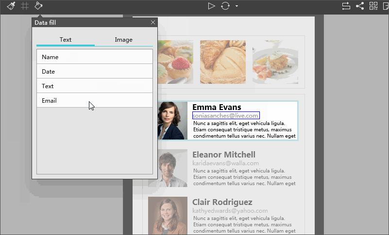
In Mockplus, you can easily drag and drop “Image” components to add needed photos for your error page. Moreover, If necessary, you can also use its Repeater and Auto Fill to add and automatically fill a large number of Image components within seconds.

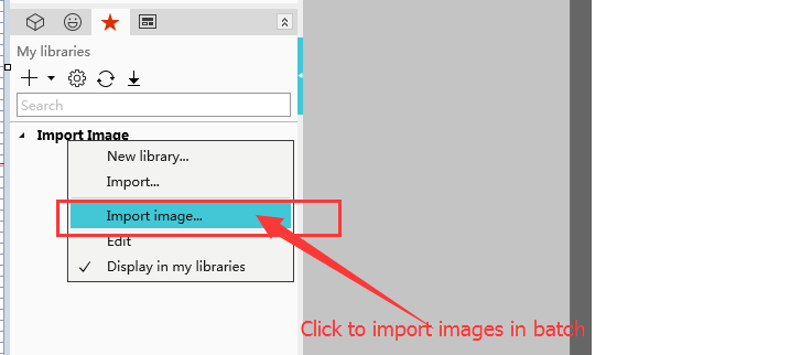
*Use My Libraries to import images in batches
If you want to import numerous beautiful images to beautify your error designs at once, you can easily open“My Libraries” section and import the desired images in batches.

*Import images from Sketch easily
Want to import images that are created and edited with Sketch for optimizing your 404 error page? You can also directly use “Import Images in Mockplus” to go on. Moreover, Mockplus plugin for Sketch can also help you a lot in such cases.
*Use GIF components to add dynamic photos
Also need dynamic photos to make your error page more vivid and intuitive? Use its GIF components to import your dynamic photos as you wish.
*Use Image Carousel components to show and switch photos dynamically
Mockplus also offers a special “Image Carousel” component for you to show and switch all selected images in a dynamic way.
In short, Mockplus can easily meet all your needs for adding/importing static/dynamic images in your 404 error page design.
Step2. Add interesting 404 error message with Label and Text Area of Mockplus
In 404 error page design, some interesting, humorous and clear explanations for 404 error problems are also an important factor to make your design stand out. And in Mockplus, you can easily use “Label” or “Text Area” components to freely input and edit interesting and humanistic copy-writings for your error page with simple drag-and-drop. The properties of these components are also able to be easily set. Of course, if necessary, also add a State Interaction for these texts to create better visual effects.
Step3. Add emotional expression icons for your page design with Mockplus
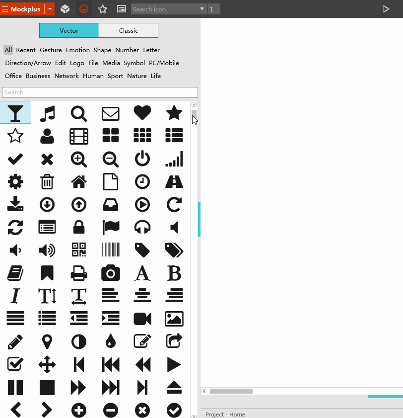
Emotional elements, especially some funny expression icons, also make an error page outstanding. And In Mockplus, except many vector expression icons, there are also over 3000 icons in all walks of life and design. You can freely search and choose any one of them for your page design based on your needs.

Step4. Add smart interactions or animations as you wish in Mockplus
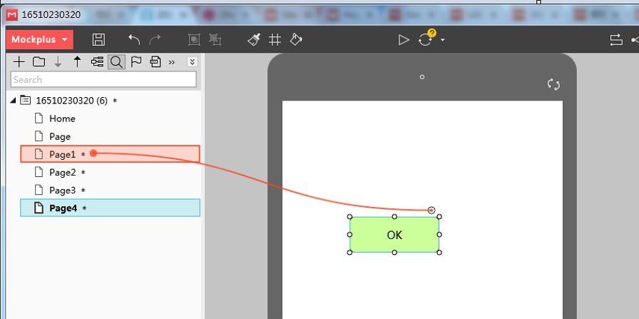
Some smart interactions or animations can also make your design unique and attractive. And Mockplus offers a variety of interaction design commands and enables you to easily make smart interactions with simple drag-and-drop. Moreover, its transition effects are also worth trying.

Step5. Sync and download your project anytime and anywhere
Looking for prototyping tool that allows you to easily cloud sync a project so that you can freely download, edit and share this project anytime and anywhere? OK! With Mocplus, once you have synced your created error page design prototypes successfully, you can freely download, edit, iterate and share them anytime and anywhere.
Moreover, Mockplus also offers users 8 ways to preview and share a project. And you can freely choose your desired way based on your needs and conditions.
Overall, no matter whether you are working on a 404 error page design or not, Mockplus will be a nice prototyping tool for you to “save” and iterate your design ideas with ease and efficiency.
Wrap Up
In comparison of taking such 404 error page as a nightmare of your website/app, you’d better use it as a good opportunity to offer user better guidance, keep them entertained and make them stay much longer on this web/site. Moreover, a cool/funny/interesting/creative 404 error page can also make the entire website/app much more attractive, outstanding and unique. Overall, hope these 14 latest and best 404 error page designs will help you anyway.
Free prototyping tool for web and mobile app design
Get Started for Free
Free prototyping tool for web and mobile app design
Get Started for Free
Free prototyping tool for web and mobile app design
Get Started for Free


